Trending Projects is available as a weekly newsletter please sign up at www.iainfreestone.com to ensure you never miss an issue.
1. Naming cheatsheet
Naming things is hard. This sheet attempts to make it easier.. Although these suggestions can be applied to any programming language, I will use JavaScript to illustrate them in practice.
 kettanaito
/
naming-cheatsheet
kettanaito
/
naming-cheatsheet
Comprehensive language-agnostic guidelines on variables naming. Home of the A/HC/LC pattern.

Naming cheatsheet
- English language
- Naming convention
- S-I-D
- Avoid contractions
- Avoid context duplication
- Reflect the expected result
- Naming functions
- Singular and Plurals
Naming things is hard. This sheet attempts to make it easier.
Although these suggestions can be applied to any programming language, I will use JavaScript to illustrate them in practice.
English language
Use English language when naming your variables and functions.
/* Bad */
const primerNombre = 'Gustavo'
const amigos = ['Kate', 'John']

/* Good */
const firstName = 'Gustavo'
const friends = ['Kate', 'John']
Like it or not, English is the dominant language in programming: the syntax of all programming languages is written in English, as well as countless documentations and educational materials. By writing your code in English you dramatically increase its cohesiveness.
Naming convention
Pick one naming convention and follow it. It may be camelCase…
2. Twin
Twin blends the magic of Tailwind with the flexibility of css-in-js (emotion, styled-components and goober) at build time.
ben-rogerson
/
twin.macro
🦹♂️ Twin blends the magic of Tailwind with the flexibility of css-in-js (emotion, styled-components, solid-styled-components, stitches and goober) at build time.


The magic of Tailwind with the flexibility of css-in-js.


Style jsx elements using Tailwind classes:
import 'twin.macro'
const Input = () => <input tw="border hover:border-black" />
Nest Twin’s tw import within a css prop to add conditional styles:
import tw from 'twin.macro'

const Input = ({ hasHover }) => (
  <input css={[tw`border`, hasHover && tw`hover:border-black`]} />
)
Or mix sass styles with the css import:
import tw, { css } from 'twin.macro'

const hoverStyles = css`
  &:hover {
    border-color: black;
    ${tw`text-black`}
  }
`
const Input = ({ hasHover }) => (
  <input css={[tw`border`, hasHover && hoverStyles]} />
)
Styled Components
You can also use the tw import to create and style new components:
import tw…3. Supabase
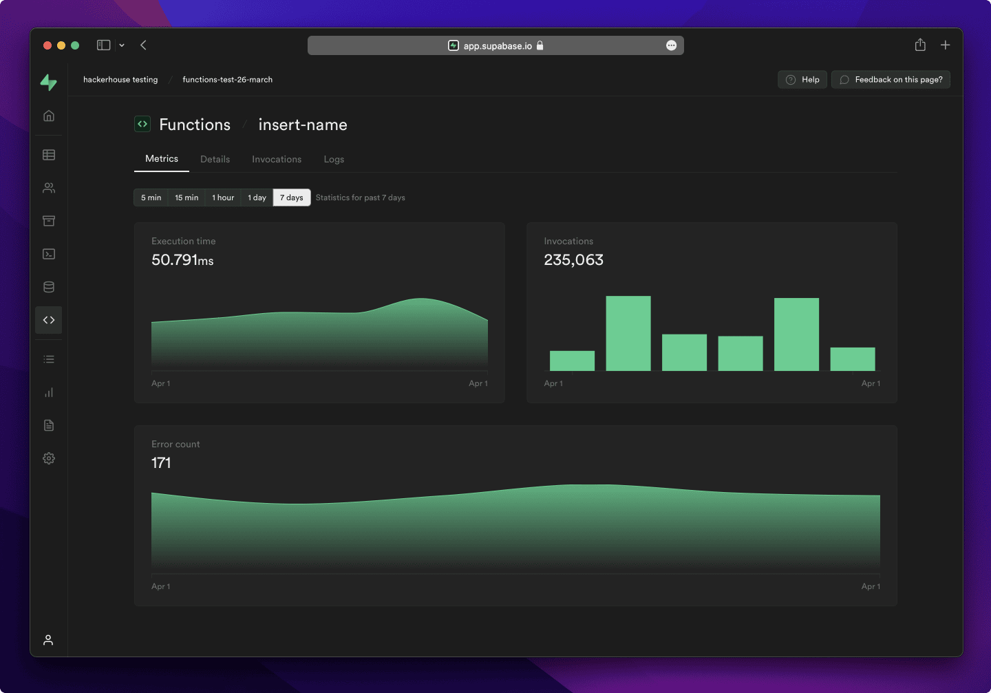
Supabase is an open source Firebase alternative. We’re building the features of Firebase using enterprise-grade open source tools.
supabase
/
supabase
The open source Firebase alternative. Supabase gives you a dedicated Postgres database to build your web, mobile, and AI applications.


Supabase
Supabase is an open source Firebase alternative. We're building the features of Firebase using enterprise-grade open source tools.
- Hosted Postgres Database. Docs
- Authentication and Authorization. Docs
- Auto-generated APIs
- Functions
- File Storage. Docs
- AI + Vector/Embeddings Toolkit. Docs
- Dashboard
Watch "releases" of this repo to get notified of major updates.
Documentation
For full documentation, visit supabase.com/docs
To see how to Contribute, visit Getting Started
Community & Support
- Community Forum. Best for: help with building, discussion about database best practices.
- GitHub Issues. Best for: bugs and errors you encounter using Supabase.
- Email Support. Best for: problems with your database or infrastructure.
- Discord. Best for: sharing your applications and hanging out with the community.
How it works
Supabase is a combination of open source tools. We’re building the features of Firebase using enterprise-grade, open source…
4. Polaris
Polaris React is a component library designed to help developers create the best experience for merchants who use Shopify.
Shopify
/
polaris
Shopify’s design system to help us work together to build a great experience for all of our merchants.

Polaris
Build. Contribute. Evolve. Shape the merchant experience for Shopify’s core product, the admin.

About this repo
The shopify/polaris repository is an intergalactic monorepo made up of NPM packages, VSCode extensions, and websites.
polaris/
├── documentation               # Documentation for working in the monorepo
├── polaris-for-vscode          # VS Code extension for Polaris
├── polaris-icons               # Icons for Polaris
├── polaris-react               # Components for @shopify/polaris package
├── polaris-tokens              # Design tokens for Polaris
├── polaris.shopify.com         # Documentation website
└── stylelint-polaris           # Rules for custom property usage and mainline coverage
Commands
Install dependencies and build workspaces
pnpm install && pnpm build
Run a command
One workspace
Run commands from a selected workspace using turbo run <command> --filter=<workspace>... flag.
| Command | Runs |
|---|---|
pnpm turbo run dev --filter=@shopify/polaris |
Open the react component storybook |
pnpm turbo run dev --filter=polaris.shopify.com |
Open polaris.shopify.com NextJS site |
All workspaces
Run commands across all workspaces…
5. Amplication
Amplication is an open‑source development tool. It helps professional Node.js developers develop quality Node.js applications without spending time on repetitive coding tasks.. Amplication auto-generates fully functional apps based on TypeScript and Node.js.
amplication
/
amplication
🔥🔥🔥 The Only Production-Ready AI-Powered Backend Code Generation
Instantly generate production-ready .NET and Node.js backend apps 🚀


Introduction
Amplication is a robust, open-source development platform designed to revolutionize the creation of scalable and secure .NET and Node.js applications. Amplication is the only AI platform turning ideas into production-ready code in a few minutes. We automate your backend applications development, ensuring consistency, predictability, and adherence to the highest standards with code that’s built to scale
Our user-friendly interface fosters seamless integration of APIs, data models, databases, authentication, and authorization. Built on a flexible, plugin-based architecture, Amplication allows effortless customization of the code and offers a diverse range of integrations.
With a strong focus on collaboration, Amplication streamlines team-oriented development, making it an ideal choice for groups of all sizes, from startups to large enterprises. Our platform enables you to concentrate on your business logic, while we handle the heavy lifting.
Experience the fastest way to develop .NET and Node.js…
6. Sapper
Sapper is a framework for building web applications of all sizes, with a beautiful development experience and flexible filesystem-based routing.
sapper
Sapper is deprecated in favor of its successor, SvelteKit, which we recommend using instead.
Financial Support
To support Sapper, SvelteKit, and the rest of the Svelte ecosystem, please consider contributing via OpenCollective.
License
7. React Tracked
State usage tracking with Proxies. Optimize re-renders for useState/useReducer, React Redux, Zustand and others.
dai-shi
/
react-tracked
State usage tracking with Proxies. Optimize re-renders for useState/useReducer, React Redux, Zustand and others.
React Tracked


State usage tracking with Proxies. Optimize re-renders for useState/useReducer, React Redux, Zustand and others.
Documentation site: https://react-tracked.js.org
Introduction
Preventing re-renders is one of performance issues in React Smaller apps wouldn't usually suffer from such a performance issue, but once apps have a central global state that would be used in many components. The performance issue would become a problem. For example, Redux is usually used for a single global state, and React-Redux provides a selector interface to solve the performance issue. Selectors are useful to structure state accessor, however, using selectors only for performance wouldn't be the best fit. Selectors for performance require understanding object reference equality which is non-trival for beginners and experts would still have difficulties for complex structures.
React Tracked is a library to provide so-called "state usage tracking." It's a technique to track property access of a state object and only triggers re-renders if…
8. xstyled
A utility-first CSS-in-JS framework built for React.
styled-components
/
xstyled
A utility-first CSS-in-JS framework built for React. 💅👩🎤⚡️
A utility-first CSS-in-JS framework built for React.


npm install @xstyled/styled-components styled-components
See the documentation at xstyled.dev for more information about using xstyled!
Quicklinks to some of the most-visited pages:
Example
import { x } from '@xstyled/styled-components'
function Example() {
  return (
    <x.div p={{ _: 3, md: 6 }} bg="white" display="flex" spaceX={4}>
      <x.div flexShrink={0}>
        <x.img h={12} w={12} src="/img/logo.svg" alt="xstyled Logo" />
      </x.div>
      <x.div>
        <x.h4
          fontSize={{ _: 'md', lg: 'xl' }}
          fontWeight="medium"
          color="black"
        >
          xstyled
</x.h4…9. react-rnd
A resizable and draggable component for React.
A resizable and draggable component for React.


Table of Contents
Screenshot

https://codesandbox.io/s/xpm699v4lp
Live Demo
Storybook
CodeSandbox
CodeSandbox(with default)
CodeSandbox(with size and position)
CodeSandbox(with typescript)
CodeSandbox(with hooks)

Install
- use npm
npm i -S react-rnd
- use yarn
yarn add react-rnd
Usage
Example with default
<Rnd
  default={{
    x: 0,
    y: 0,
    width: 320,
    height: 200,
  }}
>
  Rnd
</Rnd>
Example with position and size
<Rnd
  size={{ width: this.state.width,  height: this.state.height }}
position={{ x: this.state.x, y: this.…10. Whirl
CSS loading animations with minimal effort!

Whirl
CSS loading animations with minimal effort!

whirl is a curation of CSS loading animations(whirls! 😅). It started as a drop in CSS file to get easy animations using :pseudo elements. It's now a collection of loading animations to use, take inspiration from, change and do what you want with 👍
No CSS distro?
It's inefficient. It's likely an app will only use one or two loaders. Pulling them all into an app would be overkill. Most projects use some form of bundling making it possible to import a single loader's styles.
Usage
You've got different options here.
You can install whirl and import the styles you want. You get both CSS and SASS files 👍
Alternatively, you can grab the CSS or SASS and change to your needs. There's a dynamic link in the demo. Or visit the latest versions tag branch 👍
…
Trending Projects is available as a weekly newsletter please sign up at www.iainfreestone.com to ensure you never miss an issue.
If you enjoyed this article you can follow me on Twitter where I regularly post bite size tips relating to HTML, CSS and JavaScript.

Top comments (1)
Feels like web development is becoming more automated .. someday we'll just drang & drop components & everything will be generoted in bockend