
This tutorial is the second part of our React Native Travel Article App UI clone series. In the previous part, we successfully set up the overall project structure and established the base template with different UI sections for our Article List screen. This tutorial is the continuation of the same tutorial from where we left off in the last part. So, it is recommended to go through the previous part in order to establish the basis and get insight into the overall project.
As mentioned in the previous part, the motivation to implement this UI clone series came from the React Native Universal Listings App Template that accommodates a wide variety of use cases, powered by universal features and design which allows us to implement our own apps to list anything that belongs in categories and can be added on a map. And, this second part is also the continuation of coding implementations and designs from the Youtube video tutorial by React UI Kit for the Travel Article App clone. The video tutorial provides overall guidance using fast coding which may be difficult to grasp for any developer especially the beginners. This written tutorial provides the step by step implementation which will be easier to understand and implement.
Overview
In this second part of this tutorial series, we are going to implement a portion of the Destinations section which we sectioned out in our previous tutorial part. The idea is to start by implementing the Destination section with a scrolling transition. Then, we will define mock destinations data which we will later integrate into the Destinations section. Lastly, we will style and configure the contents in the Destination section in order for it to look similar to the actual app.
So, let us begin!!
Implementing Destination Section
For starters, we are going to implement a simple Destination section template in the renderDestinations() method. For that, we need to use the code from the following code snippet:
renderDestinations(){
        return(
            <View style={[styles.flex, styles.column]}>
              <ScrollView horizontal>
                <Text>Destination 1</Text>
                <Text>Destination 2</Text>
                <Text>Destination 3</Text>
              </ScrollView>
            </View>
        )
    }
Here, we have included a ScrollView component that wraps three Text components. The ScrollView component allows us to integrate the scroll feature in the app. Since there is a prop horizontal included in the ScrollView component, we will be able to scroll horizontally.
Hence, we will get the following result in our emulator screen:
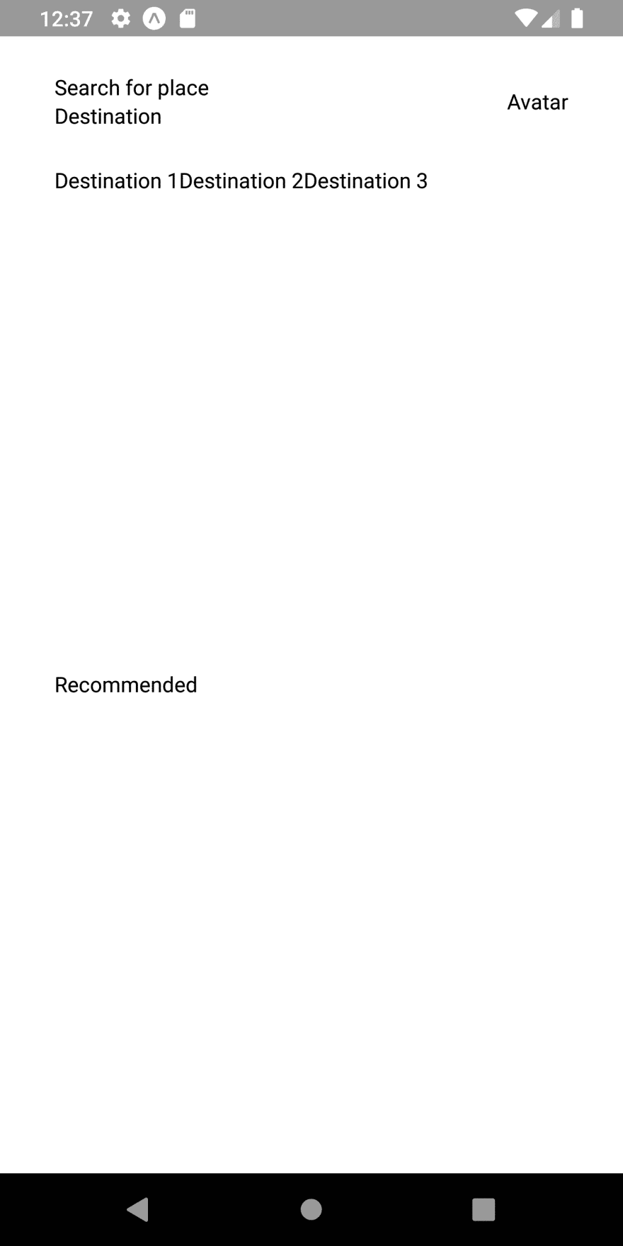
As we can see, we have got the Destinations section with three Text components. But this screen is not scrollable as there is no room for scrolling.
Now, we are going to style and configure this template in order to make it scrollable.
Adding Dimensions
Here, we are going to add the Dimensions component. This component allows us to take the full width and height of the app screen. For that, we need to use the code from the following code snippet:
import { StyleSheet, Text, View, ScrollView, Dimensions } from 'react-native';
const {height, width} = Dimensions.get('screen');
Here, we have imported the Dimensions component from the react-native package. Then, we have defined the height and width constants by using get() function of Dimensions module.
Making Destinations Section Scrollable
Now, we are going to make the Destinations section scrollable to the right. For that, we need to make use of Dimensions properties and different styles in our renderDestionations() method template. The coding implementation to make the Destinations section scrollable is provided in the code snippet below:
renderDestinations(){
        return(
            <View style={[styles.flex, styles.column]}>
              <ScrollView horizontal>
                <View style={[styles.flex, styles.destination]}>
                  <Text>Destination 1</Text>
                </View>
                <View style={[styles.flex, styles.destination]}>
                  <Text>Destination 1</Text>
                </View>
                <View style={[styles.flex, styles.destination]}>
                  <Text>Destination 1</Text>
                </View>
              </ScrollView>
            </View>
        )
    }
Here, we have included three View components inside the ScrollView component. Each View component wraps the Text component. There are also some styles bound to them. The required styles are provided in the code snippet below:
destination : {
      width : width - (36 * 2),
      borderRadius : 12,
      backgroundColor : 'pink'
    }
Hence, we will get the following result in our emulator screen:
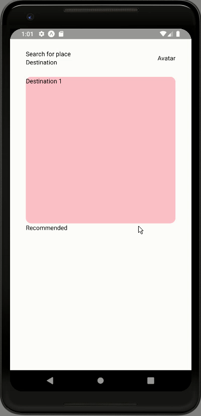
As we can see, now we can scroll the View components with text in the Destinations section.
But what we want is to display only one View component at a time. And while scrolling it will immediately scroll to the next View component without consistent scrolling transition.
Configuring ScrollView
Here, we are going to make some configurations to ScrollView so that only one View component inside the ScrollView component displayed while scrolling motion. We also need to remove the horizontal scroll bar that appears at the bottom of the Destinations section. For that, we need to include different ScrollView configuration props to ScrollView. The overall coding implementation is provided in the code snippet below:
 <ScrollView
                horizontal
                pagingEnabled
                scrollEnabled
                showsHorizontalScrollIndicator = {false}
                scrollEventThrottle = {16}
                snapToAlignment = "center"
              >
                <View style={[styles.flex, styles.destination]}>
                  <Text>Destination 1</Text>
                </View>
                <View style={[styles.flex, styles.destination]}>
                  <Text>Destination 1</Text>
                </View>
                <View style={[styles.flex, styles.destination]}>
                  <Text>Destination 1</Text>
                </View>
    </ScrollView>
As we can see, we have included five new props to the ScrollView. The function of all the props are listed below:
-
pagingEnabled: When its value is true, the scroll view stops on multiples of the scroll view’s size when scrolling. The default value is false. -
scrollEnabled: When its value is false, the view cannot be scrolled via touch interaction. The default value is true. -
showsHorizontalScrollIndicator: When its value is false, the horizontal scroll bar at the bottom does not show up. -
scrollEventThrottle: This prop is used to controls how often the scroll event will be fired while scrolling (as a time interval in ms). A lower number corresponds to better accuracy for code that is tracking the scroll position. -
snapToAlignment: This prop will define the relationship of the snapping to the scroll view.
There is also changes to some style properties which is provided below:
articles : {
    },
    destination : {
      width : width - (36 * 2),
      marginHorizontal : 36,
      padding : 36,
      borderRadius : 12,
      backgroundColor : 'pink'
    },
Adding style to the Recommendation section
Here, we are going to make a few style adjustments to the Recommendation section so that our Destinations section will appear better. For that, we need to use the code from the following code snippet:
renderRecommended(){
        return(
            <View style={[styles.flex, styles.column, styles.recommended]}>
                <Text>Recommended</Text>
            </View>
        )
    }
The required style is provided in the code snippet below:
recommended : {
      padding : 36
    }
Hence, we will get the following result in our emulator screen:

As we can see, when we scroll the Destinations section cards only one card is visible at a time. This makes the section more appealing and smooth. Now, we need to add some content to the Destinations section and style them so that it will look similar to the actual app.
Adding Mock data for Destinations section
Here, we are going to add the mock destinations data. For that, we need to define an array variable called destinations. Then, we need to define the array of objects inside the destinations array which will represent the data for each destination in the Destinations section. The required mock destinations array data is provided in the code snippet below:
const destinations = [
  {
    id: 1,
    user: {
      name: 'Lelia Chavez',
      avatar: 'https://randomuser.me/api/portraits/women/44.jpg',
    },
    saved: true,
    location: 'Santorini, Greece',
    temperature: 34,
    title: 'Santorini',
    description: 'Santorini is one of the Cyclades islands in the Aegean Sea. It was devastated by a volcanic eruption in the 16th century BC, forever shaping its rugged landscape. The whitewashed, cubiform houses of its 2 principal towns, Fira and Oia, cling to cliffs above an underwater caldera (crater). They overlook the sea, small islands to the west and beaches made up of black, red and white lava pebbles.',
    rating: 4.3,
    reviews: 3212,
    preview: 'https://images.unsplash.com/photo-1507501336603-6e31db2be093?auto=format&fit=crop&w=800&q=80',
    images: [
      'https://images.unsplash.com/photo-1507501336603-6e31db2be093?auto=format&fit=crop&w=800&q=80',
      'https://images.unsplash.com/photo-1507501336603-6e31db2be093?auto=format&fit=crop&w=800&q=80',
      'https://images.unsplash.com/photo-1507501336603-6e31db2be093?auto=format&fit=crop&w=800&q=80',
      'https://images.unsplash.com/photo-1507501336603-6e31db2be093?auto=format&fit=crop&w=800&q=80',
    ]
  },
  {
    id: 2,
    user: {
      name: 'Lelia Chavez',
      avatar: 'https://randomuser.me/api/portraits/women/44.jpg',
    },
    saved: false,
    location: 'Loutraki, Greece',
    temperature: 34,
    title: 'Loutraki',
    description: 'This attractive small town, 80 kilometers from Athens',
    rating: 4.6,
    reviews: 3212,
    preview: 'https://images.unsplash.com/photo-1458906931852-47d88574a008?auto=format&fit=crop&w=800&q=80',
    images: [
      'https://images.unsplash.com/photo-1458906931852-47d88574a008?auto=format&fit=crop&w=800&q=80',
      'https://images.unsplash.com/photo-1446903572544-8888a0e60687?auto=format&fit=crop&w=800&q=80',
    ]
  },
  {
    id: 3,
    user: {
      name: 'Lelia Chavez',
      avatar: 'https://randomuser.me/api/portraits/women/44.jpg',
    },
    saved: true,
    location: 'Santorini, Greece',
    temperature: 34,
    title: 'Santorini',
    description: 'Santorini - Description',
    rating: 3.2,
    reviews: 3212,
    preview: 'https://images.unsplash.com/photo-1507501336603-6e31db2be093?auto=format&fit=crop&w=800&q=80',
    images: [
      'https://images.unsplash.com/photo-1507501336603-6e31db2be093?auto=format&fit=crop&w=800&q=80',
      'https://images.unsplash.com/photo-1507501336603-6e31db2be093?auto=format&fit=crop&w=800&q=80',
      'https://images.unsplash.com/photo-1507501336603-6e31db2be093?auto=format&fit=crop&w=800&q=80',
      'https://images.unsplash.com/photo-1507501336603-6e31db2be093?auto=format&fit=crop&w=800&q=80',
    ]
  },
  {
    id: 4,
    user: {
      name: 'Lelia Chavez',
      avatar: 'https://randomuser.me/api/portraits/women/44.jpg',
    },
    location: 'Loutraki, Greece',
    temperature: 34,
    title: 'Loutraki',
    description: 'This attractive small town, 80 kilometers from Athens',
    rating: 5,
    reviews: 3212,
    preview: 'https://images.unsplash.com/photo-1458906931852-47d88574a008?auto=format&fit=crop&w=800&q=80',
    images: [
      'https://images.unsplash.com/photo-1458906931852-47d88574a008?auto=format&fit=crop&w=800&q=80',
      'https://images.unsplash.com/photo-1446903572544-8888a0e60687?auto=format&fit=crop&w=800&q=80',
    ]
  },
]
As we can see, the destinations array data contains four object items, each representing the single destination. Each data item contains an id, user info, location, temperature, title, description, rating, reviews, image preview and an additional set of images. Here, we are only going to include a few data from data items. But, other information from the data items will be useful in upcoming tutorials.
Separate function for each Destination cards
Here, we are going to define a separate function called renderDestination() that will return the template for each destination. The coding implementation of renderDestination() method is provided in the code snippet below:
renderDestination(item){
      return(
        <ImageBackground
          style={style.flex}
          source= {{uri : item.preview}}
        >
          <View style={[styles.flex, styles.row, styles.destination]}>
            <View>
              <Image source={{uri: item.user.avatar}} style={style.avatar}/>
            </View>
            <View style={[styles.flex, styles.column]}>
              <Text>{item.user.name}</Text>
              <Text>{item.location}</Text>
            </View>
            <View >
              <Text style={style.rating}>{item.rating}</Text>
            </View>
          </View>
        </ImageBackground>
      )
    }
Here, the renderDestination() function takes a single parameter called item. This item parameter will include each data object item from the destinations array that we defined earlier. Then, we have used the item data in order to implement a simple template. The template includes an ImageBackground component that wraps a View component. This ImageBackground component is used to set the background image on the app screen. The View component wraps the child View components with Text component for the destination information. There are some styles bound to them that are provided in the code snippet below:
avatar :{
      width: 36,
      height : 36,
      borderRadius : 18
}
Now, we need to configure the ScrollView in the renderDestinations() method as well. We need to call the renderDestionation() method in the renderDestinations() method by passing the item parameter. And, we are also going to change the ScrollView to FlatList component as well for better configuration.
Note that we need to remember to import the ImageBackground component from the react-native package.
Changing ScrollView to FlatList
Now, we are going to replace the ScrollView component in the renderDestinations() method with the FlatList component. The FlatList component can be configured with all the props from the ScrollView component as well as provide a better transition as a List view. The changes made to the renderDestinations() function is provided in the code snippet below:
renderDestinations(){
        return(
            <View style={[styles.flex, styles.column]}>
              <FlatList
                horizontal
                pagingEnabled
                scrollEnabled
                showsHorizontalScrollIndicator = {false}
                scrollEventThrottle = {16}
                snapToAlignment = "center"
                data = {destinations}
                keyExtractor = {(item, index)=> `${item.id}`}
                renderItem = {({item}) => this.renderDestination(item)}
              />
            </View>
        )
    }
Here, we have completely replaced the ScrollView component with FlatList component. All the props integrated into ScrollView are included in the FlatList. The additional data prop takes in the destinations array data. The keyExtractor prop is used to identify each item in the list uniquely. And, the renderItem prop function returns the required template which in this case is calling the renderDestination() function with the item parameter.
Note that, we need to remember to import FlatList component from the react-native package.
Hence, we will get the following result in our emulator screen:
As we can see, we have got the Destination section card template on the app screen. But, this does not look appealing at all. So, we need to configure the destination card with additional components and styles to make it look like in the actual app.
Configuring Single Destination card
Here, we are going to configure the Destination card with different components and styles in order to make it look appealing as in the actual app. For that, we need to make some changes to the renderDestination() function. The changes made in the renderDestinations() function is provided in the code snippet below:
renderDestination(item){
      return(
        <ImageBackground
          style={[styles.flex, styles.destination]}
          imageStyle = {{borderRadius : 12}}
          source= {{uri : item.preview}}
        >
          <View style={[styles.row, {justifyContent: 'space-between'}]}>
            <View style={{flex : 0}}>
              <Image source={{uri: item.user.avatar}} style={styles.avatar}/>
            </View>
            <View style={[styles.column, {flex : 2, paddingHorizontal : 18}]}>
              <Text style={{color : 'white', fontWeight : 'bold'}}>{item.user.name}</Text>
              <Text style={{color : 'white'}}>{item.location}</Text>
            </View>
            <View style={{flex : 0, justifyContent : 'center', alignItems : 'flex-end'}}>
              <Text style={styles.rating}>{item.rating}</Text>
            </View>
          </View>
        </ImageBackground>
      )
    }
The required styles are provided in the code snippet below:
 rating: {
      fontSize: 28,
      color: 'white',
      fontWeight: 'bold'
    },
    destination : {
      width : width - (36 * 2),
      marginHorizontal : 36,
      paddingHorizontal : 36,
      paddingVertical : 24,
      borderRadius : 12,
      backgroundColor : 'pink'
    },
Now, we also want to add an Avatar image to the header section of the List screen. For that, we need to use the code from the following code snippet:
   header: (
          <View style={[styles.row, styles.header]}>
            <View>
              <Text>Search for place</Text>
              <Text style={{fontSize : 24}}>Destination</Text>
            </View>
            <View>
              <Image style={styles.avatar} source={{ uri: 'https://randomuser.me/api/portraits/women/32.jpg'}} />
            </View>
          </View>
        )
Here, we have included an Image component with a source prop for the avatar image URL.
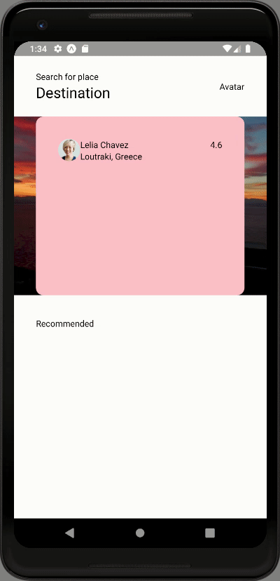
Hence, we will get the following result in our emulator screen:

As we can see, our destination cards in the Destinations sections look very attractive now. We have also got the Avatar image in the header. With this, we have come to the end of this part of the tutorial.
Finally, We have successfully implemented the scrolling cards transition of the Destinations section in the List screen of our React Native Travel Article UI clone app.
Conclusion
This tutorial is the second part of the React Native Travel Article App UI clone tutorial series. In this part, we continued from where we left off in the first part of this tutorial series. In this part of the tutorial, we got step by step guide on how to implement the horizontal scrolling transition in our Destinations section. Then, we also learned how to use FlatList with different prop configurations to make the scrolling transition of cards a lot better. Lastly, we added different elements to our destination cards with an Avatar image in the header section of the List screen as well.
In the next part of this tutorial series, we are going to implement the remaining portion of our Destinations section. This will include the Destination information card section and active scrolling dots.
So, Stay Tuned folks!!!
The post React Native Travel Article App UI Clone #2 : Destinations Section appeared first on Kriss.

Top comments (0)