
This tutorial is the sixth part of our React Native Travel Article App UI clone series. In the previous part, we successfully implemented the Delimiter dots animation while scrolling the Destination cards in the Destinations section. This tutorial is the continuation of the same tutorial from where we left off in the last part. So, it is recommended to go through the previous parts in order to get the knowledge and insight into the overall project.
In case of wanting to learn from the beginning, all the parts for this tutorial series are available below:
- React Native Travel Article App UI Clone #1: Getting Started
- React Native Travel Article App UI Clone #2: Destinations Section
- Building React Native Travel Article App UI Clone #3: Destinations Info Section
- React Native Travel Article App UI Clone #4: Recommendation Section
- React Native Travel Article App UI Clone #5: Animated Delimiter Dots
As mentioned in the previous tutorial part, the inspiration for this tutorial series came from the React Native App Templates that delivers a wide variety of beautiful templates written in React Native and powered by universal features and design. The templates enable us to implement our own apps and even help us get started with our own startups. And, this sixth part is also the continuation of the same coding implementations and designs from the Youtube video tutorial by React UI Kit for the Travel Article App UI clone. The video tutorial seems to deliver the overall tutorial using fast coding which may be difficult to grasp for any developer especially the beginners. Hence, this article tutorial provides a step by step implementation which will be easier to understand and implement. So, the learners can relax and take their time to implement the UI.
Overview
In this sixth part of this tutorial series, we are going to add the icons in the required UI sections and also add star ratings to the Recommendation cards. In this tutorial part, we are going to complete the implementation of the List screen as a whole. The idea is to add the vector icons to the required UI section of the list screen. Then, we are going to add the star ratings to the Recommendation section. Finally, we will also configure the star ratings to show the active and inactive stars on the basis of rating value.
So, let us begin!!
Installing Vector Icons Package
Here, we are going to install the react-native-vector-icons package into our project. This package provides customizable Icons for React Native with support for NavBar/TabBar/ToolbarAndroid, image source, and full styling. Now, in order to install the package, we need to use the following command:
>>>expo install react-native-vector-icons
Now, we need to import the required icons into our List screen. For that, we need to use the code from the following code snippet:
import FontAwesome from 'react-native-vector-icons/FontAwesome';
import Octicons from 'react-native-vector-icons/Octicons';
Here, we have imported the Font Awesome icon package in the form of FontAwesome component. And, we have also imported the Octicons icon package as Octicons component.
Adding Icon to UI sections
Now, we are going to add the icons that we imported to various sections of the List screen.
Adding Icon to Recommendation Section
Here, we are going to add the bookmark icon to the Recommendation cards. The bookmark icon will be set on the basis of the saved value from the destinations array data. If the saved value is true then the bookmark active icon will be set otherwise the bookmark inactive icon will be set. Now in order to implement this, we need to use the code from the following code snippet in the renderRecommendation() function:
<View style={[styles.flex, styles.recommendationHeader]}>
              <Image style={[styles.recommendationImage]} source={{ uri: item.preview }} />
              <View style={[styles.flex, styles.row, styles.recommendationOptions]}>
                <Text style={styles.recommendationTemp}>
                  {item.temperature}℃
                </Text>
                <FontAwesome
                  name={item.saved ? 'bookmark' : 'bookmark-o'}
                  color={theme.colors.white}
                  size={theme.sizes.font \* 1.25}
                />
              </View>
            </View>
Here, we have added the FontAwesome component which enables us to set the FontAwesome icons. We have also provided the color and size props to the FontAwesome component.
Hence, we will get the following result in our emulator screen:

As we can see, we have got the bookmark icons in the Recommendation cards section.
Adding Icon to Destinations section
In the Destinations section, we need to add two icons. One is the location icon in the ImageBackground component and the other is the greater than an arrow-like icon in the Destination Info section. First, we are going to add the location marker icon to the ImageBackground component of the Destinations section. For that, we need to use the code from the following code snippet in the renderDestination() function:
<View style={[styles.column, {flex : 2, paddingHorizontal : theme.sizes.padding / 2}]}>
              <Text style={{color : theme.colors.white, fontWeight : 'bold'}}>{item.user.name}</Text>
              <Text style={{ color: theme.colors.white }}>
                <Octicons
                  name="location"
                  size={theme.sizes.font \* 0.8}
                  color={theme.colors.white}
                />
                <Text> {item.location}</Text>
              </Text>
            </View>
Here, we have added the Octicons component to add the icon from the Octicons package. We have selected the location icon of the Octicons icon package. The size and color props are also configured in the Octicons component.
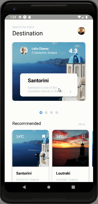
Hence, we will get the following result in our emulator screen:

As we can see, we have got the location icon in the background image of the Destinations section.
Now, we need to add an icon to the Destinations Info section. For that, we need to use the code from the code snippet below:
<View style={[styles.column, styles.destinationInfo, styles.shadow]}>
            <Text style={{ fontSize: theme.sizes.title, fontWeight: '500', paddingBottom: 8, }}>
              {item.title}
            </Text>
            <View style={[styles.row, { justifyContent: 'space-between', alignItems: 'flex-end'}]}>
              <Text style={{ color : theme.colors.caption}}>
                {item.description.split('').slice(0, 50)}...
              </Text>
              <FontAwesome
                name="chevron-right"
                size={theme.sizes.font \* 0.75}
                color={theme.colors.caption}
              />
            </View>
          </View>
Here, we have added the FontAwesome component which provides us with access to Font Awesome icons. The size and color props are also configured.
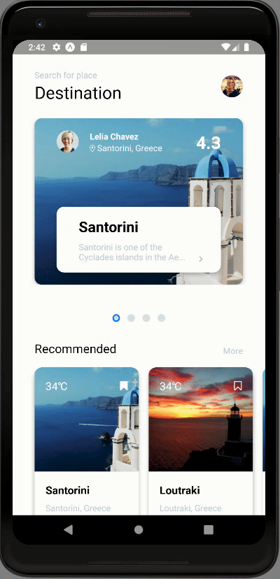
Hence, we will get the following result in the emulator screen:
As we can see, we have got the ‘greater than’ icon in the Destination Info section as well. Hence, this completes our task of adding icons in the List screen. Now, we are going to add the star ratings to the Recommendation Card section.
Adding Star Ratings to the Recommendation Card Section
In this step, we are going to add the star ratings in the Recommendation Card Section. These star ratings will represent the overall rating given to the recommended travel destination. We might have remembered that we have added the rating value before. Now, we are going to add the star icons including the rating value. For that, we are going to define a new function called renderRatings() which will return the template for the ratings. The overall implementation of this function is provided in the code snippet below:
renderRatings(rating) {
      const stars = new Array(5).fill(0);
      return (
        stars.map((value, index) => {
          const activeStar = index < rating;
          return (
            <FontAwesome
              name="star"
              key={`star-${index}`}
              color={theme.colors[activeStar ? 'active' : 'gray']}
            />
          )
        })
      )
    }
Here, in the renderRatings() function we have initialized a new Array variable called stars which can take up to 5 values. This function takes ratings as a parameter. Then, we have used the map() array function which enables us to iterate through each item of stars array. Inside the map() function, we have defined a new constant that stores the activeStars in order to give style accordingly. Then, we have returned the FontAwesome component with star icons. The FontAwesome component is configured with key and color props. The key prop to identify each item in array uniquely. And, the color is based on the activeStar constant.
Now, we need to call this renderRatings() function in the renderRecommendation() function as shown in the code snippet below:
<View style={[styles.flex, styles.column, styles.shadow, { justifyContent: 'space-evenly', padding: theme.sizes.padding / 2 }]}>
              <Text style={{ fontSize: theme.sizes.font \* 1.25, fontWeight: '500', paddingBottom: theme.sizes.padding / 4.5, }}>{item.title}</Text>
              <Text style={{ color: theme.colors.caption}}>{item.location}</Text>
              <View style={[
                styles.row,
                { alignItems: 'center', justifyContent: 'space-between', marginTop: theme.sizes.margin }
              ]}>
                <Text style={{ color: theme.colors.active }}>
                  {this.renderRatings(item.rating)}
                  {item.rating}
                </Text>
              </View>
            </View>
Here, we have called the renderRatings() function inside the Text component wrapping the rating value. We have passed the rating value of the item from the destinations data array.
Hence, we will get the following result in our emulator screen:

As we can see, we have got the star ratings with star icons and rating value in our Recommendation card section. But, all the ratings seem to be active and it does not seem appealing as well.
Now, we are going to configure the active and inactive stars based on rating value as well as style the rating stars properly.
Configuring the active rating star icons
Here, we are going to configure the active ratings based on the rating value. For that, we need to make some configurations to the activeStar constant in the renderRatings() method as shown in the code snippet below:
stars.map((value, index) => {
          const activeStar = Math.floor(rating) >= (index + 1);
          return (
            <FontAwesome
              name="star"
              key={`star-${index}`}
              size={theme.sizes.font}
              color={theme.colors[activeStar ? 'active' : 'gray']}
            />
          )
        })
Here, we have taken the floor value of rating using Math function and index property. Then, we have also added the size prop to the FontAwesome component.
Now, we need to make some changes to the renderRecommendation() function as well which is provided in the code snippet below:
<View style={[styles.flex, styles.column, styles.shadow, { justifyContent: 'space-evenly', padding: theme.sizes.padding / 2 }]}>
              <Text style={{ fontSize: theme.sizes.font \* 1.25, fontWeight: '500', paddingBottom: theme.sizes.padding / 4.5, }}>{item.title}</Text>
              <Text style={{ color: theme.colors.caption}}>{item.location}</Text>
              <View style={[
                styles.row,
                { alignItems: 'center', justifyContent: 'space-evenly', marginTop: theme.sizes.margin }
              ]}>
                {this.renderRatings(item.rating)}
                <Text style={{ color: theme.colors.active }}>
                  {item.rating}
                </Text>
              </View>
            </View>
Here, we have removed the renderRatings() function from the Text component and placed outside it. We have also added some style to the View component wrapping the renderRatings() function.
Hence, we will get the following result in our emulator screen:
As we can see, we have got the star ratings in accordance with the rating value. The rating section also looks appealing now as in the actual app.
Now, we are going to add navigation to the Article screen while clicking on the Destination section cards.
Adding Navigation to Article screen
Here, we are going to add the navigation to Article screen. We are going to configure this navigation property into the Destination Section cards For that, we need to use the code from the following code snippet in the renderDestination() function:
renderDestination(item){
      return(
        <TouchableOpacity activeOpacity={0.8} onPress={() => this.props.navigation.navigate('Article', { article: item })}>
          <ImageBackground
            style={[styles.flex, styles.destination, styles.shadow]}
            imageStyle = {{borderRadius : theme.sizes.radius}}
            source= {{uri : item.preview}}
          >
        …………………………………..
          </ImageBackground>
        </TouchableOpacity>
      )
    }
Here, we have wrapped the entire Destination card template by the TouchableOpacity component. Then, we have added the activeOpacity prop to the TouchableOpacity component to give the opaque effect while clicking. In the onPress event of the TouchableOpacity component, we have configured the navigation using the navigate function provided by navigation prop. The navigation prop is automatically available to all the screens which are configured to our Navigator.
Now, we can navigate to Article screen by clicking on the Destination cards as shown in the emulator simulation below:

As we can see, when clicking on each Destination cards, we can navigate to the Article screen. With this, we have come to the end of this part of the tutorial.
Finally, we have successfully implemented each and every UI section in the List screen of our React Native Travel Article App UI clone.
Conclusion
This tutorial is the sixth part of the React Native Travel Article App UI clone tutorial series. In this part, we continued from where we left off in the fifth part of this tutorial series. In this part of the tutorial, we learned how to add the vector icons to the required UI section in our List screen. Then, we got the stepwise guidance on how to add the star ratings as well as configure the active ratings based on rating value. We also learned to add the navigation from the navigation prop in order to navigate to the Article screen. Finally, we have successfully completed the implementation of every UI section in the List screen of our Travel Article App UI clone.
In the next part of this tutorial series, we are going to move on to the implementation of the Article screen.

Top comments (0)