
This tutorial is the fourth part of our React Native Travel Article App UI clone series. In the previous part, we successfully implemented the remaining portion of the Destinations Section which included Destinations Info card and the bottom delimiter dots. This tutorial is the continuation of the same tutorial from where we left off in the last part. So, it is recommended to go through the previous parts in order to get the knowledge and insight into the overall project.
In case of wanting to learn from the beginning, all the parts for this tutorial series are available below:
- [React Native Travel Article App UI Clone #1: Getting Started](https://kriss.io/react-native-travel-article-app-ui-clone-1-getting-started/)
- [Building React Native Travel Article App UI Clone #2: Destinations Section](https://kriss.io/react-native-travel-article-app-ui-clone-2-destinations-section/)
- [React Native Travel Article App UI Clone #3: Destinations Info Section](https://kriss.io/react-native-travel-article-app-ui-clone-3-destination-info-section/)
As stated in the previous parts, the inspiration for this tutorial series came from the React Native Universal Listings App Template that consists of a wide variety of use cases, powered by universal features and design which enables us to implement our own apps to list anything that belongs in categories and can be added on a map. And, this fourth part is also the continuation of the same coding implementations and designs from the Youtube video tutorial by React UI Kit for the Travel Article App UI clone. The video tutorial seems to deliver the coding implementations using fast coding which may be difficult to grasp for any developer especially the beginners. Hence, this article tutorial provides a stepwise implementation which will be easier to understand and implement. So, the learners can relax and take their time to implement the UI.
Overview
In this fourth part of this tutorial series, we are going to implement the Recommendation section that represents the feature that recommends the user for different travel places. This section will include the various info on the travel places which will be scrollable horizontally as well. The idea is to start by implementing the Recommendation Section content and then making it scrollable. Then, we will implement each recommendation cards with different style configurations. Finally, we will add ratings to this Recommendation section as well. So, let us begin!!
Configuring Some Style properties in Header and Destinations Section
Before starting to implement the Recommendation section, we are going to make some style changes to the Header and the Destinations section. For the changes in the Destinations section, we need to use the code from the following code snippet in the renderDestination() function:
             <View style={[ styles.row, { justifyContent: 'space-between', alignItems: 'flex-end'}]}>
              <Text style={{ color : '#BCCCD4'}}>
                {item.description.split('').slice(0, 50)}...
              </Text>
            </View>
For the changes in the Header section, we need to use the code from the following code snippet in the header config of navigationOptions object:
            <View>
              <Text style={{color : '#BCCCD4'}}>Search for place</Text>
              <Text style={{fontSize : 24}}>Destination</Text>
            </View>
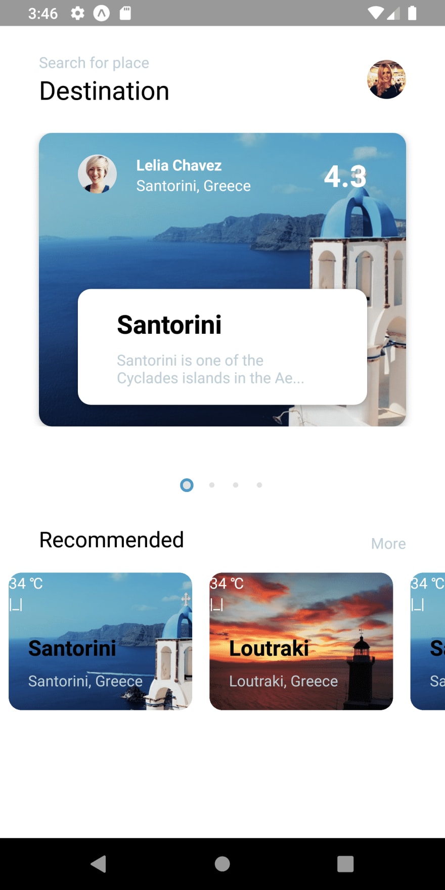
Hence, we will get the following result in our emulator screen:  As we can see, the style of text has been changed in both the Header and the Destinations section. Now, we are going to implement the Recommendation section that we have already separated out like
 renderRecommended() function.
Implementing Recommendation Section
Here, we are going to create the template for the Recommendation Section. We are going to implement the template in the renderRecommended() function that we have already separated out and called in the render() function. The Recommendation Section will include a series of recommendation cards with different information about the place as well as the ratings. Moreover, this Recommendation section cards will be scrollable horizontally just as in the Destinations section.
Configuring Header section of Recommendation Section
Now in order to establish the template. we are first going to complete the header section of the Recommendations section. For that, we need to use the code from the following code snippet in the renderRecommended() function:
renderRecommended(){
        return(
            <View style={[styles.flex, styles.column, styles.recommended]}>
              <View
                style={[
                  styles.row,
                  styles.recommendedHeader
                ]}
              >
                <Text style={{ fontSize: 20 }}>Recommended</Text>
                <TouchableOpacity activeOpacity={0.5}>
                  <Text style={{ color: '#BCCCD4' }}>More</Text>
                </TouchableOpacity>
              </View>
            </View>
        )
    }
Here, we have a parent View component wrapping the child View component. The child View component wraps the Text component and the TouchableOpacity component. The TouchableOpacity component makes the element inside in clickable. It wraps the Text component. All the components are bound to some styles which are provided in the code snippet below:
    recommended : {
    },
    recommendedHeader: {
      justifyContent: 'space-between',
      alignItems: 'flex-end',
      paddingHorizontal: 36,
    },
Hence, we will get the following result in our emulator screen:  As we can see, we have got the header section of the Recommendation section. It includes the header text and the ‘More’ button at the right. Now, we are going to implement the Recommendation cards section in the Recommendation section which is scrollable.
Implementing Recommendation cards section
Here, we are going to implement the Recommendation card section template in new function called renderRecommendation(). This function will return the template for the Recommendation cards. This template will hold the image and information section for our Recommendation section. Then, we will make this section scrollable as well. The coding implementation of this renderRecommendation() section is provided in the code snippet below:
renderRecommendation(item) {
      return(
          <View style={[styles.flex, styles.column, styles.recommendation]}>
            <View style={[styles.flex]}>
              <ImageBackground
                style={[styles.flex, styles.shadow]}
                imageStyle = {styles.recommendationImage}
                source= {{uri : item.preview}}
              >
                <View>
                  <Text style={{color : 'white'}}>{item.temperature} ℃</Text>
                  <Text style={{color : 'white'}}>|_|</Text>
                </View>
              </ImageBackground>
            </View>

          </View>
      )
    }
Here, we have included a parent View component that wraps the child View component. The child View component wraps the ImageBackground component for the image. Moreover, the ImageBackground wraps the View component holding the Text components for temperature and a bookmark icon. For simplicity, we have just placed a sign for the bookmark icon that we will add later. This function takes the item parameter which is a data item from our destinations data array. This parameter is used to implement all the content materials inside the Recommendation card section.
Making Recommendation Section Scrollable
Now in order to make the Recommendation Section scrollable, we need to replicate the configuration that we did in the renderDestinations() function. Here, we are going to the same configuration in the renderRecommended() function which will include the horizontally scrollable FlatList component. The overall coding implementation is provided in the code snippet below:
             <View style={[styles.flex, styles.column, styles.recommended]}>
              <View
                style={[
                  styles.row,
                  styles.recommendedHeader,
                ]}
              >
                <Text style={{ fontSize: 20 }}>Recommended</Text>
                <TouchableOpacity activeOpacity={0.5}>
                  <Text style={{ color: '#BCCCD4' }}>More</Text>
                </TouchableOpacity>
              </View>
              <View style={[styles.column]}>
                <FlatList
                  horizontal
                  pagingEnabled
                  scrollEnabled
                  showsHorizontalScrollIndicator = {false}
                  scrollEventThrottle = {16}
                  snapToAlignment = "center"
                  data = {destinations}
                  keyExtractor = {(item, index)=> `${item.id}`}
                  renderItem={({ item, index }) => this.renderRecommendation(item, index)}

                />
              </View>
            </View>
Here, we have included the second child View component inside the renderRecommended() function. The View component wraps the FLatList component with same configuration as the FlatList in renderDestinations() function. The only difference is some style properties and the function we are calling. The function we are calling here in the renderItem prop is the renderRecommendation() function that we implemented earlier. We are calling this function by passing the item and index value as parameters.
The required styles are provided in the code snippet below:
 recommendation: {
      width: (width - (36 * 2)) / 2,
      marginHorizontal: 8,
      backgroundColor: 'white',
      overflow: 'hidden',
      borderRadius: 12,
      marginVertical: 36 * 0.5,
    },
    recommendationImage: {
      width: (width - (36* 2)) / 2,
      height: (width - (36 * 2)) / 2,
    },
Hence, we will get the following result in our emulator screen:

As we can see, we have got the Recommendation cards section in the Recommendation section. Therefore, the cards are horizontally scrollable.
Now, we are going to add the description section to our recommendation cards which will include the title, location, and ratings.
Implementing Description section within Recommendation cards
Here, we are going to add the description section in our Recommendation cards. For simplicity, we are just going to add the title and location info for now. Later, we will style it properly and add ratings as well. Now, for its implementation, we need to use the code from the following code snippet:
renderRecommendation(item) {
      return(
          <View style={[styles.flex, styles.column, styles.recommendation]}>
            <View style={[styles.flex]}>
              <ImageBackground
                style={[styles.flex, styles.shadow]}
                imageStyle = {styles.recommendationImage}
                source= {{uri : item.preview}}
              >
                <View>
                  <Text style={{color : 'white'}}>{item.temperature} ℃</Text>
                  <Text style={{color : 'white'}}>|_|</Text>
                </View>
              </ImageBackground>
            </View>
            <View style={[styles.flex, styles.column, styles.shadow, { justifyContent: 'space-evenly', padding: 36 / 2 }]}>
              <Text style={{ fontSize: 16 * 1.25, fontWeight: '500', paddingBottom: 36 / 4.5, }}>{item.title}</Text>
              <Text style={{ color: '#BCCCD4' }}>{item.location}</Text>
            </View>
          </View>
      )
    }
Here, below the first child View component in the renderRecommendation() function, we have added the second View component. The second View component wraps the Text components for the item and title of the recommended travel places. Moreover, the components here are bound to some color and size styling properties.
Hence, we will get the following result in our emulator screen:
As we can see, we have got the description section as well. But the overall Destination card does not look appealing with its contents out of position. Now, we need to style them properly in order to make it look appealing as in the actual all.
Configuring Contents in the Recommendation cards section
Here, we are going to style each and every component in the renderRecommendation() function which styles and position properties. Hence, the section will look exactly like in the actual app. The overall coding implementation in the renderRecommendation() function is provided in the code snippet below:
renderRecommendation(item) {
      return(
          <View style={[styles.flex, styles.column, styles.recommendation, styles.shadow]}>
            <View style={[styles.flex, styles.recommendationHeader]}>
              <Image style={[styles.recommendationImage]} source={{ uri: item.preview }} />
              <View style={[ styles.flex, styles.row, styles.recommendationOptions ]}>
                <Text style={styles.recommendationTemp}>
                  {item.temperature}℃
                </Text>
              </View>
            </View>
            <View style={[styles.flex, styles.column, styles.shadow, { justifyContent: 'space-evenly', padding: 36 / 2 }]}>
              <Text style={{ fontSize: 16 * 1.25, fontWeight: '500', paddingBottom: 36 / 4.5, }}>{item.title}</Text>
              <Text style={{ color: '#BCCCD4' }}>{item.location}</Text>
            </View>
          </View>
      )
    }
Here, we have replaced the ImageBackground component with the Image component and also added an addition View component for displaying temperature. Also, we have removed the bookmark icon section as we are going to add the icons in our upcoming tutorial parts. Then, there are some inline styles as well as StyleSheet styling properties bound to the components. These styles are provided in the code snippet below:
      recommendationHeader: {
      overflow: 'hidden',
      borderTopRightRadius: 12,
      borderTopLeftRadius: 12,
    },
    recommendationOptions: {
      alignItems: 'center',
      justifyContent: 'space-between',
      padding: 36 / 2,
      position: 'absolute',
      top: 0,
      left: 0,
      right: 0,
    },
    recommendationTemp: {
      fontSize: 14 * 1.25,
      color: 'white'
    },
Adjusting the Scrolling positions
Here, we are going to adjust the scrolling position of the Recommendation cards in the Recommendation Section. For that, we are going to use the variable called isLastItem . This variable will contain the position of the last item in our destinations array. Then, we will make use of it to set the margins in the first and last Destination cards in our Destination sections. This will make the cards scrolling look more smooth as in the actual app. The overall coding implementation is provided in the code snippet below:
renderRecommendation(item, index) {
      const isLastItem = index === destinations.length - 1;
      return(
          <View
            style={[styles.flex, styles.column, styles.recommendation, styles.shadow,
                    index === 0 ? { marginLeft: 36 } : null,
                    isLastItem ? { marginRight: 36 / 2 } : null,
                   ]}
           >
            <View style={[styles.flex, styles.recommendationHeader]}>
              <Image style={[styles.recommendationImage]} source={{ uri: item.preview }} />
              <View style={[ styles.flex, styles.row, styles.recommendationOptions ]}>
                <Text style={styles.recommendationTemp}>
                  {item.temperature}℃
                </Text>
              </View>
            </View>
            <View style={[styles.flex, styles.column, styles.shadow, { justifyContent: 'space-evenly', padding: 36 / 2 }]}>
              <Text style={{ fontSize: 16 * 1.25, fontWeight: '500', paddingBottom: 36 / 4.5, }}>{item.title}</Text>
              <Text style={{ color: '#BCCCD4' }}>{item.location}</Text>
            </View>
          </View>
      )
    }
Hence, we will get the following result in our emulator screen:
As we can see, our Recommendation cards look stunning now. The scrolling is also smooth. All the cards have shadow and also the contents are accurately positioned. Now, all that’s left to add is the rating information.
Adding Ratings to Recommendation cards
Here, we are going to add the rating information to the recommendation cards. We are going to implement the actual ratings with star icons in the upcoming tutorial parts. Here, we are just going to add the rating info so that all the required content that should be present in the Recommendation card is available. Adding ratings is pretty simple and straightforward which we can easily understand by studying the following code snippet:
 <View style={[
            styles.row,
            { alignItems: 'center', justifyContent: 'space-between', marginTop: theme.sizes.margin }
          ]}>
            <Text style={{ color: '#007BFA'}}>
              {item.
  </View>
Here, we have a View component that we need to add at the bottom of our renderRecommention() method. The View component wraps the Text component holding the rating info.
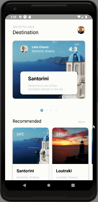
Hence, we will get the following result in our emulator screen:

As we can see, we have got all the contents in the proper position in the Recommendation cards of the Recommendation section. With this, we have come to the end of this part of the tutorial.
Hence, we have successfully implemented the Recommendation section with the horizontally scrolling Recommendation Info cards section in the List screen of our React Native Travel Article app UI clone.
Conclusion
This tutorial is the fourth part of the React Native Travel Article App UI clone tutorial series. In this part, we continued from where we left off in the third part of this tutorial series. In this part of the tutorial, we learned how to implement the Recommendation section on our List screen. We also got a stepwise guide on how to implement and style different components of the Recommendation cards section. We also learned how to make it horizontally scrollable. Finally, we have the Recommendation section as well in our List screen of React Native Travel Article app UI clone.
In the next part of this tutorial series, we are going to configure Animation to our delimiter dots of the Destinations section. We will organize our coding by adding separate file which stores the size and color style properties.
So, Stay Tuned folks!!!
The post React Native Travel Article App UI Clone #4 : Recommendation Section appeared first on Kriss.
Affiliate Disclosure
Keep in mind that we may receive commissions when you click our links and make purchases. However, this does not impact our reviews and comparisons. We try our best to keep things fair and balanced, in order to help you make the best choice for you.

Top comments (0)