The app is called “Help Me” and is designed primarily as an “SOS” (distress signal) to a selected circle of trusted people when someone is going through a mental health crisis. The goal is to build a trusted community around the user with private conversations and a system to show the user's range of emotions.
Day 8 of Development
On Day 7, I create a basic layout for a communications page with the "feed" content page. Day 8 goal is to build the final two communications pages, integrate real data from a service to all pages, and submit a pull request. I'm so excited. I'm almost finished with all the initial wire-frames created by my project partner, Miguel Hernandez.
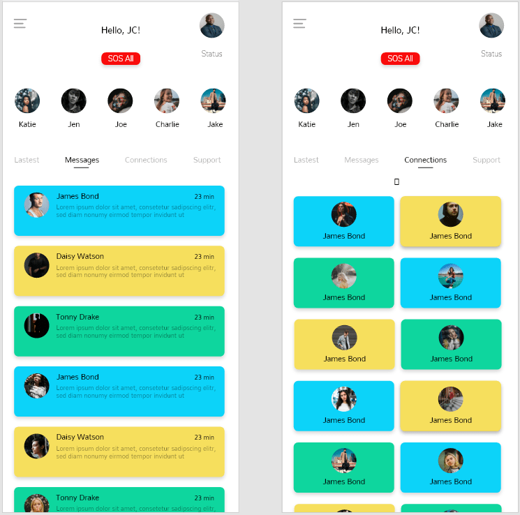
This is the wireframe of what I want to build today.
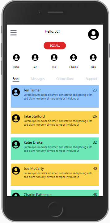
1st UI attempt at the messages content screen
The messages communications page had all profile sections on one row similar to the feed page. What was fun about building this was updating the array of profiles data to include different message time stamps.
First UI attempt of the messages page
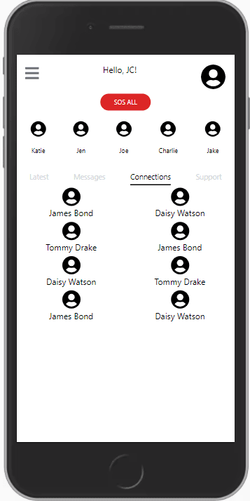
1st UI attempt at the connections content screen
The connections communications page has a double row of profile sections for mobile view. The new challenge for me was using TailwindCSS's display grid utilities to structure the displaying of the profile sections.
Code that creates two columns of elements that are centered
class="grid grid-cols-2 place-items-center mt-4"
First UI attempt of the connections page.
Added styling to the component after I got the structure of the page out of "work in progress".
Refactor to add routing through the application
I love that Angular makes routing really simple to add to any element.
Code showing routing formula
[routerLink]="['/setup-screen']"
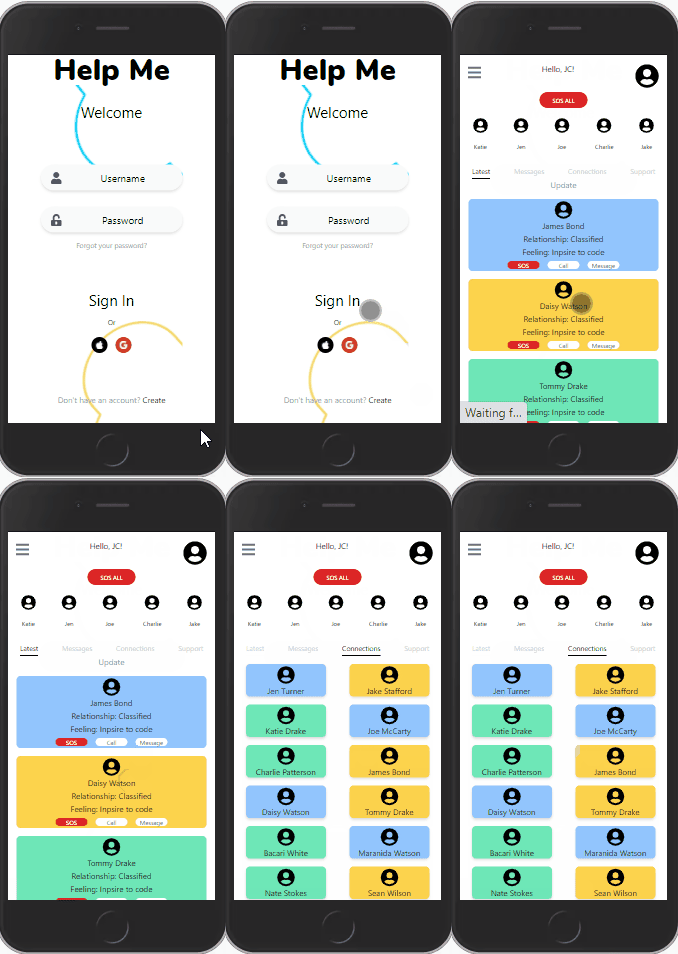
Within minutes, I was able to create this GIF of me clicking through the entire application.

What's next
I submitted a pull request of my current progress and can't wait for the recommendations on how to make things better. I always see code reviews as an opportunity to learn. Tomorrow will be about making those changes. If I have time reminding, I will focus on these areas I need practice with: a11y, using aria tags, and testing with Angular.


Top comments (6)
Fantastic job, you are killing it with the progress!
Thank you
Making some good progress!
Really cool to read these everyday!
Thavk you. I'm hoping this will help me practice my communication skills.
Awesome to see more Mental Health related projects! Interested in seeing more of this!
Thank you. I really hope to finish on time to submit a MVP to the Hackathon and then continue upgrading afterward.