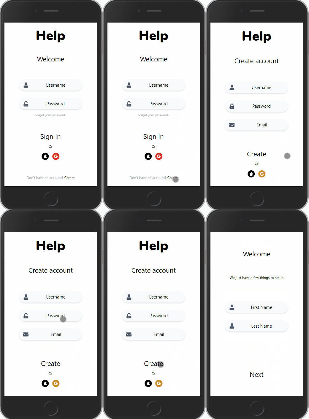
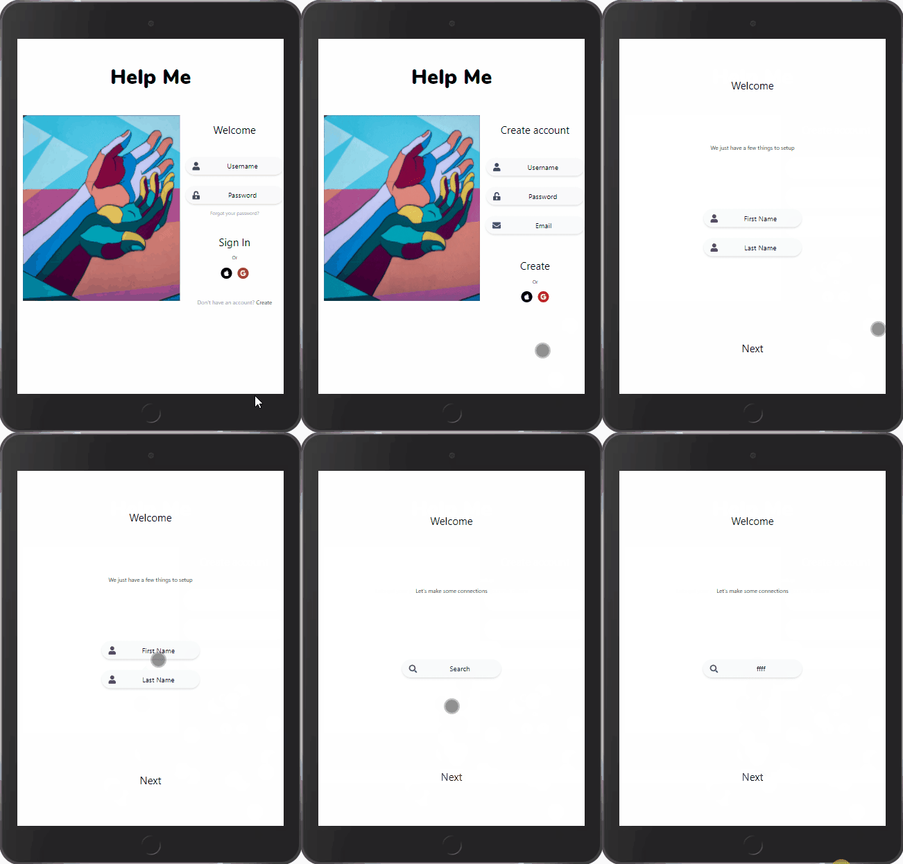
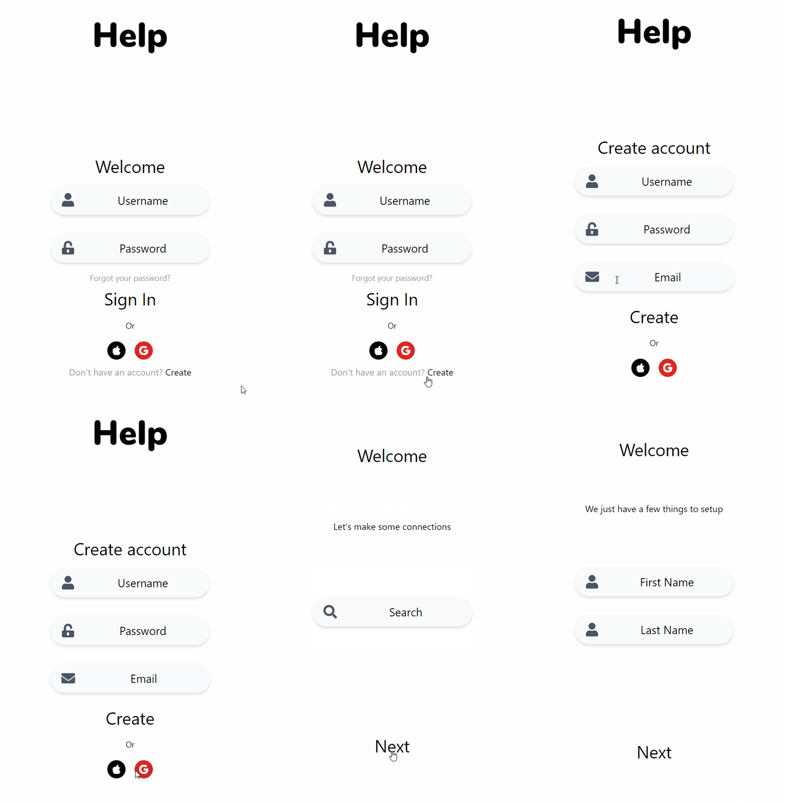
The app is called “Help Me” and is designed primarily as an “SOS” (distress signal) to a selected circle of trusted people when someone is going through a mental health crisis. The user can send a message with their location to one person or everyone in their community. The goal is to build a trusted community around the user with private conversations and a system to show their emotions. This will help the trusted people to be aware of the user's range of emotions.
Day 5 of Development
At the end of Day 4, I submitted a pull request (PR) for the log-in and set-up account screens for review to my project's partner, Miguel Hernandez. Day 5 was mainly following those recommendations, learning about Angular services, and saving inputted data.
PR Recommendation: User can navigate through all screens
Miguel asked if I can learn about routing with Angular and allowing for the user to navigate through the app.

PR Recommendation: Add new logo to desktop view
Miguel has updated the wire-frame with new desktop views. He asked if I could incorporate the awesome logo he found into the app but just for large screens. These gave me a chance to deep dive into TailWindCSS design responsive class utilities and refactoring the log-in screen to include a big image.

PR Recommendation: Remove an outline in input fields
Miguel showed me that when a user is typing in an input field, an outline is briefly shown. He asked for me to remove it. Honestly, I didn't know there was a difference in an outline vs a border. This was a great learning opportunity in CSS and UX.
PR Recommendation: Restyled header elements
Miguel asked if header elements that is used for navigation be styled with a cursor pointer. In hindsight, I know these should be links instead of headers. But it gave me an opportunity to learn how TailwindCSS apply cursor pointers to elements.

PR Recommendation: Save the user data with Angular Services
As the user creates a user account, the data needs to be saved so it can be updated to a back-end database. I learn best by having a tactical reason to do something and this was perfect. Researching Angular service took me through Angular documentation, a pluralsight course, and several blog articles.
What's Next
- Miguel wireframe's mobile design included a certain background image. Tomorrow I want to learn how to use TailwindCSS to include and manipulate that imported background image.
- I want to resubmit my pull request to see if there are more recommendations I can learn from.


Top comments (0)