
Intro
Welcome back to the Recreate Spotify Series! In this part I will recreate a portion of the bottom bar!
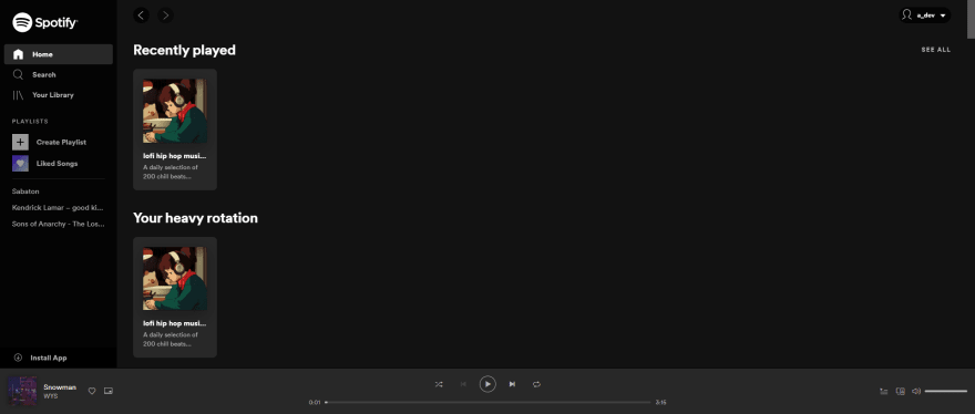
What I want to recreate:
If you have any recommendations or you think that I could do anything differently feel free to leave a comment 🙂.
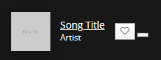
A sneak peek of the result:
and a closer look 👀:

The starting point 🏁
As always, the first step is to split the design to smaller chunks.
Looking at the bottom bar of the Spotify I can see 3 different areas.

In this part of the series I will focus in the area marked with the number 1.

After splitting the design I can see 3 main areas, marked in the image below:

One extra step
Before starting to code it is a good idea to hover & click the elements in the design to see what happens. Maybe an event, such as hovering over an item, triggers a new element to appear or changes the color of an item.
After hovering over the area I see some minor changes in the design:

These are the following:
- Hovering over the image, makes a new element visible (the arrow circle)
- Text hover changes color to white (#fff) and "underlines" the text. (I will explain later why the "underlines" is in quotes 🤔 )
- Icon hover changes the color to white (#fff) again.
Code 💻
If you want to follow along, you can find the code from the part 4 (Home page) of the series in this Github gist.
Structure
I will start by adding the html code for the bottom bar right after the ending of the </main> tag.
</main>
<div class="bottom-bar">
    <div class="bottom-bar--left-col">
        <div class="bottom-bar--left-col--song">
            <div class="bottom-bar--left-col--song--img">
                <div class="bottom-bar--left-col--song--img--pull-up">
                    <i class='lni lni-chevron-up'></i>
                </div>
                <img src="http://via.placeholder.com/150x150" alt="">
            </div>
            <div class="bottom-bar--left-col--song--details">
                <div class="bottom-bar--left-col--song--details--wrapper">
                    <a href="#" class="bottom-bar--left-col--song--details--title">Song Title</a>
                </div>
                <div class="bottom-bar--left-col--song--details--wrapper">
                    <a href="#" class="bottom-bar--left-col--song--details--artist">Artist</a>
                </div>
            </div>
        </div>
        <div class="bottom-bar--left-col--actions">
            <button class="bottom-bar--left-col--actions--favorite">
                <i class='lni lni-heart'></i>
            </button>
            <button class="bottom-bar--left-col--actions--pip">
                <i class="pip-icon"></i>
            </button>
        </div>
    </div>
</div>
This is how the section looks without any added styles:

Yep, that's right! You can't even see it without any styling 😅
Styling
Adding the basic styles so that the bottom bar is correctly positioned and is visible.
main {
    max-height: calc(100vh - 90px); /* 90px is the height of the bottom bar */
    min-height: calc(100vh - 90px); /* 90px is the height of the bottom bar */
}

.sidebar {
    height: calc(100% - 90px); /* 90px is the height of the bottom bar */
}

.bottom-bar {
    width: 100%;
    height: 90px;
    border-top: 1px solid #000;
    background-color: rgba(24, 24, 24, 1);
    z-index: 1;
    position: absolute;
    bottom: 0;
    padding-left: 16px;
    padding-right: 16px;
    display: flex;
}

I know it is not looking the best right now, but at least it's visible.
First things first, I need to contain the elements inside the bottom bar and not let them overflow it.
.bottom-bar--left-col {
    display: flex;
    align-items: center;
    position: relative;
    transition: left 300ms;
    left: 0;
}

.bottom-bar--left-col--song {
    display: flex;
}

.bottom-bar--left-col--song--img img {
    height: 56px;
    width: 56px;
}

It looks much better now!
Time to focus on the actual styling of the elements. I will start working on the image and the hoverable arrow icon.
.bottom-bar--left-col--song--img img {
    height: 56px;
    width: 56px;
    box-shadow: 0 10px 30px 0 rgba(0,0,0,.3), 0 1px 2px 0 rgba(0,0,0,.2);
}

.bottom-bar--left-col--song--img {
    margin-right: 14px;
    display: flex;
    position: relative;
}

.bottom-bar--left-col--song--img--pull-up {
    position: absolute;
    top: 4px;
    right: 4px;
    background: #000;
    width: 24px;
    height: 24px;
    opacity: 0.7;
    border-radius: 50%;
    display: none;
    align-items: center;
    justify-content: center;
    font-size: 0.75rem;
    color: #b3b3b3;
}

.bottom-bar--left-col--song--img--pull-up:hover {
    /* Hovering over the arrow icon makes it bigger and brighter */
    opacity: 0.8;
    transform: scale(1.1);
    color: #fff;
}

.bottom-bar--left-col--song--img:hover .bottom-bar--left-col--song--img--pull-up {
    /* Hovering over the image reveals the arrow icon */
    display: flex;
}

Now the image part of the bottom bar is finished and I can move on the the text on the right side of the image.
.bottom-bar--left-col--song--details {
    justify-content: center;
    display: flex;
    flex-direction: column;
    margin-right: 14px;
}

.bottom-bar--left-col--song--details--wrapper {
    display: block;
    line-height: 17px;
}

.bottom-bar--left-col--song--details a {
    display: inline;
    text-decoration: none;
    color: #fff;
    letter-spacing: 0;
}

.bottom-bar--left-col--song--details a:hover {
    color: #fff;
    /* Border-bottom instead of text-decoration: underline */
    border-bottom: 1px solid #fff;
}

.bottom-bar--left-col--song--details--title {
    font-size: 0.875rem;
}

.bottom-bar--left-col--song--details--artist {
    font-size: 0.75rem;
}

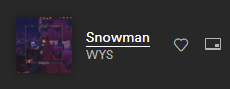
When hovering over the text "Song Title" we get the underline effect.

⚔ Text-decoration: underline vs border-bottom ("underline")
Now remember when I talked about the Text hover "underline" and why the "underline" was in quotes?
Let's see the Spotify hover text "underline":
Now let's see how the text-decoration: underline looks like on the "Song Title":
.bottom-bar--left-col--song--details a:hover {
    text-decoration: underline;
}
As you can see the difference between text-decoration: underline; and border-bottom is subtle, but it does exist.
Now let's begin working with the icons on the right side.
I will start with the heart icon, since this one is available in the LineIcons library.
.bottom-bar--left-col--actions {
    display: flex;
    align-items: center;
}

.bottom-bar--left-col--actions--favorite {
    background: transparent;
    border: 0;
    outline: 0;
    color: #b3b3b3;
    font-size: 1rem;
    margin-right: 10px;
}

.bottom-bar--left-col--actions--favorite:hover {
    color: #fff;
}

When hovering over the icon:

As you can see I still have to style the last icon, which is the Picture in Picture (PiP) icon.

Boy am I in a pickle, I couldn't find any icon resembling the Picture in Picture icon in the LineIcons library.
Since I can't find the icon, I have 3 options:
- Use a png of an icon from some other site,
- Use one more icon library that contains the PiP icon
- Build the icon with css
Well, I didn't want to use a png for icon, because it is a very simple icon, and I didn't want to bloat the project with 2 icon libraries. So, I went with option 3, which is good since this series is targeted for beginners.
/* Reset the button's default styles  */
.bottom-bar--left-col--actions--pip {
    background: transparent;
    border: 0;
    outline: 0;
    position: relative;
    /* Width and height will be the actual size of the PiP icon */
    width: 16px;
    height: 13px;
    padding: 0;
}

/* The outside of the PiP icon, the Rectangle part of the icon */
.pip-icon {
    border: 1px solid;
    border-bottom: 2px solid;
    border-radius: 1px;
    border-color: #b3b3b3;
    width: 100%;
    height: 100%;
    position: absolute;
    left: 0;
    top: 0;
}

/*
    The small rectangle of the PiP icon
    that is on filled and is on the bottom right corner of the icon
*/
.pip-icon:before {
    content: '';
    position: absolute;
    bottom: 1px;
    right: 1px;
    height: 3px;
    width: 5px;
    background: #b3b3b3;
    border-radius: 1px;
}

.bottom-bar--left-col--actions--pip:hover .pip-icon {
    border-color: #fff;
}

.bottom-bar--left-col--actions--pip:hover .pip-icon:before {
    background: #fff;
}

When the user hovers over the PiP icon:
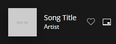
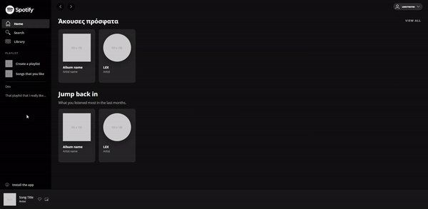
That is the last part that I will add to this section of the series. Now let's have a look at the result:
And a closer look at the bottom bar 👀:
Conclusion

🎉 Thank you for reading through all the post! 🎉
If you have any questions or any feedback, let me know in the comments 🗨.
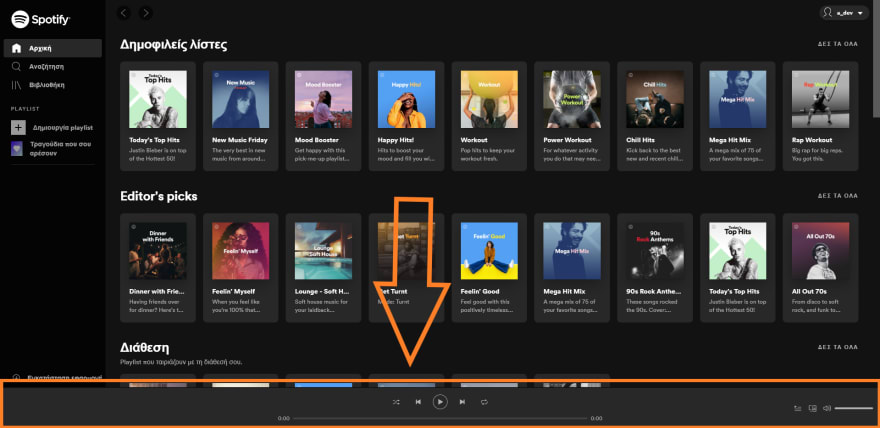
For the next part of the series I will create rest of the bottom bar. You can see it in this image:
If you want to follow along, you can find the code of the series in these Gists:

Top comments (0)