
Intro
Welcome back to the Recreate Spotify Series! In this part I will recreate the search page of the open.spotify.com.
What I want to recreate:
If you have any recommendations or you think that I could do anything differently feel free to leave a comment 🙂.
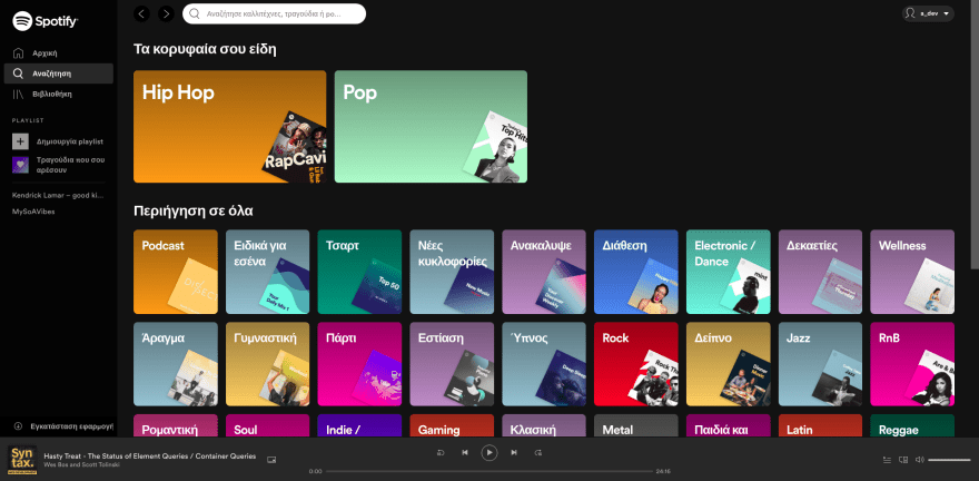
A sneak peek of the result:
The starting point
As always, the first step is to split the design to smaller chunks. Looking at the search page, I mark all the new components.
You can see the new components marked in the picture below:

Starting from the top of the page and going to the bottom I will recreate each marked element.
Code 💻
If you want to follow along, you can find the code from the part 2 of the series in this Github gist.
The search page is a different than the Home page, so I will create a new html file named search.html. The new file will have all the code from the part 2 of the series but I will remove the contents from the main element.
The search input
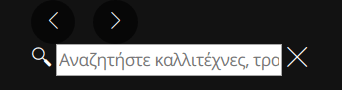
The first change is the search input on the header (top bar).
A closer look at the search input:
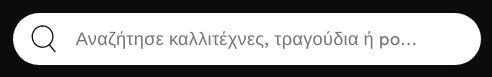
When the user writes something inside the input the 'X' icon appears.
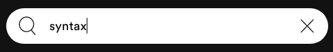
Clicking the 'X' icon deletes the text from the input and the icon disappears.
Structure
I will start with modifying the current header element and add the html for the search input inside the div with the class .header--actions.
<div class="header--search input-group has-left-icon has-right-icon can-delete">
    <span class="left-icon lni lni-search"></span>

    <input type="text" id="search" name="search" class="input" placeholder="Αναζητήστε καλλιτέχνες, τραγούδια ή podcast">

    <span class="right-icon clear--search lni lni-close"></span>
</div>
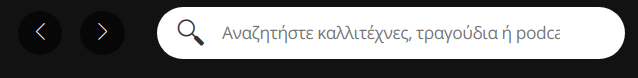
This is how the header looks with the newly added search input:
Styling
It is a good start, but I need to style it and make it interactive.
.header--actions {
    display: flex;
    align-items: center;
}

.header--search {
    margin-left: 25px;
    min-width: 360px;
}

.input-group {
    position: relative;
}

.input-group .left-icon {
    position: absolute;
    z-index: 2;
    left: 15px;
    top: 0;
    color: #333;
    font-size: 1.375rem;
    height: 40px;
    line-height: 40px;
}

.input {
    margin: 0;
    border: 0;
    position: relative;
    z-index: 1;
    height: 40px;
    border-radius: 25px;
    width: 100%;
    outline: 0;
}

.input-group.has-left-icon .input {
    padding-left: 50px;
}

.input-group.has-right-icon .input {
    padding-right: 50px;
}

.input-group .right-icon {
    position: absolute;
    z-index: 2;
    right: 15px;
    color: #333;
    font-size: 0.9375rem;
    height: 40px;
    line-height: 40px;
}
/*
toggling the z-index =>
hides/shows the X icon in the search input
*/
.input-group .right-icon.clear--search {
    z-index: 0;
}
Interactivity
Now all I need to do is:
- Toggle the 'X' icon whenever the user writes something in the search input.
- Clear the search input, when the user clicks the 'X' icon.
Toggle the icon
/* Grab all the inputs that can be deleted from the document */
const _input_els = document.querySelectorAll('.input-group.can-delete input');
_input_els.forEach(_el => {
    /* When the user writes something on the input */
    _el.addEventListener('input', (e) => {
        const value = _el.value;
        /* Grab the nearest 'X' icon */
        const _clear_icon_el = _el.parentNode.querySelector('.clear--search');
        if(value == '') {
        /* Hide 'X' icon */
            _clear_icon_el.style.zIndex = '0';
        } else {
        /* Show 'X' icon */
            _clear_icon_el.style.zIndex = '2';
        }
    });
});
Clear the input on click
/* Get all the 'X' icons */
const _clear_icon_els = document.querySelectorAll('.clear--search');
_clear_icon_els.forEach(_el => {
    /* Clicking the 'X' icon */
    _el.addEventListener('click', (e) => {
        const _clear_icon_el = e.target;
        /* Get the input */
        const _input_el = e.target.parentNode.querySelector('input');
        if(_input_el) {
            /* Clear the input and hide the 'X' icon */
            _input_el.value = '';
            _clear_icon_el.style.zIndex = '0';
        }
    });
})
Category section
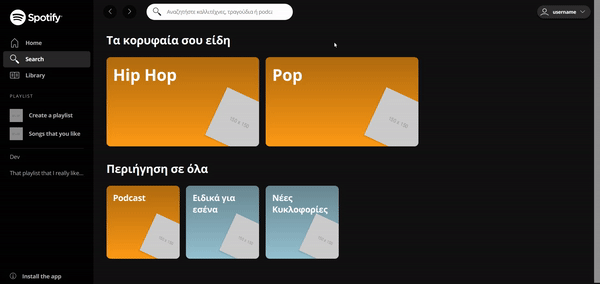
Moving on to the next marked area, you can see it in the image below.
This section consists of:
- a title
- a container that contains the category cards
The category card consists of:
- a title
- an image
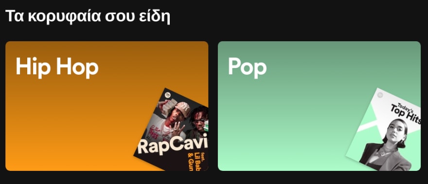
Category Card large

Category Card small

As you can see the two Category Cards look very similar. Because of their similarity, I will create one component for both of them.
The default component will be for the small Category Card and the large Category Card will be a variation of the small one.
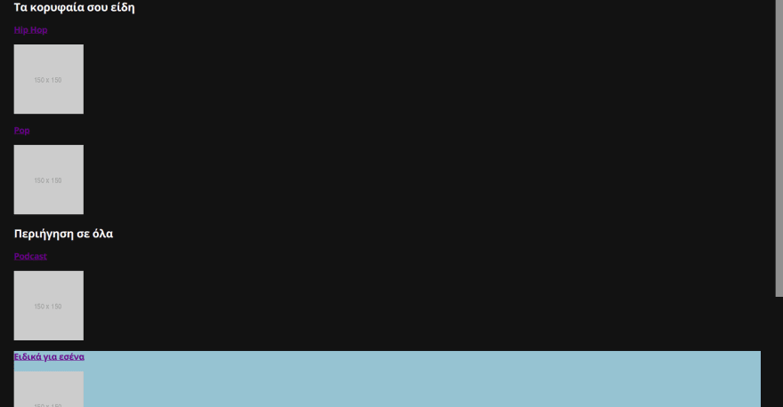
I will add the below html code inside the main element of the page.
Structure
<!-- Section with large category cards -->
<section class="section">
    <h2 class="title">Τα κορυφαία σου είδη</h2>
    <div class="section--body">
        <div class="section--body--item section--body--item--lg category--item">
            <a href="#">
                <h3>Hip Hop</h3>
                <img src="http://via.placeholder.com/150x150" alt="">
            </a>
        </div>
        <div class="section--body--item section--body--item--lg category--item">
            <a href="#">
                <h3>Pop</h3>
                <img src="http://via.placeholder.com/150x150" alt="">
            </a>
        </div>
    </div>
</section>
<!-- Section with small category cards -->
<section class="section">
    <h2 class="title">Περιήγηση σε όλα</h2>
    <div class="section--body">
        <div class="section--body--item category--item">
            <a href="#">
                <h3>Podcast</h3>
                <img src="http://via.placeholder.com/150x150" alt="">
            </a>
        </div>

        <div class="section--body--item category--item" style="background-color: rgb(160, 195, 210);">
            <a href="#">
                <h3>Ειδικά για εσένα</h3>
                <img src="http://via.placeholder.com/150x150" alt="">
            </a>
        </div>

        <div class="section--body--item category--item" style="background-color: rgb(160, 195, 210);">
            <a href="#">
                <h3>Νέες Κυκλοφορίες</h3>
                <img src="http://via.placeholder.com/150x150" alt="">
            </a>
        </div>
    </div>
</section>
Styling
.section {
    margin-bottom: 35px;
}

.title {
    font-size: 1.75rem;
    margin-top: 0;
}

.section--body {
    display: flex;
    flex-wrap: wrap;
    margin-right: -16px;
    margin-bottom: -16px;
}

.section--body--item {
    position: relative;
    z-index: 1;
    overflow: hidden;
    border-radius: 10px;
    margin-right: 16px;
    margin-bottom: 16px;
}

.category--item {
    width: 180px;
    height: 180px;
    background-color: rgb(245, 155, 35);
}

.category--item:before {
    content: ' ';
    position: absolute;
    top: 0;
    left: 0;
    right: 0;
    bottom: 0;
    background: linear-gradient(180deg, rgba(0,0,0,0.3) 0%, rgba(0,212,255,0) 100%);
    z-index: -1;
}

.category--item a {
    display: block;
    height: 100%;
    width: 100%;
    color: #fff;
    text-decoration: none;
    font-size: 18px;
}

.category--item a h3 {
    margin: 0;
    padding-top: 16px;
    padding-left: 16px;
}

.category--item img {
    position: absolute;
    width: 100px;
    height: 100px;
    bottom: -5px;
    right: -18px;
    transform: rotate(25deg);
    z-index: 0;
    box-shadow: -1px 3px 2px 0px rgba(0,0,0,0.1);
}

.section--body--item.section--body--item--lg.category--item {
    width: 376px; /* (2 * normal section--item width) + 16px [margin-right: 16px] */
    height: 220px;
}

.section--body--item.section--body--item--lg.category--item img {
    width: 130px;
    height: 130px;
}

.section--body--item.section--body--item--lg.category--item a h3 {
    font-size: 2.5rem;
}
How the page looks after the styling of the Category Cards.

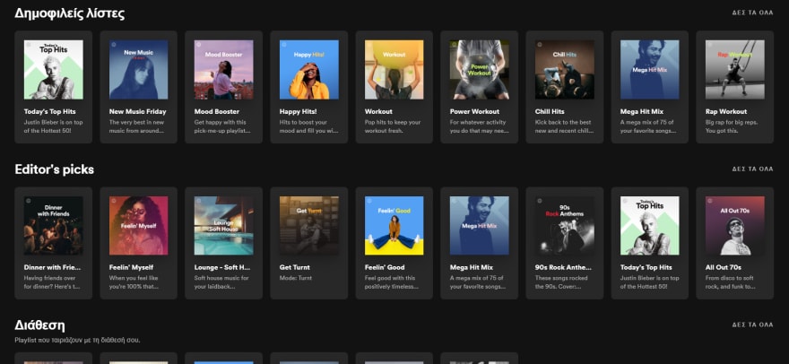
And how the whole page looks:
Conclusion

🎉 Thank you for reading through all the post! 🎉
If you have any questions or any feedback, let me know in the comments.
For the next part of the series I will create the main area of the Spotify Homepage, which you can see below
You can find all the code from the series so far in this Github gist.

Top comments (0)