
Intro
Welcome back to the Recreate Spotify Series! In this part I will recreate the main section of the homepage.
What I want to recreate:
If you have any recommendations or you think that I could do anything differently feel free to leave a comment 🙂.
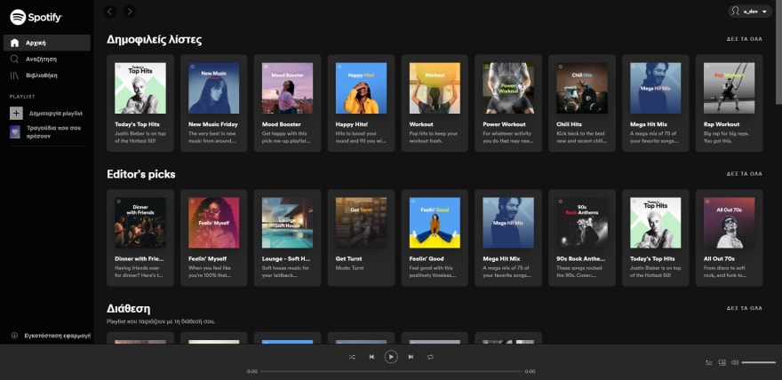
A sneak peek of the result:

and a closer look 👀:

The starting point 🏁
As always, the first step is to split the design to smaller chunks. Looking at the main section of the home page, I mark all the new components.
You can see the new components marked in the picture below:

Code 💻
If you want to follow along, you can find the code from the part 3 (Search page) of the series in this Github gist and the part 2 (Header & Sidebar) in this Github gist.
Structure
I will start by adding the html code for the section head and section body. Inside the section head there could be the following items:
- A title
- A subtitle
- A 'VIEW MORE' link
<main>
    <section class="section">
        <div class="section--header">
            <div class="section--header--left">
                <h2 class="title">Άκουσες πρόσφατα</h2>
            </div>
            <div class="section--header--right">
                <a href="#" class="section--header--right--more">VIEW ALL</a>
            </div>
        </div>
        <div class="section--body">
            <div class="section--body--item album--item">
                <div class="section--body--item--img">
                    <img src="http://via.placeholder.com/150x150" alt="">
                </div>
                <p class="section--body--item--title">Album name</p>
                <p class="section--body--item--subtitle"><a href="#">Artist name</a></p>
                <div class="section--body--item--play">
                    <i class="lni lni-play"></i>
                </div>
            </div>

            <div class="section--body--item artist--item">
                <div class="section--body--item--img">
                    <img src="http://via.placeholder.com/150x150" alt="">
                </div>
                <p class="section--body--item--title">LEX</p>
                <p class="section--body--item--subtitle">Artist</p>
                <div class="section--body--item--play">
                    <i class="lni lni-play"></i>
                </div>
            </div>
        </div>
    </section>
</main>
This is how the section looks without any added styles:

Styling
main .section .subtitle {
    color: #b3b3b3;
    font-size: 1rem;
    margin-top: -8px;
    font-weight: 100;
}

.section--header {
    display: flex;
    justify-content: space-between;
}

a.section--header--right--more,
.section--body--item--subtitle,
.section--body--item--subtitle a {
    color: #b3b3b3;
    font-size: 0.8rem;
    text-decoration: none;
}

a.section--header--right--more:hover,
.section--body--item--subtitle a:hover {
    border-bottom: 1px solid #b3b3b3;
}

a.section--header--right--more {
    font-weight: 700;
    letter-spacing: 1.35px;
}
After applying the above styles the section now looks like the image below

Now I need to add the styles for the section body, one for the album card and one for the artist card.
.section--body--item {
    width: 165px;
    height: 240px;
    background-color: rgb(38, 38, 38);
}

.section--body--item.album--item,
.section--body--item.artist--item {
    padding: 20px;
    cursor: pointer;
}

.section--body--item .section--body--item--img {
    width: 125px;
    height: 125px;
    margin: 0 auto;
}

.section--body--item .section--body--item--img img {
    max-width: 100%;
    height: auto;
    box-shadow: 0 10px 30px 0 rgba(0,0,0,.3), 0 1px 2px 0 rgba(0,0,0,.2);
}

.section--body--item--title {
    margin-top: 1rem;
    margin-bottom: 0;
    font-weight: 600;
    font-size: 0.9rem;
    text-overflow: ellipsis;
    overflow-x: hidden;
    white-space: nowrap;
}

.section--body--item--subtitle {
    margin: 0;
    margin-top: 1px;
}

.section--body--item.artist--item .section--body--item--img img {
    border-radius: 50%;
}

.section--body--item--play {
    display: none;
    height: 40px;
    width: 40px;
    border-radius: 50%;
    background: #1db954;
    align-items: center;
    justify-content: center;
    position: absolute;
    bottom: 15px;
    right: 15px;
    box-shadow: 0px 0px 8px 8px rgb(37, 37, 37);
    cursor: default;
}

.section--body--item--play:hover,
.section--body--item--play.active {
    transform: scale(1.05);
}

.section--body--item:hover .section--body--item--play,
.section--body--item--play.active {
    display: flex;
}
After applying the above styles, the page looks like this:

The last step is to add some javascript code to toggle the Play/Pause ( ⏯️ ) icon. The functionality that I want to achieve is the following:
When the user clicks the 'Play' ( ▶️ ) button:
- the icon should change to 'Pause' ( ⏸️ ) and it should be always visible.
- all the previous 'Pause' ( ⏸️ ) buttons should change to Play ( ▶️ )
When the user click the 'Pause' ( ⏸️ ) button:
- the icon should change to 'Play' ( ▶️ )
const _play_pause_els = document.querySelectorAll('.section--body--item--play');
/* Get all the 'Play' buttons */
_play_pause_els.forEach(_el => {
    /* When the user clicks the button */
    _el.addEventListener('click', (e) => {
        /* Get all the play buttons
            1. remove the 'active' class
            2. Change the 'pause' icon to the 'play' icon
        */
        _play_pause_els.forEach(_el2 => {
            if(_el != _el2) {
                _el2.classList.remove('active');
                const _icon_el2 = _el2.querySelector('i');

                if(_icon_el2) {
                    _icon_el2.classList.remove('lni-pause')
                    _icon_el2.classList.add('lni-play');
                }
            }
        });

        _el.classList.toggle('active');

        const _icon_el = _el.querySelector('i');
        if(_icon_el) {
        /* Toggle the icon to 'pause' or 'play' */
            if(_icon_el) {
                if(_el.classList.contains('active')) {
                    _icon_el.classList.remove('lni-play');
                    _icon_el.classList.add('lni-pause');
                } else {
                    _icon_el.classList.remove('lni-pause')
                    _icon_el.classList.add('lni-play');
                }
            }
        }
    });
});
A close look to the section body cards with the added functionality:
And how the whole page looks:
Conclusion

🎉 Thank you for reading through all the post! 🎉
If you have any questions or any feedback, let me know in the comments 🗨.
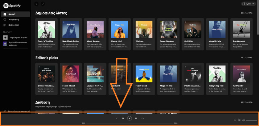
For the next part of the series I will create the bottom bar of the main layout. You can see it in this image:
If you want to follow along, you can find the code of the series in these Gists:

Top comments (0)