Hello 🌍
This is the first part of the Recreate Spotify series!
I will document all the steps that I take along the way, in the hope that someone will benefit from this process. If you think that I could do anything differently feel free to leave a comment 🙂.
Disclaimer
I will use the magic of the Inspect element for properties that I think do not truly matter in the context of these series. Examples are: the background colors, text colors and the scrollbar(the width).
Lastly, throughout these the font family will be Open Sans and all the icons will be LineIcons, if I do not find the exact icon then I will use one that is similar.
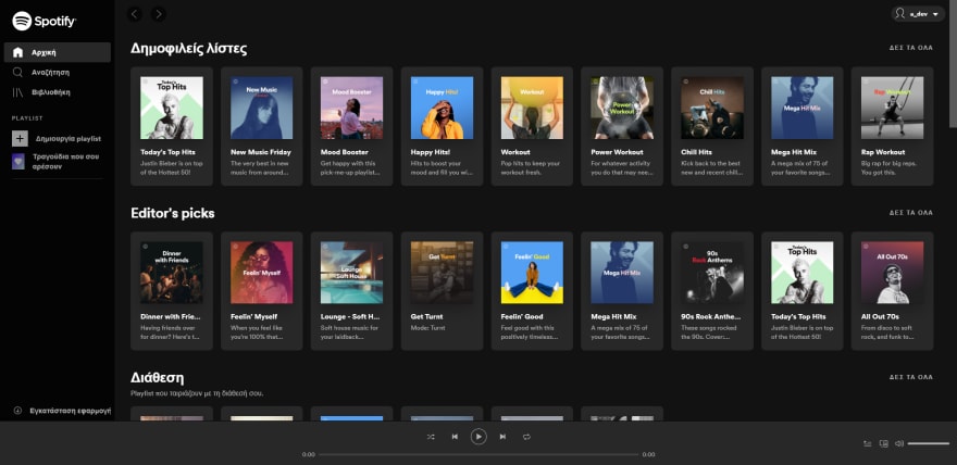
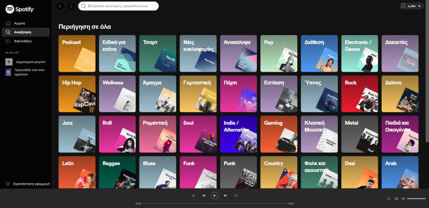
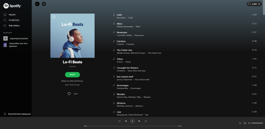
In these series I will recreate the open.spotify.com UI. You can see the UI in the following images:
First steps
The first step is to go through the pages of the open.spotify.com web app.
My goal is to:
- Understand which components are always visible (Left Sidebar).
- Make a rough estimation of the total number of the components.
- Understand the general look & feel of the app.
Cutting the design to smaller pieces
Scanning through the application, I counted 4 main components that are always there
- Left sidebar
- Top bar
- Main area that holds the data between every page
- Music playback bar
Of course the main (parent) components consist of many children components.
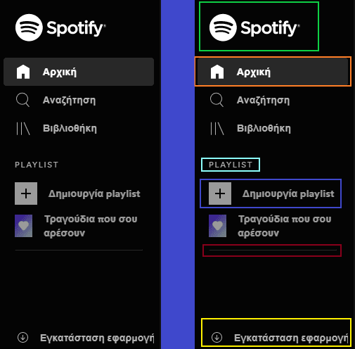
For example: looking at the Left Sidebar, we can see that it has some children inside.
Those are the following:
- Logo/Brand
- Menu item that has one icon and text
- Heading text
- Menu item that has image and text
- Separator
- Install application link on the bottom
Coding the left sidebar💻
I start with creating a item that will be the left sidebar and just give a proper width and position to it.
html {
    font-size: 16px;
}

body {
    margin: 0;
    color: #fff;
}

* {
    box-sizing: border-box;
    font-family: 'Open Sans', sans-serif;
    letter-spacing: -0.35px;
}

.sidebar {
    background-color: rgba(4, 4, 4);
    position: fixed;
    height: 100%;
    width: 230px;
}
<nav class="sidebar"></nav>
I continue with creating the top bar and the main area. At this point I like to give the components different background colors and full height so that I can easily see if I misplaced something.
.sidebar {
    background-color: rgba(4, 4, 4);
    position: fixed;
    height: 100%;
    width: 230px;
}

main {
    min-height: 100vh;
    background: dodgerblue;
}

.header {
    position: fixed;
    top: 0;
    left: 230px; /* sidebar width */
    right: 0;
    height: 80px;
    background-color: rgb(18, 18, 18);
}
<nav class="sidebar"></nav>
<div class="header"></div>
<main></main>
Don't worry, I promise it will start looking like the Spotify web app.
Let's go back to the sidebar, but now we will progress a bit more. When we finish the sidebar will have all the different marked elements from the Image 5.
Further examination of the sidebar
Looking at the sidebar I try to think of all the paddings and the margins that I will need. For example it looks like there is a padding-left in the main element. If you look at the sidebar you can see that all the elements inside the start from the same point (horizontally).
So starting from the parent element I add the padding. Next I insert the logo of spotify in svg format and I create the html for the main menu items (Home, Browse, Library).
<nav class="sidebar">
    <div class="brand">
        <svg viewBox="0 0 1134 340" class="spotify-logo--text"><title>Spotify</title><path fill="currentColor" d="M8 171c0 92 76 168 168 168s168-76 168-168S268 4 176 4 8 79 8 171zm230 78c-39-24-89-30-147-17-14 2-16-18-4-20 64-15 118-8 162 19 11 7 0 24-11 18zm17-45c-45-28-114-36-167-20-17 5-23-21-7-25 61-18 136-9 188 23 14 9 0 31-14 22zM80 133c-17 6-28-23-9-30 59-18 159-15 221 22 17 9 1 37-17 27-54-32-144-35-195-19zm379 91c-17 0-33-6-47-20-1 0-1 1-1 1l-16 19c-1 1-1 2 0 3 18 16 40 24 64 24 34 0 55-19 55-47 0-24-15-37-50-46-29-7-34-12-34-22s10-16 23-16 25 5 39 15c0 0 1 1 2 1s1-1 1-1l14-20c1-1 1-1 0-2-16-13-35-20-56-20-31 0-53 19-53 46 0 29 20 38 52 46 28 6 32 12 32 22 0 11-10 17-25 17zm95-77v-13c0-1-1-2-2-2h-26c-1 0-2 1-2 2v147c0 1 1 2 2 2h26c1 0 2-1 2-2v-46c10 11 21 16 36 16 27 0 54-21 54-61s-27-60-54-60c-15 0-26 5-36 17zm30 78c-18 0-31-15-31-35s13-34 31-34 30 14 30 34-12 35-30 35zm68-34c0 34 27 60 62 60s62-27 62-61-26-60-61-60-63 27-63 61zm30-1c0-20 13-34 32-34s33 15 33 35-13 34-32 34-33-15-33-35zm140-58v-29c0-1 0-2-1-2h-26c-1 0-2 1-2 2v29h-13c-1 0-2 1-2 2v22c0 1 1 2 2 2h13v58c0 23 11 35 34 35 9 0 18-2 25-6 1 0 1-1 1-2v-21c0-1 0-2-1-2h-2c-5 3-11 4-16 4-8 0-12-4-12-12v-54h30c1 0 2-1 2-2v-22c0-1-1-2-2-2h-30zm129-3c0-11 4-15 13-15 5 0 10 0 15 2h1s1-1 1-2V93c0-1 0-2-1-2-5-2-12-3-22-3-24 0-36 14-36 39v5h-13c-1 0-2 1-2 2v22c0 1 1 2 2 2h13v89c0 1 1 2 2 2h26c1 0 1-1 1-2v-89h25l37 89c-4 9-8 11-14 11-5 0-10-1-15-4h-1l-1 1-9 19c0 1 0 3 1 3 9 5 17 7 27 7 19 0 30-9 39-33l45-116v-2c0-1-1-1-2-1h-27c-1 0-1 1-1 2l-28 78-30-78c0-1-1-2-2-2h-44v-3zm-83 3c-1 0-2 1-2 2v113c0 1 1 2 2 2h26c1 0 1-1 1-2V134c0-1 0-2-1-2h-26zm-6-33c0 10 9 19 19 19s18-9 18-19-8-18-18-18-19 8-19 18zm245 69c10 0 19-8 19-18s-9-18-19-18-18 8-18 18 8 18 18 18zm0-34c9 0 17 7 17 16s-8 16-17 16-16-7-16-16 7-16 16-16zm4 18c3-1 5-3 5-6 0-4-4-6-8-6h-8v19h4v-6h4l4 6h5zm-3-9c2 0 4 1 4 3s-2 3-4 3h-4v-6h4z"></path></svg>
    </div>
    <div class="menu">
        <div class="menu--item">
            <a href="#">
                <i class="lni-home"></i> <span class="menu--item--text">Home</span>
            </a>
        </div>
        <div class="menu--item">
            <a href="#">
                <i class="lni-search"></i> <span class="menu--item--text">Search</span>
            </a>
        </div>
        <div class="menu--item">
            <a href="#">
                <i class="lni-library"></i> <span class="menu--item--text">Library</span>
            </a>
        </div>
    </div>
    <p class="sidebar--header">PLAYLIST</p>
    <div class="menu menu-extra">
        <div class="menu--item">
            <a href="#">
                <img src="http://via.placeholder.com/32x32" alt="">
                <span class="menu--item--text">Create a playlist</span>
            </a>
        </div>
        <div class="menu--item">
            <a href="#">
                <img src="http://via.placeholder.com/32x32" alt="">
                <span class="menu--item--text">Songs that you like</span>
            </a>
        </div>
    </div>
    <div class="separator"></div>
    <div class="menu menu-playlist">
        <div class="menu--item">
            <a href="#">
                <span class="menu--item--text">Dev</span>
            </a>
        </div>
        <div class="menu--item">
            <a href="#">
                <span class="menu--item--text">That playlist that I really liked from the show</span>
            </a>
        </div>
    </div>
    <div class="sidebar--download-app">
        <a href="#">
            <i class="lni-arrow-down-circle"></i> <span>Install the app</span>
        </a>
    </div>
</nav>
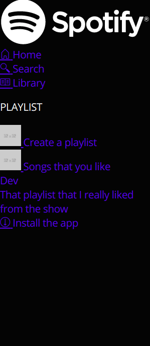
Without any more css the sidebar looks like the image below:
Now let’s think about the necessary styles.
- the sidebar itself, needs a padding-left and a padding-top.
- the logo needs to have specific width and a padding-bottom ( to create some distance between the logo and the menu items
- the menu items need to have specific font-size, color and height. They also need an active state where a background is applied to them and a hover state where their color changes to a lighter one.
.sidebar {
    background-color: rgba(4, 4, 4);
    padding: 24px 24px 0 24px;
    position: fixed;
    height: 100%;
    width: 230px;
}

.sidebar .brand {
    padding-bottom: 18px;
}

.sidebar .brand svg {
    width: 131px;
}

.sidebar .menu .menu--item {
    font-size: 1.5rem;
    position: relative; /* Needed for the .active state to add the background */
}

.sidebar .menu.menu-extra .menu--item:not(:first-child) {
    margin-top: 5px;
}

.sidebar .menu .menu--item a,
.sidebar .sidebar--download-app a {
    text-decoration: none;
    color: #B3B3B3;
    width: 100%;
    display: flex;
    align-items: center;
    height: 40px;
    transition: all 350ms;
}

.sidebar .menu.menu-extra .menu--item a img {
    opacity: 0.7;
    transition: all 350ms;
}

.sidebar .menu.menu-extra .menu--item:hover a img {
    opacity: 1;
}

.sidebar .menu .menu--item.active a,
.sidebar .menu .menu--item:hover a,
.sidebar .sidebar--download-app:hover a {
    color: #fff;
}
/* Active state of the menu  item, adds a background color to the element */
.sidebar .menu .menu--item.active:before {
    content: ' ';
    position: absolute;
    top: 0;
    height: 100%;
    left: 8px;
    left: -16px; /* -(Sidebar's padding left) + 8px */
    right: -16px; /* -(Sidebar's padding left) + 8px */
    background: rgb(40, 40, 40);
    z-index: -1;
    border-radius: 5px;
}

.menu--item--text,
.sidebar--download-app a span {
    font-size: 0.88rem;
    font-weight: 700;
    margin-left: 15px;
}

.sidebar--header {
    margin-top: 1.5rem;
    margin-bottom: 1.3rem;
    font-size: 0.68rem;
    letter-spacing: 1.5px;
    color: #B3B3B3;
}

.sidebar .separator {
    height: 1px;
    width: 100%;
    border-top: 1px solid #303030;
    margin-top: 16px;
}

.sidebar .menu.menu-playlist .menu--item--text {
    font-weight: 400;
    margin-left: 0;
    /*
        Add ellipsis when the text is bigger than the width of the sidebar
        Read more: https://developer.mozilla.org/en-US/docs/Web/CSS/text-overflow
    */
    text-overflow: ellipsis;
    white-space: nowrap;
    overflow: hidden;
}

.sidebar .menu.menu-playlist a {
    cursor: default;
}

.sidebar--download-app {
    position: absolute;
    bottom: 0;
}
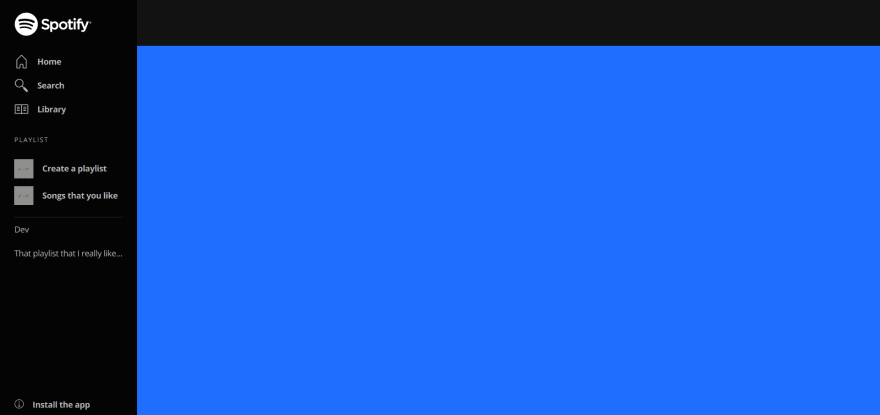
The current UI looks like this, we can see that it needs changes but it is starting to take shape.
Hover animation
As shown on the gif when the user hovers over a menu item, the color and the image becomes brighter. The effect is very simple to create and the code responsible for it is the following:
/* Start the menu item with a gray color */
.sidebar .menu .menu--item a,
.sidebar .sidebar--download-app a {
    color: #B3B3B3;
    /*
        All changes will take 350ms to finish.
        Read More: https://css-tricks.com/almanac/properties/t/transition/
    */
    transition: all 350ms;
}
/* When the user hovers -> change the color */
.sidebar .menu .menu--item.active a,
.sidebar .menu .menu--item:hover a {
    color: #fff;
}
/*
    Changing the opacity of the image gives the brighter effect. This happens because the background is dark.
*/
.sidebar .menu.menu-extra .menu--item a img {
    opacity: 0.7;
    transition: all 350ms;
}

.sidebar .menu.menu-extra .menu--item:hover a img {
    opacity: 1;
}
Wrapping up
I want to keep these posts short and easy to follow, so I will finish this one here. If you have any questions about the post or any suggestions, let me know in the comments 🙂!
In the next post I will style the Top Bar and add two small Javascript interactions.







Top comments (13)
This is great!
Another thing I can recommend (if you like css) is Spicetify CLI. It let's you customize the Spotify desktop app however you want (since the desktop app is basically just a web app).
I made a White/Green theme that I just love fiddling with from time to time
Hi Freddie,
Thank you for the recommendation I will definitely check it out!
Your theme is 🔥!
This is great! Also, fantastic looking theme :)
Looks exciting!! I'm definitely gonna make this. 🤩
I just read online that Spotify now shows lyrics synced with songs a person is listening to. This feature will no doubt improve the experience one has when using the music app. The article has really gotten my interest. I am going to bookmark your blog and keep checking for new details every week.
Open this link to reach my website and check out its contents. Please let me know if this okay with you. Many Thanks!
Other than scams and pirates, ☠️🐦 why else would you want to create a website?
Hello Adam,
I really didn't think that this could lead to scams 😅.
As I wrote in the first part, I started this series to help beginners. Help them understand that they do not always need a framework to make things work.
Also, I think that recreating sites that you use daily is a great exercise (because you know how the site looks and feels when you use it).
Of course I'm kidding, it reminds me of site forgery. But of course we have all had to recreate things it's a great post idea. 😁
What a good exercise! I wish there were more examples of recreation of most used websites
Thank you! I do have some sites in mind. If you want me to do a specific one please leave a comment!🙂
great tsanak. I will wait for part 2
This is awesome!! Keep it up
I'm a beginner in frontend developer and i love what you have presented here