In this post, we will learn about aria attributes, testing with Voice Over, and using Inspector to view the accessibility tree and to check and improve color contrast.
This is the twelfth post and video in a series on learning web development. Learn more about the series and see the post schedule >
You may want to refer back to the first lesson that explored web accessibility, episode 7:

You may watch the following video or follow along with the expanded transcript that follows.
To begin this lesson, open the starter project you began in episode 1, or review the source files from episode 11.
To begin this lesson, open our project in VSCode.
In the Terminal, type the start command npm run start to run the project.
In the first lesson on accessibility, we talked about the impact of hierarchy, content, contrast, and keyboard interaction. Now that you've begun learning CSS, we can revisit a few of those topics to layer in styling considerations.
Open index.html in VSCode, and organize your screen to be split with the browser like we've done in the last few lessons.
We're going to update this page to be an "About Me" style page, so first let's work on the hierarchy of the page content.
One update before we dive into that is to update the <title> tag in the <head> to be more meaningful than "Website". Let's use "All About [and fill in Your Name]".
<head>
  <title>All About [Your Name]</title>
  <meta charset="utf-8" />
  <link rel="stylesheet" href="style.css" />
</head>
Next, update the h1 to the same as the title.
<h1>All About [Your Name]</h1>
At this point, we do not have a need to list headings 2-6 since we are adding more realistic content. For now, let's remove headings 3-6, and update the h2 to "[Your job title or a fun descriptor]".
<h2>[Your job title or a fun descriptor]</h2>
Before we get too far, it would be good to add some more meaningful container tags. So let's wrap the h1 with a <header> tag, and then wrap the rest of the content with the <main> tag. Then wrap the h2, p, and a tag content with the <article> tag.
<header>
 <!-- h1 -->
</header>
<main>
  <article>
    <!-- h2, p, a -->
  </article>
  <!-- .container divs -->
</main>
As a quick reminder: there should only be one main tag per page and it should wrap whatever is intended as the true main content that supports the purpose of the page. An article tag is used around any content that is able to stand alone.
Now we'll use a new tag to update the divs we had in place before, which is <aside>. The aside tag is used for content that is indirectly related to the rest of the content, or to callout some information. To help decide if the aside element is appropriate, consider if the content makes sense away from the rest of the page content.
So, let's replace each div tag with the aside tag. Save, and thanks to the classes we created in our previous lesson, there has been no change in appearance.
<aside class="container">
  <!-- content -->
</aside>
While we're here, you can decide whether to remove the container--raised class from the second aside or add it to the first one - now's the opportunity to make them the same just for visual consistency. You can also add the margin-top class to the first aside.
<aside class="container container--raised margin-top">
  <!-- content -->
</aside>
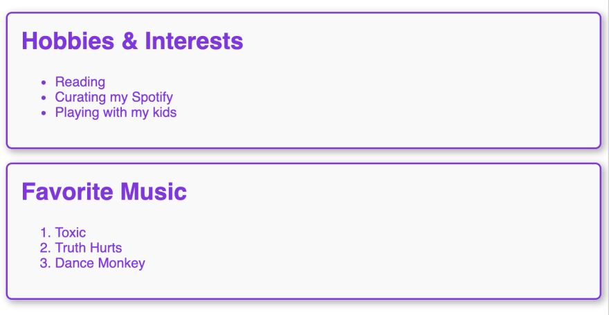
Let's quickly update the content in the asides. For each, let's change the h2 to an h3. Then change the content of the first one to "Hobbies and Interests" and the second to "Favorite Books/Songs" or whatever topic you have a ranking preference for! You can then fill in the lists with items relevant to you.

Now, a little detour on this topic to adjust the space inside our .container so open up the style.css file and in the .container rule add padding: 16px and save.
.container {
  padding: 16px;
}
Whew, that feels better to not have the headings stuck in the corner!
Ok, back to accessibility! Let's test out our page so far using Voice Over. On a Mac, the "VO" keys are control + option and with those pressed I can also press the U key to open the Heading menu.
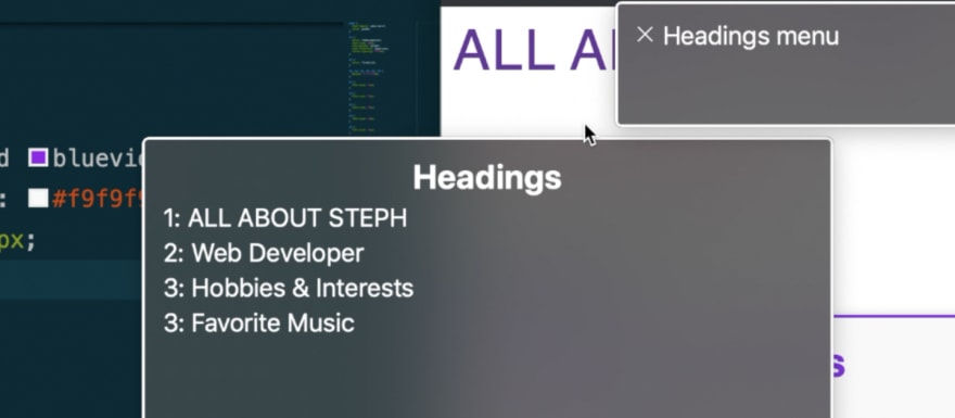
This looks ok, but let's choose the h2 and see our focus moves there. Then press the VO keys + the right arrow key to move forward through elements.
When we get to the first aside, VO announces "complimentary". This is called a "landmark" role and assists in identifying page hierarchy. However, we can make this a bit more useful as a landmark by helping our h3 title be announced at the same time.
To do this, we'll first add an id attribute to each h3. An id attribute can be added to any HTML element but it must be unique on the page. It is a short name with no spaces, but dashes or underscores are allowed. So we can't add an id with the value heading to each of these h3, but we can use a similar pattern such as aside-title-1 on the first, and aside-title-2 on the second.
<h3 id="aside-title-1">
  <!-- content -->
</h3>

<h3 id="aside-title-2">
  <!-- content -->
</h3>
With that in place, we'll add a new attribute to each aside called aria-labelledby. This is an attribute that takes another element's id as it's value and allows assistive tech like VO to associate the two. Let's add it and then see how it's handled by VO.
On the first aside add aria-labelledby="aside-title-1" and on the second one add aria-labelledby="aside-title-2".
<aside aria-labelledby="aside-title-1" class="container container--raised margin-top">
  <h3 id="aside-title-1"><!-- content --></h3>
  <!-- content -->
</aside>
<aside id="aside-title-2" class="container container--raised margin-top">
  <h3 id="aside-title-2"><!-- content --></h3>
  <!-- content -->
</aside>
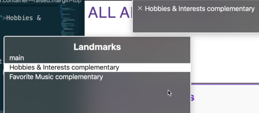
Now when we use VO on the aside, the first one is announced "Hobbies and Interests, complimentary" and the second is similar.

This provides a better experience, particularly since we have included multiple aside elements.
In addition, if we open the Headings menu with VO + U and then use VO + right arrow to navigate through the available rotor menus, the third one is for "Landmarks". You'll also see main is identified as a landmark, and we could optionally use the same technique on the main tag to associate it with our h2 as a label. If we had not used aria-labelledby than there would be two items marked just as complementary which is much less useful for informing the user of their content and purpose.
There are many ways to use aria to help associate information for assistive technology. aria can help bridge the gap between your interface element and it's intended purpose. Using the right HTML for the job, such as proper hierarchy, gets you a lot for free without having to add additional aria markup. And in turn helps ensure an accessible experience from the start. But knowledge of aria is useful for situations that are a bit more ambiguous. Review the resource links at the end of the article to learn more about aria.
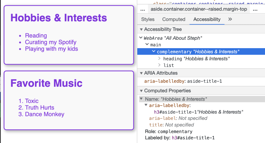
You can also use Inspector to review what's called the Accessibility Tree. Start by selecting an element to inspect, then switch to the "Accessibility" tab. This exposes the type of information assistive technology may use to communicate about your interface.
If we inspect our "Hobbies" aside, we see the tie created by the aria-labelledby attribute, as well as the "Role: complimentary" which is provided directly by the accessibility tree due to the use of the aside element. The Accessibility Tree is useful to double-check to ensure content is available as intended throughout your interface.
Another important aspect of accessibility for users who are sighted but have a visual impairment is ensuring appropriate contrast is met for text and interface elements. More examples can be found in our first lesson about accessibility, but let's review the text elements we have in this layout.
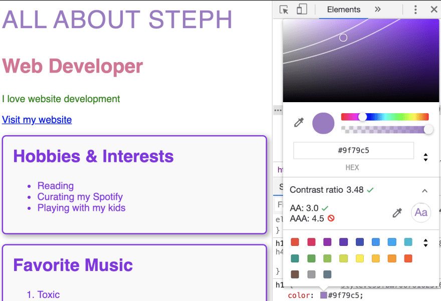
Chrome Inspector has a built-in helper to check contrast. We'll select our h1 and then find where the color property is defined. Clicking on the color swatch icon opens Chrome's color picker, and midway down the panel is clearly stated "Contrast ratio: 8.41" for our color of rebeccapurple.

This checker is taking into account the background color behind the text, which is currently white. It is showing two checkmarks to indicate that the contrast meets ratio requirements for both WCAG AA and AAA, where AAA is the more strict guidelines that require a ratio of 7:1, and AA requires 4.5:1 for text in general, or 3:1 for text larger than 18px, or 16px and bold.
If we grab the picker icon within the top part of the panel and drag it toward the lighter end, the contrast ratio updates in real-time. Since the Inspector also knows the size of the text, which is greater than 18px, it doesn't start to fail the contrast until it falls below 3:1. You'll also notice it's actually changing the value of our text which allows you to preview if the value is acceptable for your design.
An additional feature is revealed by expanding the contrast ratio section. When expanded, lines appear overlaid on the color picker. Dragging the picker icon below the first line achieves minimum AA contrast, and dragging below the second line achieves at minimum AAA contrast. This is extremely useful if you are off by just a bit on your ratio to help you pick the closest option that passes for contrast.
Let's check our h2. You can see this passes with a 3.11 contrast, which means it's acceptable for this large text but would not be appropriate for paragraph texts.
Next, our paragraph text, which is inheriting from the color defined by the body rule, passes brilliantly with 5.14.
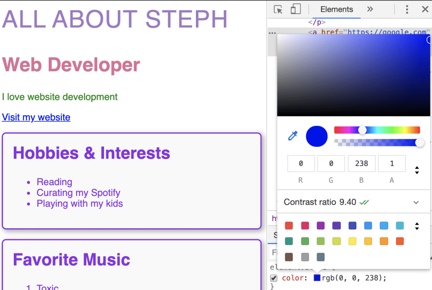
When we inspect the link, we don't actually have the color value revealed in Inspector due to how the user agent stylesheet has defined it. But we can find the value by changing to the "Computed" tab, where we can copy the value which is rgb(0, 0, 238).

Then back on the "Styles" tab, we'll use the "element.style" section provided at the top of Inspector, and add the color property with the value we just copied. Now we can open the color picker, and see that the ratio is excellent at 9.40.
It has been an unfortunate design trend to try to rely on color alone by removing the default underline from links, but this typically results in a failure of the accessibility success criteria. The criteria states that color alone should not be relied on to distinguish a link from surrounding text, unless the color of the link meets a 3:1 ratio with the surrounding text. The takeaway here is: don't remove underlines from links that are within paragraphs! You're passing accessibility for free by letting the browser apply the underline!
In our capstone project, we will learn about additional tools to assess how our interface measures up against additional accessibility success criteria.
Resources:
- Aside element: https://developer.mozilla.org/en-US/docs/Web/HTML/Element/aside
- Accessible landmarks: https://www.scottohara.me/blog/2018/03/03/landmarks.html
- Using aria-labelledby: https://developer.mozilla.org/en-US/docs/Web/Accessibility/ARIA/ARIA_Techniques/Using_the_aria-labelledby_attribute
- W3C details on failing with color-only indicator for links: https://www.w3.org/TR/WCAG20-TECHS/F73.html
- W3C details on understanding contrast success criteria: https://www.w3.org/TR/UNDERSTANDING-WCAG20/visual-audio-contrast-contrast.html
- WAI-ARIA basics from MDN: https://developer.mozilla.org/en-US/docs/Learn/Accessibility/WAI-ARIA_basics
- Full W3C reference on ARIA: https://www.w3.org/TR/wai-aria-1.1/
Next up in Episode 13: Styling a Blog Layout

Top comments (0)