This is an issue from the newsletter Frontend Horse. This was originally published on July 2nd, 2020. Visit Frontend.Horse to subscribe and find more issues.
Howdy, and welcome to the most educational horse trail on the internet! Saddle up, because we’re going to be racing through SVG filters, image APIs, and alignment techniques.
We might stop for a snack or two, but we won’t dilly-dally.
We never dilly-dally.
Let’s ride!
CODEPEN
Slash

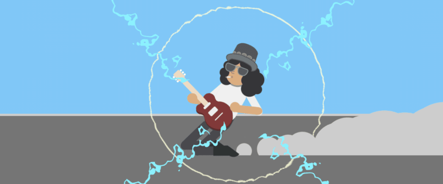
This SVG animation is so much fun that it actually won GreenSock’s CodePen challenge! Based on this excellent Dribble shot, it shows guitarist Slash shredding on his guitar as he slides across an infinite stage. The coolest part to me is the lightning and shock waves that follow every strum!
The developer, Oscar Salazar, was kind enough to show us some of his techniques, and even share some fantastic resources.
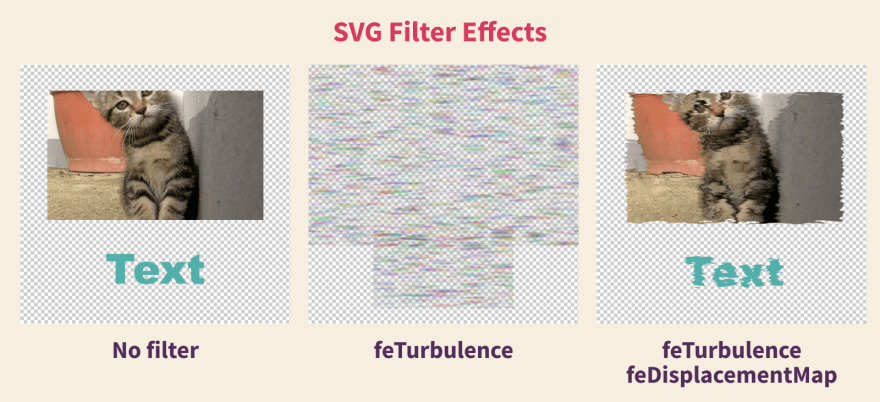
To get the remarkable lightning effect, Oscar applied two SVG filters to a long thin rectangle: feTurbulence and feDisplacementMap. We can see how those two filters can warp what they’re applied to:

If we comment out the HTML filters, we can see the dramatic effect they have on the piece!
When you use these filters, the content can often overflow, Oscar says. You can see that the lightning bolt gets much bigger than the original line. Oscar’s tip: avoid clipping issues by giving the bolt a parent element with plenty of padding.
Those circular shock waves add so much to the effect, and it turns out they’re just a div! Oscar took a square div, made it a circle with border-radius: 50%; and applied those same wavy filters. Great solution!
It’s subtle, but the blur effect on each strum is the icing on the cake. Oscar added an feGaussianBlur filter to the body with a value of 0. This turns off the effect but allows him to animate that value, bumping up the blur when he wanted. If you change line 115 of his code to have stdDeviation="5" you’d see a very blurry Slash!
Oscar credits the blur technique to friend of the newsletter, Jhey. Oscar watched him make this CodePen on a live-stream and was able to use a similar effect.
Oscar used a similar lightning effect on this fun Pokedex he made previously. We also saw Kasper De Bruyne use it to make water back in Issue #1!
Resources
One resource Oscar shared is a great tutorial, SVG Filters 101, by Sara Soueidan. The other is a super useful SVG Filter Playground by @yoksel_en. I hadn’t seen either of these before, and they’re both excellent.
TUTORIAL
Aligning Logo Images in CSS
Ahmad Shadeed has a great tutorial for making a logo grid of proportionately sized elements. When you have a grid of images with different proportions, it’s tough to get them to all look equal.
Here’s the key part of the tutorial: set a width and height and use object-fit: contain;. Check out the difference!
Ahmad sums it up: “The great thing about object-fit: contain is that no matter how the width or the height is, the logo is contained within them, without distorting it.”
I also learned that you can target specific file types with CSS: img[src$='.jpg']
Lots of good stuff in this one.
HORSE RESOURCE
Placeholder Images
When I’m in the early stages of a project, building out components that have images can be a pain. I don’t want to switch between my image editor and code editor if I can help it. Luckily there are a couple of great resources that make using images in projects way more fun.
Unsplash is the common choice for free, high-quality images, but did you know they have a super simple API?
If not: hold your horses. You’re gonna love this.
Use this API to get a perfectly sized image that matches your search term.
https://source.unsplash.com/{width}x{height}/?{search term}
Let’s use it to grab a random picture of horses:
https://source.unsplash.com/1600x900/?horses

The best part is, there’s no auth you need to worry about, it just works. Use it as if it were a path to any jpg:
<img src="https://source.unsplash.com/1600x900/?horses" alt="Horses, I hope" />
Now if your designs change, you don’t have to open photoshop to crop a bunch of pictures.
Hot Tip
If you’re hitting the same URL over and over, your browser will cache the result and serve up the same image. Images like this don’t look too great.
<img src="https://source.unsplash.com/550x225/?horses"/>
<img src="https://source.unsplash.com/550x225/?horses"/>
<img src="https://source.unsplash.com/550x225/?horses"/>
<img src="https://source.unsplash.com/550x225/?horses"/>
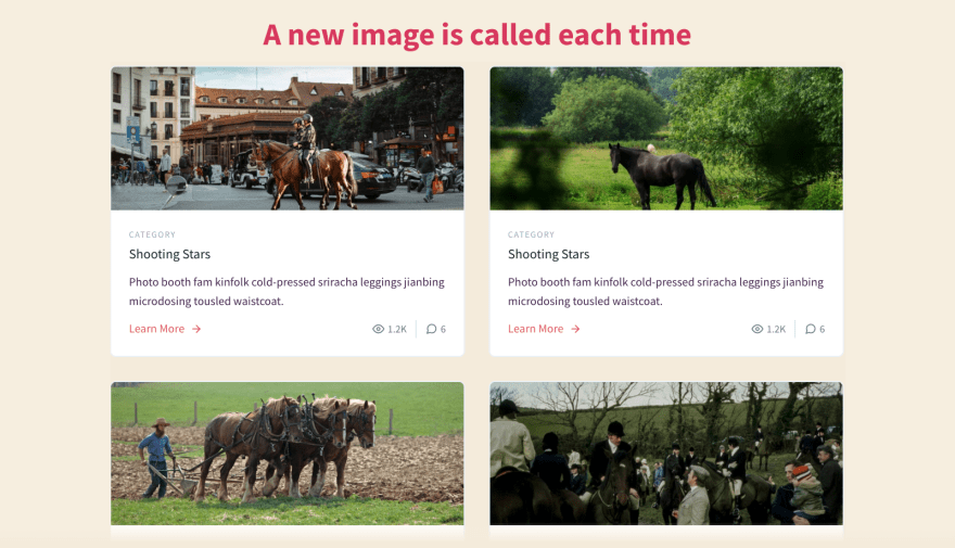
Bypass the cache by adding any query onto the end and feeding it a different value. The index of the item works nicely.
<img src="https://source.unsplash.com/550x225/?horses&i=0"/>
<img src="https://source.unsplash.com/550x225/?horses&i=1"/>
<img src="https://source.unsplash.com/550x225/?horses&i=2"/>
<img src="https://source.unsplash.com/550x225/?horses&i=3"/>
Just like that, our site is mag-neigh-fique! This is a common cache-busting technique, but especially useful for giving your pages some variety with this API.
The Unsplash Source API has a few other features, but I think this is the most useful.
One thing to note: Unsplash isn’t great if you need a bunch of user avatars. For that I reach for Pravatar or Adorable Avatars if the app is more fun.
Thanks to this thread by Swyx for inspiring this bit.
COMMUNITY
Around the Stable
Friend of the newsletter Jhey gave us an awesome shoutout this week, along with a bunch of other great newsletters! Check out that thread and subscribe to some of those other newsletters, too.
Naming the community
Every cool community has a title for its members. Listeners of the Shoptalk Show are “Shop-o-maniacs,” for example. So what do you want to be called? Who do I address at the top of each issue?
Comment on this post or tweet @FrontendHorse to help name us, and we can do a poll next week to make it official. The prize is huge for this one: you’ll be able to tell everyone you came up with the name. Forever.
Will they write this accomplishment on your tombstone? Probably.
I’m excited to hear what you come up with! All ideas welcome!
So Long, Partner
Well, that’s the end of the trail for this week. I appreciate you riding with me.
Follow @FrontendHorse on Twitter, and if you enjoyed this, I’d be over the moon if you share it with a friend or tweet about it.
Special thanks to Oscar Salazar for speaking with me about their work.
This is the part where we ride off into the sunset. You take care.
Your Neigh-bor,
Alex
If you liked this post, head to Frontend.Horse to subscribe! You'll get the next issue before it's posted here on Dev.


Top comments (0)