This is an issue from the newsletter Frontend Horse. This was originally published on July 16th, 2020. Visit Frontend.Horse to subscribe and find more issues.
Helloooo, and welcome to the Seabiscuit of frontend newsletters!
We’ve got a coffee cup, a Zelda UI tutorial, and a meetup I'm hosting all ready for race day. I hope you're wearing some ridiculous clothing and your fanciest hat.
So place your bets, find your seats, and let’s get started!
CODEPEN
Coffee For You
I’m amazed by the level of detail and care that’s gone into Vadim Bauer’s gorgeous cup of coffee. It's a great piece and I just had to know how he made it.
The detailed CSS drawing is stunning in its own right. However, the part that dropped my jaw was the animation on the bubbles. They drift from the center of the cup towards the edge to join the other foam there. When they get close, the edge foam moves outward like real form on liquid would!
How the heck is he achieving this effect?
His answer? SVG Filters
Welp, it’s official: I’m crushing hard on SVG filters. They’re just so dang versatile! In previous issues we’ve seen them used to make water and lightning effects. Now you’re telling me that they can make stuff goop together? So rad.
Vadim breaks down the effect:
It’s an SVG filter that basically applies a huge blur to the elements and then increases the contrast for the alpha channel, so that the now bigger shape doesn’t look blurred anymore. The result is the elements merging when they get close to each other.
It’s known as the gooey effect. You can find a pretty good post about it on CSS-Tricks: Gooey Effect
This is an awesome tutorial and you can see how it’s similar to Vadim’s effect.

The other thing I loved about “Coffee for you” was the subtle steam that drifted by. Guess how he made it?
That’s also an SVG filter. This time with feTurbulence for the texture and feDisplacementMap to distort it. The rest was pure trial and error to get it to look like some real steam.
To learn, Vadim recommends digging into the CodePens you admire and playing with them.
Changing things and seeing what happens is always a great way to learn about code.
Vadim, I couldn’t agree more.
TUTORIAL
Building a Zelda UI

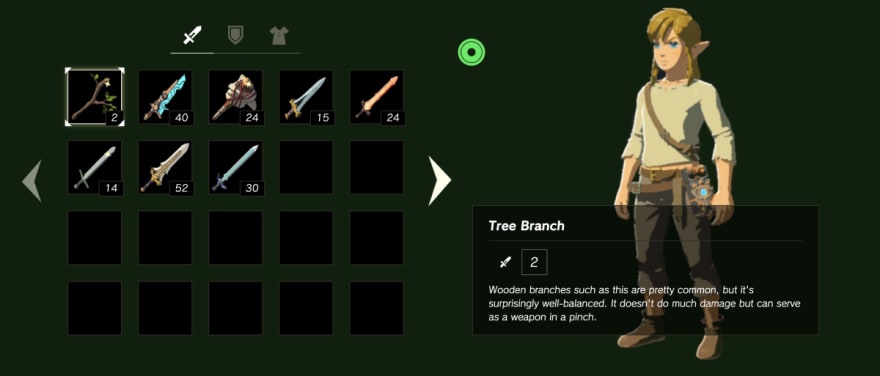
I’ve always been a fan of video games, and the Zelda series is by far my favorite franchise. So when my friend Tim sent me a a Zelda UI tutorial, how could I not dig into it?
At first I thought it was just a cool idea, maybe a fun gimmick for a tutorial. But it’s much more than that. The author, Florent Lagrede, shows you how to build out a quality UI using React, TailwindCSS, and Framer-Motion.
This is the gummy-vitamin of tutorials. Zelda is the hook, but there’s great stuff here, too.
So much of teaching is packaging the content in ways that the learner enjoys. That’s why people like Bill Nye the Science Guy was able to sneak so much education into our brains.
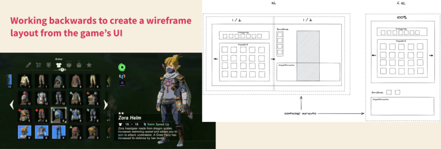
Throughout both articles, Florent decomposes the interface down to small parts, and concretely talks about how he plans to implement it. Turning a design spec into a web layout is such an important skill to develop, and it’s always helpful for me to see how other people approach it.
The result is just awesome. Not only can you navigate with your keyboard the way you’d expect to in the game, but it even accurately combines character buffs you get from wearing certain parts of clothing.
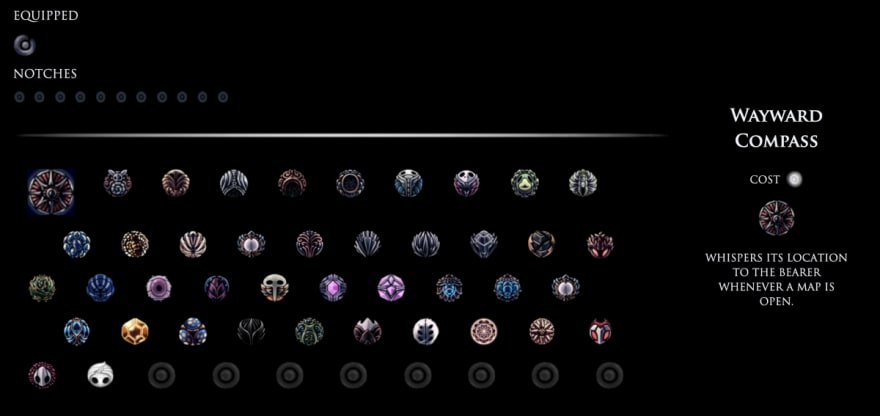
The tutorials are a part of something larger: Florent’s project, Game UI on Web. It’s Florent’s site where he’s recreating video game UIs and creating tutorials on his process. To start he’s recreated menus from Hollow Knight and Zelda. It started when Florent was looking through the UI resource Interface In Game, which has hundreds of stills and videos from all kinds of video games. He wondered why can’t we do this on the web?
So he built out the Hollow Knight demo as a challenge, and had so much fun he got hooked on making game UIs.

Then I came up with the idea to make tutorials that would focus on doing instead of only reading. As developers, I think we learn best by doing. However, it can be difficult to get started. I find that having a motivating goal can help you begin. Having fun while learning makes the process even easier.
I asked Florent what he thought web developers could learn from building these game interfaces? He said:
• How to make interactions more enjoyable, visible and understandable
• Small details that add to the experience
• Using sounds in an interface
While web dev has a lot of ‘sameness’ right now, Florent’s projects and tutorials on GameUIonWeb feel unique. Creating game UIs with web technology is such a great concept. So many UX design principles carry over.
Picking apart a well designed game UI will deepen your understanding of web and user experience design. Plus, as the web becomes more whimsical, some of these game dev skills are going to come in handy!
What’s to Come
Florent has big plans for Game UI on Web. He wants to build more game UIs that go beyond the ‘inventory menu’ type that he’s done already. He also wants to write tutorials that teach web developers the tricks that bring delight and joy to games.
I think it’s safe to say that Florent wants to make the web a lot more fun.
Check out Part 1 and Part 2 of his Zelda Breath of the Wild tutorial. Then check out Game UI on Web to see the demos of what he’s built so far.
Resources
This Interface In Game site is such a fantastic resource. For example, check out this huge collection of Animal Crossing screenshots and videos!
Florent created his excellent wireframes in Excalidraw, a free web-based drawing tool.
EVENT
Codefwd: Design Patterns
If you’re reading this as it comes out, then I have some exciting news! I’m going to be hosting a meetup with a wonderful round of talks and I’d LOVE to see you there!
We’ll be streaming over on the Codefwd Twitch channel starting at 6PM EST. Please ride through and throw some horse puns into the chat! It’s my first time hosting a remote conference, so I’m pretty excited.
Here’s the lineup:
- Responsive Design in 2020 - Kilian Valkhof
- Event Driven Serverless Microservices - Gareth Mc Cumskey
- Simple Rules for Complex Systems - Jake Burden
- MongoDB Schema Design Best Practices - Joe Karlsson
I hope to see you there!
So Long, Partner
And it's a photo finish! What a race, I don't care who won, I'm just glad you were here for it!
Follow @FrontendHorse on Twitter. If you enjoyed this I’d be over the moon if you share it with a friend or tweet about it.
Special thanks to Vadim Bauer and Florent Lagrede for speaking with me about their work.
Now let's get out of here before the next race starts. You take care.
Your Neigh-bor,
Alex
If you liked this post, head to Frontend.Horse to subscribe! You'll get the next issue before it's posted here on Dev.


Top comments (0)