This is an issue from the newsletter Frontend Horse. Visit Frontend.Horse to subscribe and find more issues.
Hey there, and welcome to the first issue of Frontend Horse! I can’t say how thankful I am that you subscribed before the very first one. Someday this will be worth as much as a copy of Spider-Man #1!
Probably.
For all the things I share I’ll try to bring you more details and a deeper understanding. Often times I’ll reach out to the creators to get it straight from the horse’s mouth.
I’ve got a lot for you this week, so let’s saddle up!
CODEPEN
Water
I love the composition and colors in this pen by Kasper De Bruyne , but the animated water effects steal the show!
The Technique
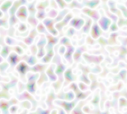
Kasper is using a combination of SVG filters and animation to simulate the water ripples. He’s using a fractal noise filter, which creates an image like this:
He’s then using a displacement map, which displaces or warps an image with the color values of another image.
Kasper explains that we pass the fractal noise_“to the displacement map and then animate thebaseFrequencyvalue of the fractal noise.”_ Animating that value is what creates the water ripples!
Kasper gives us this Codrops article by Sara Soueidan to learn more about the effect. For all the animations in the piece, he’s utilizing GSAP .
CODEPEN
Canyonlands
Adam Kuhn makes such delightful pens, and this one is no exception . The colors are gorgeous in light and dark mode, and the interactivity is a great touch.
The Technique
There’s so much to learn from this pen, but I want to focus on the way he’s changing the paths.
He’s declared a bunch of SVG paths as variables in his CSS. In the HTML he’s made a grid of SVG shapes that all look to their local var(--path)
For context, there’s a 6x6 grid of SVG elements. JavaScript loops through and randomly assigns each SVG a new path variable like this:
var(--path): var(--path5);
Adam tells us the key to his smooth transitions. “Each path needs to use the same number of handles and points as the next or they won’t transition smoothly. Rather, it looks as if they jump from one state to the next”
Adam also points out that this trick only works in Chrome and Edge at the moment.
To learn how to use scope with CSS custom properties, here’s a great article by Jhey Tompkins .
SITE SHOWCASE
Say Cheese
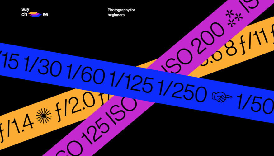
This wonderful one-page experience teaches the basics of photography through clear interactive examples and scroll-based animation.
The Techniques
Say Cheese has a lot going on with animations, hover states, and dynamic typography. The key is they all support the content, never take from it. The creator, Arthur de Almeida knows that content is king. He wanted the subject matter to “be as simple and accessible as possible.”
This is great web design and education design, too. As web developers, we’re always educating our users. It might be about a brand, a product, a topic like photography, or even telling about ourselves.
When your goal is to educate, break the subject into its simplest components,and build from there.
Arthur avoided as much technical jargon as he could, putting it in simple terms anyone can understand. Try this in your next project!
HORSE RESOURCE
Blush
Image resources like Unsplash and Undraw help you communicate your message and look professional. Pablo Stanley and his team recently launched Blush , the newest picture resource site. With Blush, you can create, mix, and customize illustrations from artists around the world.
Like Pablo’s Humaaans and Open Peeps , the bodies and scenes are highly customizable. The difference is that Pablo isn’t the only horse in the stable: he’s got 7 other illustrators, with more to come.
There’s a Figma plugin with a Sketch plugin on the way.
Everything in this scene is customizable! From the background to the body positions, clothes, heads, hair, and facial expressions. It’s a bit like playing dress-up, and a great tool to have in your toolbox.
You can download up to a medium PNG with a free account, and unlock the large PNG and SVG options with a paid plan.
TOP TROTTIN’ TUTORIAL
Animated Sparkle Text in React
Josh W. Comeau has made his site one of the most delightful places on the web, and he shares his methods in tutorials like this one . We make a component that can wrap elements like text and images in animated sparkles.

An image can’t do the animation justice. You’ve gotta see it for yourself!
The Technique
The technique to learn here is much more than just animated sparkle text! It’s the concept of adding emotion, clarity, and fun to content through reusable components.
Like any great idea, it’s catching on! Josh pointed us to Richard Haines’s animated music notes , and Mindsaha uses it with a few different icons.
I want to see devs take this idea and run with it. How about rainclouds that drench your pictures when toggled? Or a rainbow that animates across text? Josh has given us the tools, let’s use them!
So Long, Partner
That’s it for this week! I hope you found this useful, informative, and just a bit of fun. I’ll occasionally share what I’ve been working on, but for the past couple of weeks, I’ve been working towards this first issue!
Follow @FrontendHorse on Twitter and Instagram , or send this to a friend who might enjoy it!
Special thanks for Adam Kuhn, Arthur de Almeida, Kasper De Bruyne, Pablo Stanley, and Josh W. Comeau for speaking with me about their work.
Your Neigh-bor,
Alex
If you liked this post, head to Frontend.Horse to subscribe! You'll get the next issue before it's posted here on Dev.


Top comments (2)
Wow. Nice project. Saved to the bookmarks
thanks so much, Igor! Really glad you found it useful!