Description
The following tutorial explains step by step how to create a responsive photo album app with React Native and React Native Reflect that works on Web and Native devices.
Our photo album app will display images in a grid with variable number of columns, image aspect ratio, grid separation, etc. all in a responsive manner. We'll also create several responsive, theme-based UI components, including conditional rendering based on screen size.
Create a new Expo app
Create a new Expo app, choosing "blank (TypeScript)" option when asked.
expo init photo-album-tutorial
# ? Choose a template: expo-template-blank-typescript

cd photo-album-tutorial
yarn start
# Run Expo app on web and iOS (or Android). I'll be using iOS for this
# tutorial, but if you prefer, you can follow along using Android instead.
#
# Press 'w' to open web app
# Press 'i' to open iOS app (or 'a' for Android)
Get some galactic photos!
We'll use axios for making HTTP requests and getting images from NASA's public API
yarn add axios
Replace the contents of App.tsx with the following and follow the comments in the code for an explanation of what we're doing.
import React, { useEffect, useState } from "react";
import { ActivityIndicator, FlatList, SafeAreaView, Image } from "react-native";
import Axios from "axios";

// Items used by FlatList, contains list of images.
type Items = { links: [{ href: string }] }[];

// Data returned by HTTP request
type AxiosData = {
  collection: {
    items: Items;
  };
};

const GET_GALAXY_IMAGES =
  "https://images-api.nasa.gov/search?q=spiral%20galaxies&media_type=image";

export default function App() {
  const [isLoading, setLoading] = useState(true);
  const [data, setData] = useState<Items>([]);

  // Get our data
  useEffect(() => {
    Axios.get<AxiosData>(GET_GALAXY_IMAGES)
      .then(({ data }) => {
        setData(data.collection.items);
      })
      .catch((error) => console.error(error))
      .finally(() => setLoading(false));
  }, []);

  // After loading is done "isLoading", we render a FlatList with the data that
  // was set on the success axios callback above "setData(...)"
  //
  // Then we render each of our images inside FlatList's renderImage prop
  return (
    <SafeAreaView>
      {isLoading ? (
        <ActivityIndicator />
      ) : (
        <FlatList
          data={data}
          keyExtractor={(_item, index) => index.toString()}
          renderItem={({ item }) => (
            <Image
              style={{ height: 100, width: 100 }}
              source={{ uri: item.links[0].href }}
            />
          )}
        />
      )}
    </SafeAreaView>
  );
}
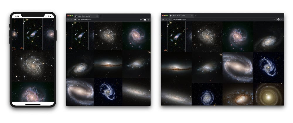
Your App should like like this:
Responsive Number of Columns
Let's make our gallery responsive as follows:
- Display single column list of images on small screens
- Display three columns image grid on medium size screens
- Display four columns image grid on large screens
To accomplish this we'll use react-native-reflect library.
yarn add react-native-reflect
React Native Reflect defines a useStyled() hook that let's us easily define responsive props. Add the following to App.tsx:
import { useStyled } from "react-native-reflect";
Inside App() function:
const { attrs } = useStyled({
  attrs: {
    numColumns: [1, 3, 4],
  },
});
Then, use attrs.numColumns responsive prop with FlatList
<FlatList
  data={data}
  numColumns={attrs.numColumns}
  // NOTE: we need to change FlatList's key to be able to change
  // numColumns on the fly. This is a React Native specification.
  key={attrs.numColumns}
  keyExtractor={(_item, index) => index.toString()}
  renderItem={({ item }) => (
    <Image
      style={{ height: 100, width: 100 }}
      source={{ uri: item.links[0].href }}
    />
  )}
/>
Voilà! Resize your browser window and/or test with different native devices to see how the number of columns update with different screen widths.

Fit Images to Screen's Width
So far, we have renderd our images with a fixed 100x100 width and height dimensions. Let's change this such as our gallery takes 100% of the screen's width and the images inside stretch to fit. Keep in mind that for this tutorial, we'll display all images with the same aspect ratio, so all our calculations are based on this assumption.
Moreover, as of the date of writing this tutorial, React Native Image component requires width and height explicit values. Because of this, we will calculate the actual dimensions of the images based on the number of columns and a customly assigned aspect ratio.
Our first step is to get FlatList's width using FlatList's onLayout prop.
Add the following to App() function:
// keep track of FlatList's width as screen resizes
const [flatListWidth, setFlatListWidth] = useState(0);
// Update FlatList's width
const onLayout = (obj: LayoutChangeEvent) => {
  const width = obj.nativeEvent.layout.width;

  // avoid unnecessary updates
  if (width === flatListWidth) return;

  setFlatListWidth(width);
};
Calculate image dimensions using an aspect ratio, the width of the FlatList and the number of columns. Try changing imageAspectRatio with values such as 16/9, 4/3, 3/4 etc.
const imageAspectRatio = 1;
const imageWidth = flatListWidth / attrs.numColumns;
const imageHeight = imageWidth / imageAspectRatio;
Add onLayout prop and update Image's style with calculated dimensions
<FlatList
  ...
  onLayout={onLayout}
  renderItem={({ item }) => (
    <Image
      style={{ width: imageWidth, height: imageHeight }}
      source={{ uri: item.links[0].href }}
    />
  )}
  ...
/>
)}
Your App should look like this:

Responsive Aspect Ratio
What about displaying images with different aspect ratios on different screen sizes? No problem, that's very easy with react-native-reflect! we just need to provide one more value to useStyled().
const { attrs } = useStyled({
  attrs: {
    numColumns: [1, 3, 4],
    // Aspect ration of 4 / 3 on smaller screens and 1 on larger screens
    imageAspectRatio: [4 / 3, 1],
  },
});

// DELETE LINE const imageAspectRatio = 1;
const imageWidth = flatListWidth / attrs.numColumns;
const imageHeight = imageWidth / attrs.imageAspectRatio;
And that's all for Part 1! So far we have created an image gallery that works on web and native devices. Our image gallery has responsive number of columns and image's aspect ratio. Cool!

Next Steps
On Part 2, we will add more options to our image gallery, such as spacing between images. We will also convert our image gallery into it's own component!
Links
- Tutorial's source code: https://github.com/sntx/photo-album-tutorial
- React Native Reflect: https://sntx.github.io/react-native-reflect


Top comments (2)
This is wonderfully crafted, responsive system all in one place
Thanks!