Responsive UX Design with React Native Reflect (Part 4)
Description
The following tutorial explains step by step how to create a responsive photo album app with React Native and React Native Reflect that works on Web and Native devices.
Our photo album app will display images in a grid with variable number of columns, image aspect ratio, grid separation, etc. all in a responsive manner. We'll also create several responsive, theme-based UI components, including conditional rendering based on screen size.
This is a tutorial series, you need to complete Part 3 to be able to continue from here
Conditional Content
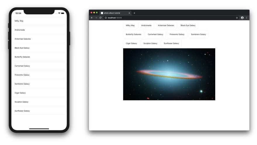
When there is no search selected, our UI looks quite empty on larger screens. Let's add a fixed full size image below the search buttons only on larger screens. On smaller screens we won't show the fixed image since the buttons are taking most of the screen space.
React Native Images require explicit width and height values. To take care of this, we'll create a new component (FullWidthImage) for rendering our full width image. FullWidthImage will determine it's width from it's parent component and it's height by dividing its width by an aspect ratio value.
src/FullWidthImage.tsx:
import React, { useState } from "react";
import { View, Image, LayoutChangeEvent } from "react-native";

type FullWidthImageProps = { uri: string; aspectRatio: number };

/**
 * Renders full width image by inferring its width from the Image's parent
 * component and its height using an aspect ratio value.
 */
export default function FullWidthImage({
  uri,
  aspectRatio = 1,
}: FullWidthImageProps) {
  const [width, setWidth] = useState(0);

  // set Image's width to the width of its parent component
  const onLayout = (obj: LayoutChangeEvent) =>
    setWidth(obj.nativeEvent.layout.width);

  return (
    <View onLayout={onLayout}>
      <Image style={{ width, height: width / aspectRatio }} source={{ uri }} />
    </View>
  );
}
Now, add the following lines to App.tsx, to use the new component we created and to add the logic to display our full width image only on larger screens.
import FullWidthImage from "./src/FullWidthImage";
const COVER_IMAGE_URI =
  "https://images-assets.nasa.gov/image/0700064/0700064~medium.jpg";
We can very easily create conditional rendered components using Reflect responsive attrs. Below, add attrs.displayHomeImg: [false, true] which will be false on smaller screens and true on larger screens.
  const { attrs, styles } = useStyled({
    ...
    attrs: {
      ...
      // only show cover image on small screens
      displayHomeImg: [false, true],
    },
  });
Then, let's use our newly created attrs.displayHomeImg value on our App's render() method.
return (
  <ThemeProvider value={theme}>
    <SafeAreaView>
      <Container>
        <SearchTerms onChange={createQuery} />
        {(() => {
          if (isLoading) return <MyActivityIndicator />;

          // display cover image only on larger screens when there is no
          // other data to display
          if (data.length === 0 && attrs.displayHomeImg)
            return (
              <FullWidthImage aspectRatio={16 / 9} uri={COVER_IMAGE_URI} />
            );

          return (
            <ImageGrid
              data={data}
              numColumns={attrs.numColumns}
              aspectRatio={attrs.imageAspectRatio}
              gridGap={styles.gridGap.margin as number}
            />
          );
        })()}
      </Container>
    </SafeAreaView>
  </ThemeProvider>
);
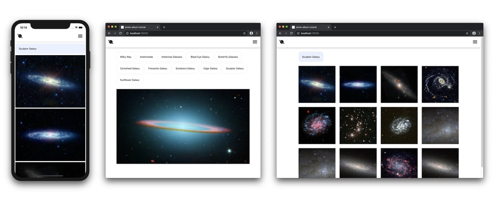
Your App should look like this:
Navigation Bar
Next, let's create a dummy navigation bar with a logo and some other elements. Add the following lines to App.tsx
import { Ionicons } from "@expo/vector-icons";
const NavBar = styled(View, {
  flexDirection: "row",
  alignItems: "center",
  justifyContent: "space-between",
  backgroundColor: "white",
  height: 7, // theme.sizes[7] = 64
  borderWidth: 0, // theme.borderWidths[0] = 1
  borderColor: "lightGray", // theme.colors["lightGray"] = "#EAEBEE"
  marginBottom: 4, // theme.space[4] = 16
  paddingLeft: 4, // etc.
  paddingRight: 5,
  shadowColor: "black",
  shadowOffset: { width: 0, height: 1 },
  shadowOpacity: 0.3,
  shadowRadius: 8,
  elevation: 1,
});
  return (
    <ThemeProvider value={theme}>
      <SafeAreaView>
        <NavBar>
          <Ionicons name="md-planet" size={32} color="black" />
          <Ionicons name="md-menu" size={32} color="black" />
        </NavBar>
        ...
    </ThemeProvider>

Notice that <NavBar> renders its shadows below and above itself which looks bad on some mobile devices because of the top spacing created by <SafeAreaView>. One way to fix this is by using react-native-safe-area-context instead of SafeAreaView.
To get native links working, install react-native-safe-area-context with expo:
expo install react-native-safe-area-context@latest
NOTE: react-native-safe-area-context was having some issues for me with Expo 37, after I upgraded my Expo app to 38.0.0, the installation worked just fine.
Then, replace the following lines in App.tsx
Remove SafeAreView, we'll use imports from react-native-safe-area-context insted:
import { View, ActivityIndicator } from "react-native";
...
import {
  SafeAreaProvider,
  useSafeAreaInsets,
} from "react-native-safe-area-context";
Create a more complex NavBar component that applies shadows to a Wrap wrapper component and compensates for the top inset spacing with an empty View component. Read the comments in the code below for more info:
const NavBar = ({ children }) => {
  const insets = useSafeAreaInsets();

  const Bar = styled(View, {
    flexDirection: "row",
    alignItems: "center",
    justifyContent: "space-between",
    backgroundColor: "white",
    // theme.sizes[7] = 64
    height: 7,
    // theme.borderWidths[0] = 1
    borderWidth: 0,
    // since theme.borderWidths[0] is 1, we can use "px" suffix to ignore the
    // theme. "0px" gets gets converted to 0 (number)
    borderTopWidth: "0px",
    // theme.colors["lightGray"] = "#EAEBEE"
    borderColor: "lightGray",
    paddingLeft: 4,
    paddingRight: 5,
  });

  const Wrap = styled(View, {
    // smaller screens: theme.space[2] = 4
    // larger  screens: theme.space[4] = 16
    marginBottom: [1, 4],
    shadowColor: "black",
    shadowOffset: { width: 0, height: 1 },
    shadowOpacity: [0.2, 0.3],
    shadowRadius: [3, 10],
    backgroundColor: "white",
    elevation: [0.2, 0.8],
  });

  return (
    <Wrap>
      <View style={{ height: insets.top }} />
      <Bar>{children}</Bar>
    </Wrap>
  );
};
Let's adjust some other style values to make our app look better:
const Container = styled(View, {
  // small  screens: 2 -> theme.space[2] = 4
  // medium screens: 7 -> theme.space[7] = 64
  // medium screens: 8 -> theme.space[9] = 128
  marginRight: [2, 7, 8],
  marginLeft: [2, 7, 8],
});
const SearchTermsWrap = styled(View, {
  paddingBottom: [0, 4],
});
Finally, let's update our main render() method:
return (
  <ThemeProvider value={theme}>
    <SafeAreaProvider>
      <NavBar>
        <Ionicons name="md-planet" size={32} color="black" />
        <Ionicons name="md-menu" size={32} color="black" />
      </NavBar>
      <Container>
        <SearchTermsWrap>
          <SearchTerms onChange={createQuery} />
        </SearchTermsWrap>
        ...
      </Container>
    </SafeAreaProvider>
  </ThemeProvider>
);
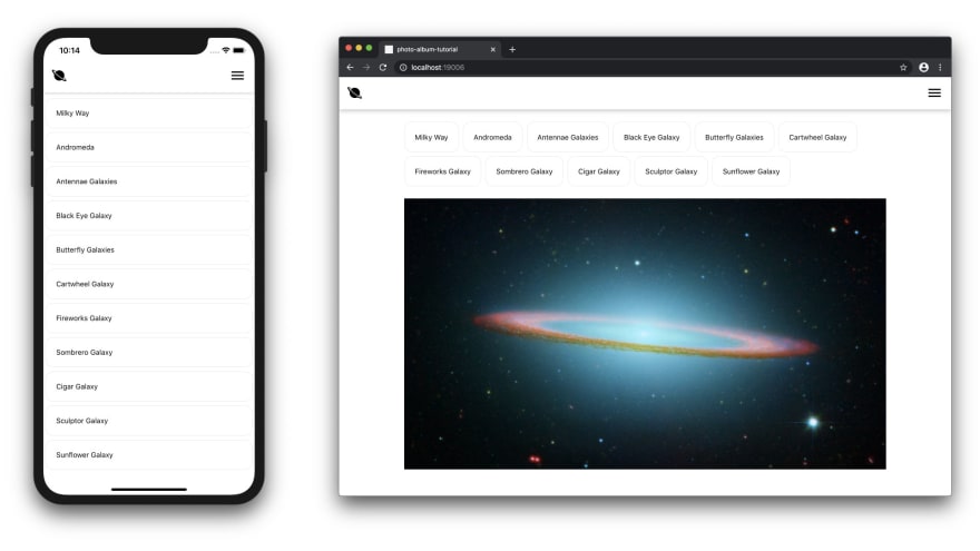
Your app should like like this:

The End
Hope you enjoyed working with Reflect. If you decide to use it in your projects, have questions or feedback, or just want to say hello, please write a comment below!
Links
- Tutorial's source code: https://github.com/sntx/photo-album-tutorial
- React Native Reflect Docs: https://sntx.github.io/react-native-reflect
- Let's connect on Twitter: https://twitter.com/sntx_dev
- Reflect's Twitter: https://twitter.com/rnreflect


Top comments (0)