Description
The following tutorial explains step by step how to create a responsive photo album app with React Native and React Native Reflect that works on Web and Native devices.
Our photo album app will display images in a grid with variable number of columns, image aspect ratio, grid separation, etc. all in a responsive manner. We'll also create several responsive, theme-based UI components, including conditional rendering based on screen size.
This is a tutorial series, you need to start from Part 1 to be able to continue from here
Time for Math!
Below is a sketch of all the math we need to make this work:

Our strategy for creating grid spacings is as follows:
- Calculate exact image dimensions
- Add
marginBottomstyle to all images - Add
marginRightstyle to all images, except the last images on rows
ImageGrid Component
Create a new file: src/ImageGrid.tsx with the following content:
import React, { useState } from "react";
import { FlatList, Image, LayoutChangeEvent } from "react-native";

type ImageGridProps = {
  data: any;
  numColumns: number;
  aspectRatio: number;
  gridGap: number;
};

type RenderItemProps = {
  item: { links: [{ href: string }] };
  index: number;
};

export default function ImageGrid({
  data,
  numColumns = 3,
  aspectRatio = 1,
  gridGap = 0,
}: ImageGridProps) {
  const [flatListWidth, setFlatListWidth] = useState(0);

  // width of all vertical gridGaps in a row
  const gridGaps = gridGap * (numColumns - 1);
  const imageWidth = (flatListWidth - gridGaps) / numColumns;
  const imageHeight = imageWidth / aspectRatio;

  const onLayout = (obj: LayoutChangeEvent) => {
    const width = obj.nativeEvent.layout.width;
    if (width === flatListWidth) return;

    setFlatListWidth(width);
  };

  const renderItem = ({ item, index }: RenderItemProps) => {
    const isLastImageInRow = (index + 1) % numColumns === 0;
    const marginRight = isLastImageInRow ? 0 : gridGap;
    const marginBottom = gridGap;

    return (
      <Image
        style={{
          width: imageWidth,
          height: imageHeight,
          marginRight,
          marginBottom,
        }}
        source={{ uri: item.links[0].href }}
      />
    );
  };

  return (
    <FlatList
      data={data}
      numColumns={numColumns}
      // NOTE: we need to change FlatList's key to be able to change
      // numColumns on the fly. This is a React Native specification.
      key={numColumns}
      onLayout={onLayout}
      keyExtractor={(_item, index) => index.toString()}
      renderItem={renderItem}
    />
  );
}
Note that the code here is mostly what we had in App.tsx with the addition of the calculations for grid spacing.
Updated App.tsx
We'll also need to update App.tsx as follows:
import React, { useEffect, useState } from "react";
import { SafeAreaView, ActivityIndicator } from "react-native";
import Axios from "axios";
import { useStyled } from "react-native-reflect";

import ImageGrid from "./src/ImageGrid";

// Items used by ImageGrid, contains list of images.
type Items = { links: [{ href: string }] }[];

// Data returned by HTTP request
type AxiosData = {
  collection: {
    items: Items;
  };
};

const GET_GALAXY_IMAGES =
  "https://images-api.nasa.gov/search?q=spiral%20galaxies&media_type=image";

export default function App() {
  const [isLoading, setLoading] = useState(true);
  const [data, setData] = useState<Items>([]);

  // Get our data
  useEffect(() => {
    Axios.get<AxiosData>(GET_GALAXY_IMAGES)
      .then(({ data }) => {
        setData(data.collection.items);
      })
      .catch((error) => console.error(error))
      .finally(() => setLoading(false));
  }, []);

  // Responsive values
  const { attrs } = useStyled({
    attrs: {
      // 1 on small screens, 3 on medium screens, 4 on large screens
      numColumns: [1, 3, 4],
      // 4/3 on small screens, 1 on medium and large screens
      imageAspectRatio: [4 / 3, 1],
    },
  });

  // After loading is done "isLoading", we render our images using <ImageGrid/>
  return (
    <SafeAreaView>
      {isLoading ? (
        <ActivityIndicator />
      ) : (
        <ImageGrid
          data={data}
          numColumns={attrs.numColumns}
          aspectRatio={attrs.imageAspectRatio}
          gridGap={20}
        />
      )}
    </SafeAreaView>
  );
}
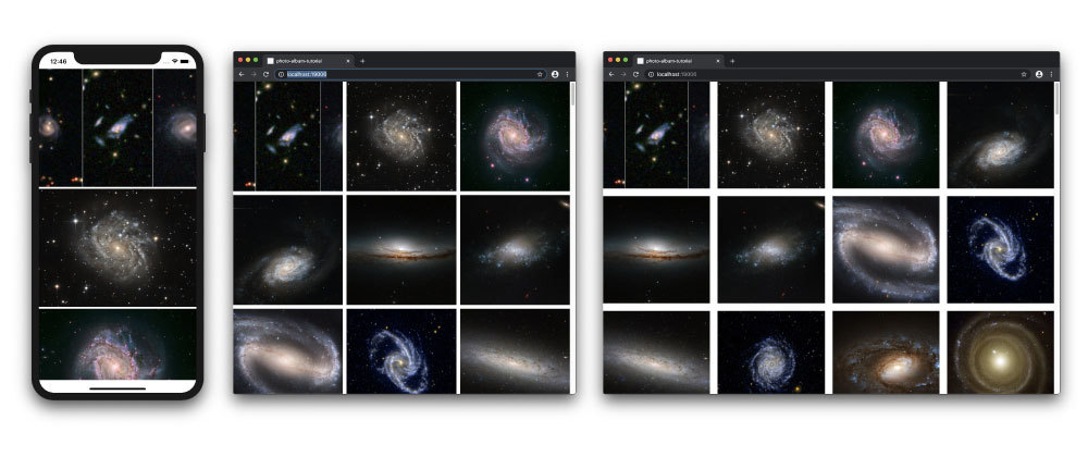
Your App should like like this:

Responsive Grid Spacing
Finally, let's make the grid spacing of our ImageGrid responsive. To do so, just define a new responsive array, gridGap, with useStyled():
const { attrs } = useStyled({
  attrs: {
    // 1 on small screens, 3 on medium screens, 4 on large screens
    numColumns: [1, 3, 4],
    // 4/3 on small screens, 1 on medium and large screens
    imageAspectRatio: [4 / 3, 1],
    // 5 on small screens, 10 on medium screens, 20 on large screens
    gridGap: [5, 10, 20],
  },
});
And pass the value to ImageGrid component:
<ImageGrid
  data={data}
  numColumns={attrs.numColumns}
  aspectRatio={attrs.imageAspectRatio}
  gridGap={attrs.gridGap}
/>
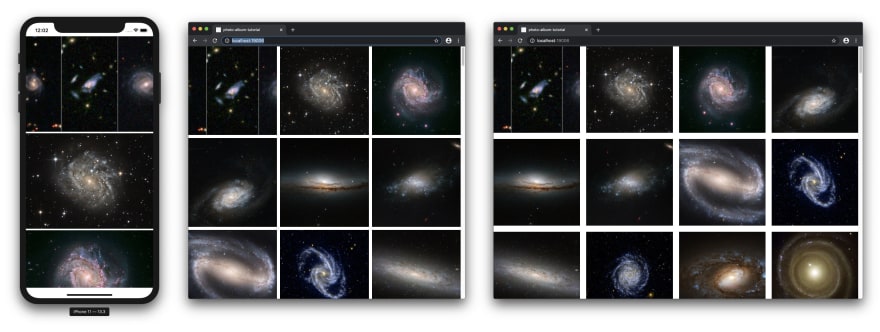
Your App should look like this:
That's all for Part 2! So far we have a created a responsive Image gallery in React Native that adapts to different screen sizes by providing three responsive attribute values: numColumns, imageAspectRatio and gridGap. Combining different values for these three attributes gives us a lot of flexibility!
Next Steps
On Part 3, we will create a fully responsive UI, including page layouts, branding elements, etc. Stay tuned!
Links
- Tutorial's source code: https://github.com/sntx/photo-album-tutorial
- React Native Reflect: https://sntx.github.io/react-native-reflect


Top comments (0)