
Welcome to part-4 of the series.
We will first learn about Sizing Grid Items in this tutorial. In Grid also, as in Flexbox we have to select and individual item and add the property.
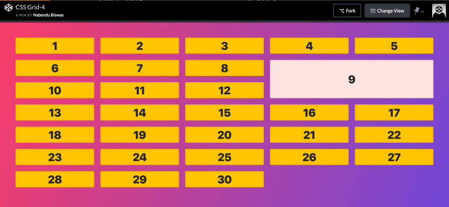
This use this codepen for this part. We have 30 items and then selecting item9 to have a width. Notice it is similar to what happens when we give an item some content(We did in last tutorial).
<body>
  <div class="container">
    <div class="item item1">1</div>
    <div class="item item2">2</div>
    <div class="item item3">3</div>
    <div class="item item4">4</div>
    <div class="item item5">5</div>
    <div class="item item6">6</div>
    <div class="item item7">7</div>
    <div class="item item8">8</div>
    <div class="item item9">9</div>
    <div class="item item10">10</div>
    <div class="item item11">11</div>
    <div class="item item12">12</div>
    <div class="item item13">13</div>
    <div class="item item14">14</div>
    <div class="item item15">15</div>
    <div class="item item16">16</div>
    <div class="item item17">17</div>
    <div class="item item18">18</div>
    <div class="item item19">19</div>
    <div class="item item20">20</div>
    <div class="item item21">21</div>
    <div class="item item22">22</div>
    <div class="item item23">23</div>
    <div class="item item24">24</div>
    <div class="item item25">25</div>
    <div class="item item26">26</div>
    <div class="item item27">27</div>
    <div class="item item28">28</div>
    <div class="item item29">29</div>
    <div class="item item30">30</div>
  </div>

<style>
    .container {
      display: grid;
      grid-gap: 20px;
      grid-template-columns: repeat(5, 1fr);
    }

.item9 {
      background: mistyrose;
      width: 500px;
    }
  </style>
</body>

</html>
 The result
Instead of defining the width or having some content to increase the width, we have a property in grid called span. We can ask an item to span the desired number of column. We will use the grid-column on the item.
.container {
      display: grid;
      grid-gap: 20px;
      grid-template-columns: repeat(5, 1fr);
    }

.item9 {
      background: mistyrose;
      grid-column: span 2;
    }
Which will result in item 9 to take two spaces, but it shift item 10 to the next row.
 The result
Similarly, we can use the grid-row property also, to tell how many rows the item expands.
.container {
      display: grid;
      grid-gap: 20px;
      grid-template-columns: repeat(5, 1fr);
    }

.item9 {
      background: mistyrose;
      grid-column: span 2;
      grid-row: span 2;
    }
 The result
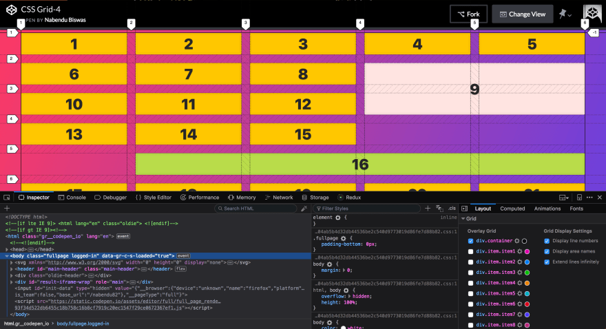
Now, we will look into placing grid item. We will place them exactly where we want. The grid-column is actually a short-hand property. We can divide it as grid-column-start and grid-column-end.
Let’s choose item 16 and also display the grid line by opening the dev tools and selecting the grid. We will use the below code.
.item16 {
      background: #BADA55;
      grid-column-start: 2;
      grid-column-end: 6;
    }
Now we are starting from track 2 and ending at track 6. Notice that the item 16 was not able to fit in it’s space of two, so was pushed to the next row where it got the required space of 4.
 The result
There are another two ways to do the same. We can again condense it and use the format grid-column: 2 / 6; It will give the same result.
.item16 {
      background: #BADA55;
      grid-column: 2 / 6;
<!--  grid-column-start: 2;
      grid-column-end: 6; -->
    }
The second was is to use the span by grid-column: 2 / span 4; It will also produce the same result.
.item16 {
      background: #BADA55;
      grid-column: 2 / span 4;
<!--  grid-column: 2 / 6; -->
<!--  grid-column-start: 2;
      grid-column-end: 6; -->
    }
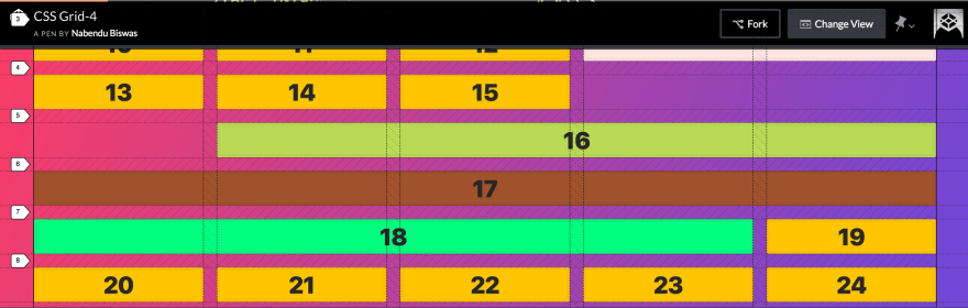
There is another concept, we can use negative number. Suppose, we want an item to expand the whole row, we can give grid-column: 1 / -1;
Similarly, grid-column: 1 / -2; means expand till the last two track.
.item17 {
      background: sienna;
      grid-column: 1 / -1;
    }

    .item18 {
      background: springGreen;
      grid-column: 1 / -2;
    }
 The result
We can mix it with grid-row property also.
.item20 {
      background: linen;
      grid-column: 1 / -3;
      grid-row: 8 / 10;
    }
 The result
This conclude part-4 of the series.


Top comments (0)