
Welcome to part-2 of the series.
Let me start with the dev tools which are really beneficial for development in Grid. By the time of writing, still Firefox developer edition have the best tool to auto-detect Grid.
Grids are a very visual thing and there are implicit track and explicit track, which are shown beautifully in latest Firefox developer edition.
Let use the codepen from last tutorial to demonstrate this.
I have opened the codepen and then right-clicked and Inspect Element on Firefox developer edition, to show me the developer tools. This is similar to the developer tool of Chrome or other browser, but have an additional section on the right side. Notice there is a Layout and that is the main tool to work in Grid.
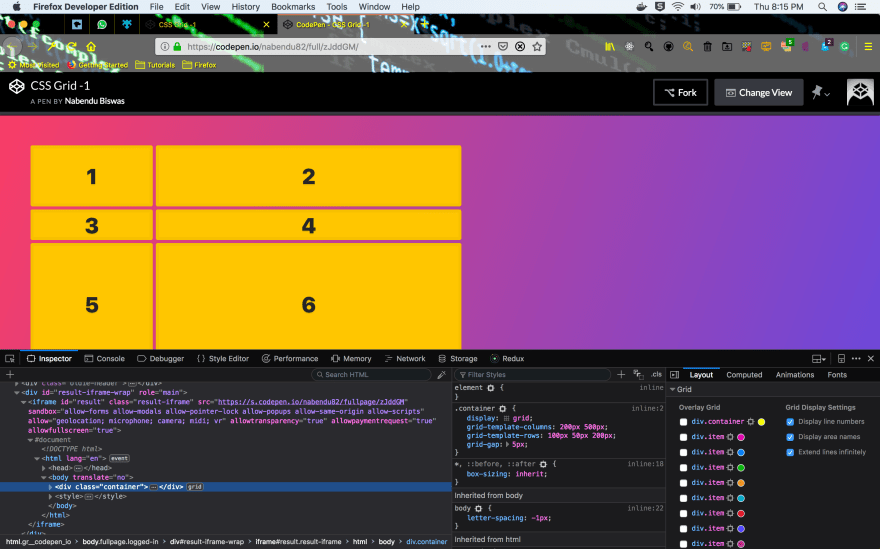 Firefox Developer Edition
There is a main grid in our code(which we will look next), called the container. I have selected it. Also there was a circle with yellow color(as in above screenshot), select that and make it black or any dark color. Also, make sure all three Grid Display Settings checkboxes are selected.
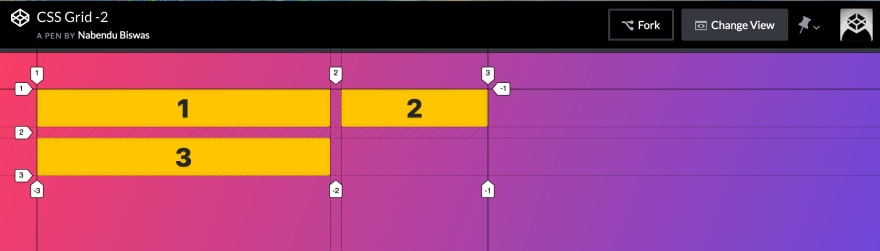
 The Grid layout
Now the code for the above grid is below. We have two grid columns and three grid rows.
<div class="container">
    <div class="item">1</div>
    <div class="item">2</div>
    <div class="item">3</div>
    <div class="item">4</div>
    <div class="item">5</div>
    <div class="item">6</div>
    <div class="item">7</div>
    <div class="item">8</div>
    <div class="item">9</div>
    <div class="item">10</div>
  </div>
  <style>
    .container {
      display: grid;
      grid-template-columns: 200px 500px;
      grid-template-rows: 100px 50px 200px;
      grid-gap: 5px;
    }
  </style>
Let look at implicit tracks and explicit tracks now. I have zoomed in the browser and we are between 1 and 3 items. The explicit tracks are marked as dashed lines (— — — —) and are called explicit as they are created because we declared them using grid-template-columns and grid-template-rows.
 The explicit track
The implicit tracks are marked by dotted line(……..) and they are called implicit because they created by the Grid system. We only have three rows because of grid-template-rows: 100px 50px 200px;
The last 2 rows are implicit because we didn’t defined them.
 The Implicit track
These implicit tracks by default takes the height of the element inside it. As, in this case it takes the digit 7 , 8 , 9 and 10 height. We can change that by a property known as grid-auto-rows, which is the size of all implicit rows.
.container {
      display: grid;
      grid-template-columns: 200px 500px;
      grid-template-rows: 100px 50px 200px;
      grid-auto-rows: 150px;
      grid-gap: 5px;
    }
Now the two implicit rows are 150px each.
 grid-auto-rows
Auto Flow — By default any implicit track is created in the next row. We can change it by grid-auto-flow property.
We will use this codepen for grid-auto-flow. First we are having this basic code. It have two columns and two items, so both are explicit and placed accordingly.
<div class="container">
    <div class="item">1</div>
    <div class="item">2</div>

</div>
  <style>
    .container {
      display: grid;
      grid-template-columns: 400px 200px;
      grid-gap: 15px;
    }
  </style>
 The result
Now if we have a third item in this setup, it will go below item 1. This implicit item follow the property grid-auto-flow: row which is the default option and we don’t have to mention it.
<div class="container">
    <div class="item">1</div>
    <div class="item">2</div>
    <div class="item">3</div>

</div>
  <style>
    .container {
      display: grid;
      grid-template-columns: 400px 200px;
      grid-gap: 15px;
    }
  </style>
 The result
Now in the same above layout, if we give grid-auto-flow: column then the implicit item 3 will be placed beside item 2.
<div class="container">
    <div class="item">1</div>
    <div class="item">2</div>
    <div class="item">3</div>

</div>
  <style>
    .container {
      display: grid;
      grid-template-columns: 400px 200px;
      grid-auto-flow: column;
      grid-gap: 15px;
    }
  </style>
 The result
This concludes part-2 of the series.


Top comments (0)