
As i have written in my previous blog on flexbox, that it helped me get out of the bootstrap trap. I also use another new addition to CSS, which is know as grid. It is an awesome system which can be used to develop the whole website.
I generally use a combination of flexbox and Grid in my projects. CSS grid can divide the whole page into columns and rows easily and there are many ways in which you can place the elements.
The best resource to quickly reference Grid this article on CSS tricks.
And then there is this awesome free tutorial from Wes Bos. This blog series is also inspired and based upon that series.
I will be using this codepen for the tutorial.
Let first have some divs with class items inside a div with class container. As, you have assumed, the container will be Grid and the items will be it’s children.
 The basic div
It will produce the below. Since div are row level elements, each will be stack one below other.
 The result
Let style it a bit, so that it looks good. The same basic style will be used in all tutorials. It contains the basic font, background color and the css to center the content of the items.
 basic css-1
 basic css -2
Now our codepen looks like.
 The beauty
Now let’s start griding. As with flexbox, we add the display property. We will add the below in CSS.
.container {
 display: grid;
 }
As if we check, it changes nothing. Because in grid we have to specify the column and/or row property. The column property is specified by grid-template-columns. So, below means create two columns. One of 200px and other of 500px.
.container {
      display: grid;
      grid-template-columns: 200px 500px;
    }
This will arrange our 10 items in two columns of 200px and 500px .
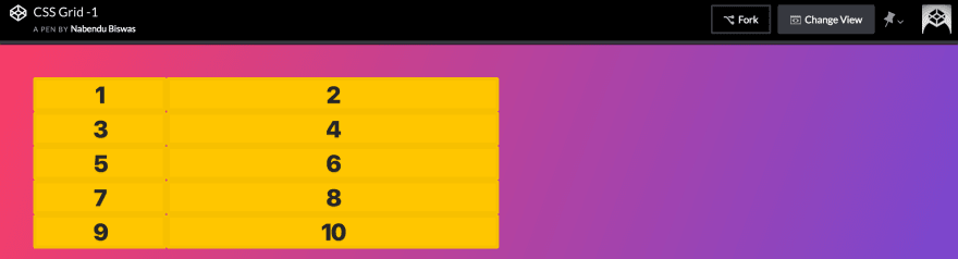 The arrangement
Now lets add the row property by grid-template-rows. The below will create 3 rows — 100px, 50px and 200px;
.container {
      display: grid;
      grid-template-columns: 200px 500px;
      grid-template-rows: 200px 100px 300px;
    }
This will result in the below. But wait we have 5 rows and the last 2 rows, doesn’t takes the sizes we specified.
They were created because we had more items then that could be fitted in our 2 column and 3 rows system.
So, grid created them and kept the row height as default height of the number inside it. We will learn more about these later in the series.

Finally, lets add some gaps between the items. This can be easily done in Grid by the property grid-gap.
.container {
      display: grid;
      grid-template-columns: 200px 500px;
      grid-template-rows: 100px 50px 200px;
      grid-gap: 5px;
    }
Which results in 5px gap in both rows and columns.
 The final image of this tutorial


Top comments (0)