Welcome to Trench Traversal Tales, horror stories from the video game industry. Tremble in fear and heed these words of caution lest you find yourself the star of similar travesties. In the tradition of such tales, all identities are intentionally obfuscated to protect all parties. Enjoy the theatrics!
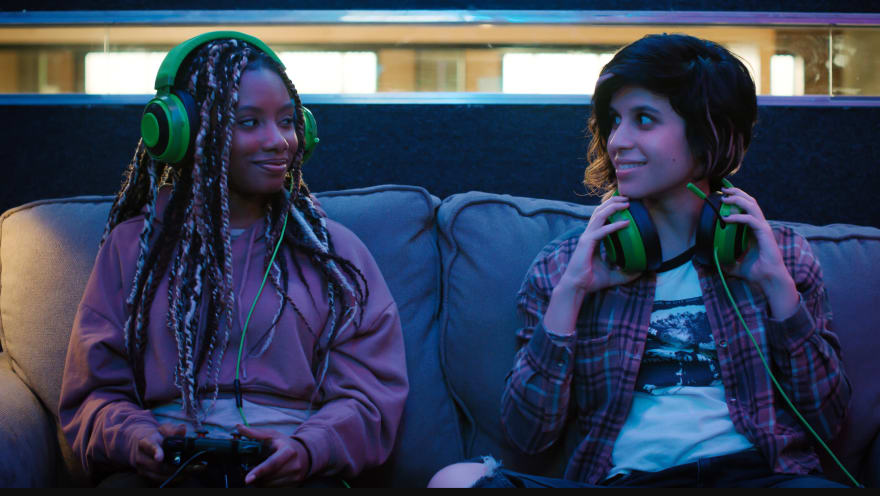
As part of a company event, a bunch of game developers watched Season 1 Episode 1-2 of Mythic Quest. There were scenes of two QA testers (played by Imani Hakim and Ashly Burch) doing their daily taskwork on a couch. This earned some scoffs from the audience because that's totally not how game testers work. But it should be. Why? Because if game developers worked on a couch, obvious issues would not ship in the final product.

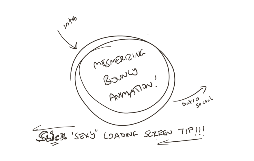
As a developer of user interfaces for games, loading screens are a special sort of unavoidable problem. And the game I was working on was plagued with them. The loading screens were short (compared to other games) but their frequency was high. There were other issues too but in typical AAA game dev fashion, you address the problem at the surface where it's often cheaper as opposed to tackling the root cause of the issue. In this case, the loading screen was designed to be entertaining. It looked a little like this.

Everyone was pleased with its sleek minimalism and stylish animations. It went through quality assurance in multiple states and countries. It passed all certifications and all the checkpoints and gates to land in the final build and soon enough, it was released to excited gamers everywhere. Not long after, we got a steady stream of complaints about the loading screen. Sure enough, their repeated appearances annoyed a lot of people but what was rather interesting was another complaint that was hidden within. The loading screen was "blinding" players. What?
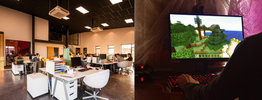
To realize this is to understand that most gamers play in dim lighting in cozy dens while most game production is done in an office environment...which tends to be bright. At least it was in this case - our players played in the dark while we worked in brightly lit grey cubicles.

To exacerbate the issue, our game's world renderings were significantly more subdued so any sudden appearance of the loading screen presented a significant flux in screen brightness. This caused further irritation and actual physical discomfort in some cases.
This is why game developers need to work on couches. They need production environments that closely match the environments of their customers. This is why I've shipped games where the font size was too small. When you develop on a screen close to your face, you can lose sight of the fact that most people will be playing on a couch while staring at a faraway TV. And when you approve or vet UI designs on your laptop, it's so easy to forget that the design is meant to be consumed on another type of screen. These types of basic oversights can occur once you forget how your customer uses your product.
We "fixed" the loading screen brightness issue with a visual redesign but that wasn't the end of it, oh not by a long shot. For you see, in the future, a drastic user flow change reared its ugly head; with it came yet another loading screen. After being flagged as an issue, you bet the powers that be would not let another loading screen assault our poor users. What happened next? Tune in next time for another exciting Trench Traversal Tale!


Top comments (0)