CSS Colors, Backgrounds, Borders, Margins and Padding
CSS color property defines the text color or the foreground color of an element.
Colors are specified using predefined names such as RGB, HEX, HSL, RGBA, HSLA values.
CSS Code:
body {
    color: #ff5722;
}
Colors in CSS are predefined with color name. Example are grey, red, blue, green etc. Defining color values The format for setting color values are A color keyword like "green", "yellow", "transparent", etc are used. A hex value is like "#ff0000", #00ff00", etc . A RGB value is like "rgb(255, 0, 0)"
CSS Background color: HTML element are set with background colors
Code:
<h1 style ="background-color: yellow;">Hello World</h1>
CSS Text Color: Text color can also be set in CSS.
Code:
<h1 style = "color: tomato;" > Hello world</h1>
CSS Background: This property allows CSS to add background effects for elements. We are going to look at several background properties. We have already looked at background-colors.
Background Image: The CSS Background image specifies the use of image on the background of an element. By default, the image is repeated in order to cover the entire element.
CSS Code:
body {
   background-image: url("google.jpg");
}
CSS Background-repeat: Some images should only be repeated horizontally or vertically, or they will look strange
CSS Code:
body{
    background-image: url("google.jpg");
    background-repeat: repeat-x;
}
The background-image can also be shown once
CSS Code:
body{
    background-image: url("google.jpg");
    background-repeat: no-repeat;
}
The background-position is also used to specify the position an image should be.
CSS Code:
body{
    background-image: url("google.jpg");
    background-repeat: no-repeat;
    background-position: right-top;
}
CSS Border: This property allows you to define the border area of an element’s box. It appears between the margin and padding of an element. It allows you to also show the style, width, and color of an element’s border. Some of the values allowed in the border property are dotted, dashed, solid, double, groove (defines a 3d grooved border), ridge, inset, outset, none, and hidden.
CSS Code:
body {
    border-style: solid;
}
Border-width: This property shows the width of the borders. The width can be specific size(in, px, pt, cm, em, etc)
CSS Code:
body {
    border-style: inset;
    border-width: 5px;
}
Border color: This property shows sets the color of the border. The color can be in HEX, RGB, HSL and transparent. In the case the color is not set it takes the color of the element.
CSS Code:
p.one {
    border-style: solid;
    border-color: blue;
}
Border side
It is possible to specify different border for each side.
CSS Code:
p {
    border-top-style: dotted;
    border-right-style: solid;
    border-bottom-style: dotted;
    border-left-style: solid;
}
CSS Margins: The CSS Margin property allows you to set space around the border of an element. It’s not usually affected by background-color, it’s always transparent. CSS margin has a property for specifying the margin for each side of an element.
CSS Code:
p {
   margin-top: 100px;
   margin-bottom: 100px;
   margin-right: 150px;
   margin-left: 80px;
}
CSS Padding: Padding is used to create space around the element’s content, inside a defined border. Individual sides of the element are also padded.
CSS Code:
div {
    padding-top: 50px;
    padding-right: 30px;
    padding-bottom: 50px;
    padding-left: 80px;
}
Padding and element width: The width property specifies the width of the element’s content area. The content area is the portion inside the padding, border, and margin of an element. The padding added to the element when the width is also stated is calculated together to give the total width.
CSS Code:
div {
    width: 300px;
    padding: 22px;
}
In these code you will see that the actual width is not 300px but 344px (300 + 22px of left padding + 22px of right padding}.
Create Stunning Websites and Web Apps
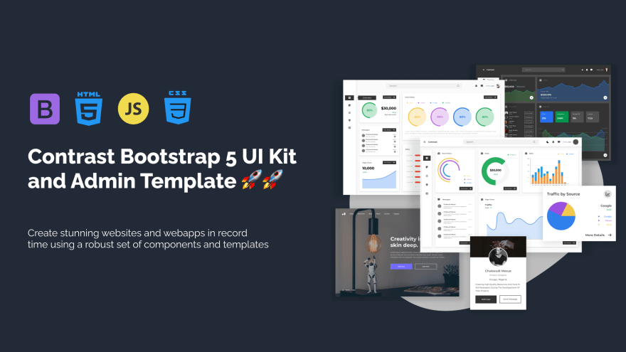
Trying to build out all user interfaces and components for your website or web app from scratch can become a very tedious task. A huge reason why we created Contrast Bootstrap to help reduce the amount of time we spend doing that, so we can focus on building some other aspects of the project. Contrast Bootstrap PRO consists of a UI Kit featuring over 10000+ component variants. Together with a template of 5 admin dashboards and 23+ additional multipurpose pages template for building almost any type of website or web app. You can view a demo and learn more about Contrast by clicking here.
Contrast Bootstrap PRO was built using the most popular CSS framework Bootstrap to help build your next landing, admin SAAS, prelaunch etc. project with a clean, prebuilt and well documented template and UI components. Learn more about contrast.
Resources
- Contrast Design Bootstrap
- Accordion
- Alert
- Animation
- Autocomplete
- Badges
- Box
- Breadcrumb
- ButtonGroup
- Button
- ButtonToolbar
- Card
- Carousel
- Checkbox
- Collapse
- DataTable
- DatePicker
- DropDown
- Footer
- Forms
- Icon
- Iframe
- Input
- InputGroup
- ListGroup
- Mask
- Modal
- Multiselect
- Notification
- Pane
- Panel
- Pop Over
- Progress
- Radio
- Rating
- Select
- Select 2
- Slider
- Spinner
- Stepper
- Switch
- Table
- Forms
- Navbar
- Pagination
- Tab
- Sidebar
- Time Picker
- Data Table
- Fixed Data Table
- Table
- Widgets


Top comments (0)