Introduction
Ever clicked a boring old button and thought, "there has to be a more exciting way"? Buttons are a crucial part of any website, but they don't have to be plain and uninspired. With the power of CSS, you can create stunning gradient buttons that elevate the user experience and make your website visually pop. This tutorial will guide you through the steps of crafting beautiful gradient buttons with a touch of animation, using just basic HTML and CSS knowledge.
Requirments:
- Basic HTML Knowelage
- Basic CSS Knowelage
You will learn:
- How to use after and apply real examples on it
- How to create a beutiful background gradients
- How to use
box-shadowproperty - How to animate shadows and gradients
Setup the HTML code, we will apply the properties on a button:
index.html
<button id="B" type="button">Titanium <i class="fa-brands fa-apple"></i></button>
The id attribute gives id to the button so we can edit it in a seperate css file.
the i element is the icon of the button, I'm using fontawesome.com for the icon, the class fa-apple retrives Apple icon for us.
Now let's start with the CSS file:
style.css
#B {
  width: 148px;
  height: 48px;
  color: #fff;
  font-size: 20px;
  font-weight: 600;
  cursor: pointer;
  border-radius: 8px;
  border: none;
}
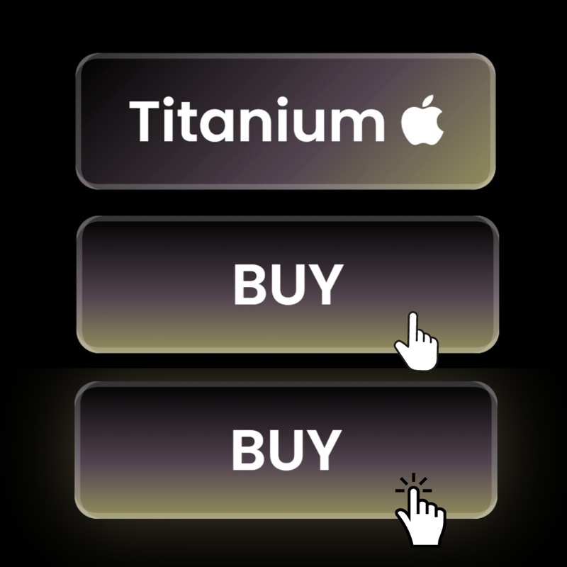
You should get something like this:

CSS Gradients
Let's start with the main meal, the gradient background. Firstly, you should know the basic syntax of the gradient property:
We start by applying background or background-image property in the button like this:
style.css
#B {
   background: ;
   /* you can also use background-image it doesn't matter */
}
Now let's add a gradient background, to add it, use linear-gradient in the background property, the main sytanx would look like this:
background: linear-gradient(0deg, first color, second color, third color and so on ..);
the first parameter is degree, you should set it as you love to, it is used to determine the direction of the gradient.
the second parameter is the color properties, you can add as much colors as you want but no less than two, this is the syntax for the color:
style.css
background: linear-gradient(
    135deg,
    rgba(0, 0, 0, 1) 0%, /* first color */
    rgba(85, 69, 79, 1) 60%, /* second color */
    rgba(149, 143, 98, 1) 100% /* third color */
  );
I prefer using rgba instead of hex to have more customizations.
the second color's parameter is the color length, it starts with 0% as minimum and 100% as maximum, you can't use the same length for more than one color, each color should has it's own length.
now you have learned how to make gradient background, final gradient code would look like this:
style.css
#B {
  width: 148px;
  height: 48px;
  background: #958462 #55454f;
  background: linear-gradient(
    135deg,
    rgba(0, 0, 0, 1) 0%,
    rgba(85, 69, 79, 1) 60%,
    rgba(149, 143, 98, 1) 100%
  );
  color: #fff;
  font-size: 20px;
  font-weight: 600;
  position: relative;
  cursor: pointer;
  border-radius: 8px;
  border: none;
}
the final touch would be adding a box-shadow property:
style.css
box-shadow: inset 2px 0 0px rgba(255, 255, 255, 0.2),
    inset -2px 0 0px rgba(255, 255, 255, 0.2),
    inset 0 2px 0px rgba(255, 255, 255, 0.2),
    inset 0 -2px 0px rgba(255, 255, 255, 0.2);
This would make the button much better, after all of that, the button should look like this:

Animating the Gradient Background
In CSS, We can't animate the gradient background directly by applying a :hover on the button, instead we can use another gradient on top of it and animate it, to do that, we will use :after to do this.
To use :after, add it in a new block of code after specifing the button:
style.css
#B:after {}
YOU SHOULD USE the same properties you applied to the button in the :after and not only the changes, :after is different from :hover:
style.css
#B5:after {
  content: "BUY";
  opacity: 0;
/* It should only appear when we hover so mainly, it should be invisible */
  position: absolute;
  left: 0;
  right: 0;
  top: 0;
  bottom: 0;
  cursor: pointer;
  border-radius: 8px;
background: linear-gradient(
    180deg,
    rgba(0, 0, 0, 1) 0%,
    rgba(85, 69, 79, 1) 60%,
    rgba(149, 143, 98, 1) 100%
  ); /* You can set a different new position */
  border: none;
  display: flex;
  justify-content: center;
  align-items: center;
  box-shadow: inset 2px 0 0px rgba(255, 255, 255, 0.2),
    inset -2px 0 0px rgba(255, 255, 255, 0.2),
    inset 0 2px 0px rgba(255, 255, 255, 0.2),
    inset 0 -2px 0px rgba(255, 255, 255, 0.2);
  transition: all 0.3s ease-in-out; /* you can edit the transition as you prefer to */
}
The first propery is content, It specifies the inner text of the element :after, the second property applies an absolute position with left: 0; right: 0; top: 0; and bottom: 0; because we want the :after element on top of the main button.
It should only appear when we hover so mainly, it should be invisible, that's why we use opacity: 0;.
Now add a hover effect to show the button :after:
style.css
#B:hover:after {
  opacity: 1;
}

/* Optional */
#B:focus {
  box-shadow: 0px 0px 26px rgba(149, 132, 98, 0.5),
    inset 2px 0 0px rgba(255, 255, 255, 0.2),
    inset -2px 0 0px rgba(255, 255, 255, 0.2),
    inset 0 2px 0px rgba(255, 255, 255, 0.2),
    inset 0 -2px 0px rgba(255, 255, 255, 0.2);
}
The final code snippet:
#B {
  /* Button styles */
  width: 148px;
  height: 48px;
  background: #958462 #55454f;
  /* Original gradient */
  background: linear-gradient(
    135deg,
    rgba(0, 0, 0, 1) 0%,
    rgba(85, 69, 79, 1) 60%,
    rgba(149, 143, 98, 1) 100%
  );
  color: #fff;
  font-size: 20px;
  font-weight: 600;
  position: relative;
  cursor: pointer;
  border-radius: 8px;
  border: none;
  box-shadow: inset 2px 0 0px rgba(255, 255, 255, 0.2),
              inset -2px 0 0px rgba(255, 255, 255, 0.2),
              inset 0 2px 0px rgba(255, 255, 255, 0.2),
              inset 0 -2px 0px rgba(255, 255, 255, 0.2);
}

#B:after {
  /* Overlay element on hover */
  content: "BUY";
  opacity: 0;
  position: absolute;
  left: 0;
  right: 0;
  top: 0;
  bottom: 0;
  background: linear-gradient(
    180deg,
    rgba(0, 0, 0, 1) 0%,
    rgba(85, 69, 79, 1) 60%,
    rgba(149, 143, 98, 1) 100%
  );
  cursor: pointer;
  border-radius: 8px;
  border: none;
  display: flex;
  justify-content: center;
  align-items: center;
  box-shadow: inset 2px 0 0px rgba(255, 255, 255, 0.2),
              inset -2px 0 0px rgba(255, 255, 255, 0.2),
              inset 0 2px 0px rgba(255, 255, 255, 0.2),
              inset 0 -2px 0px rgba(255, 255, 255, 0.2);
  transition: all 0.3s ease-in-out;
}

#B:hover:after {
  /* Show overlay on hover */
  opacity: 1;
}

#B:focus {
  /* Optional focus style */
  box-shadow: 0px 0px 26px rgba(149, 132, 98, 0.5),
              inset 2px 0 0px rgba(255, 255, 255, 0.2),
              inset -2px 0 0px rgba(255, 255, 255, 0.2);
}
The final result 😎:
Do you like it? ? Do you? ?? ?
IDC.


Top comments (0)