So you have a game-changing idea for an app. You maybe have some investors backing it up and you need to deliver a viable product fast. Or you`re aware that using the right software can boost your business and you want to build a tool that will do just that.
Whatever the scenario, after sitting down with you for an initial talk and getting clear on your goals, it is time to turn them into screens, flows and user stories. Product discovery is all about building your app`s UI/UX backbone, from the general layout of your content to actual design and mapping user interactions.
We take wireframes one step further
Development shouldn`t be the only thing agile. We believe product discovery should be too. That is why, we treat wireframes as actual design. This allows us to deliver fully-designed, clickable prototypes, which come as close as possible to the final product, early on and to address any major design changes on the spot.
Gone are the days of low-fidelity wireframes, whose sole purpose is to place content on the page. Our approach to wireframing and prototyping ensures that, at the end of your product discovery journey, you will have an actual interface design you can work with. From icons and color scheme to what happens when you click, hover over or press a button.
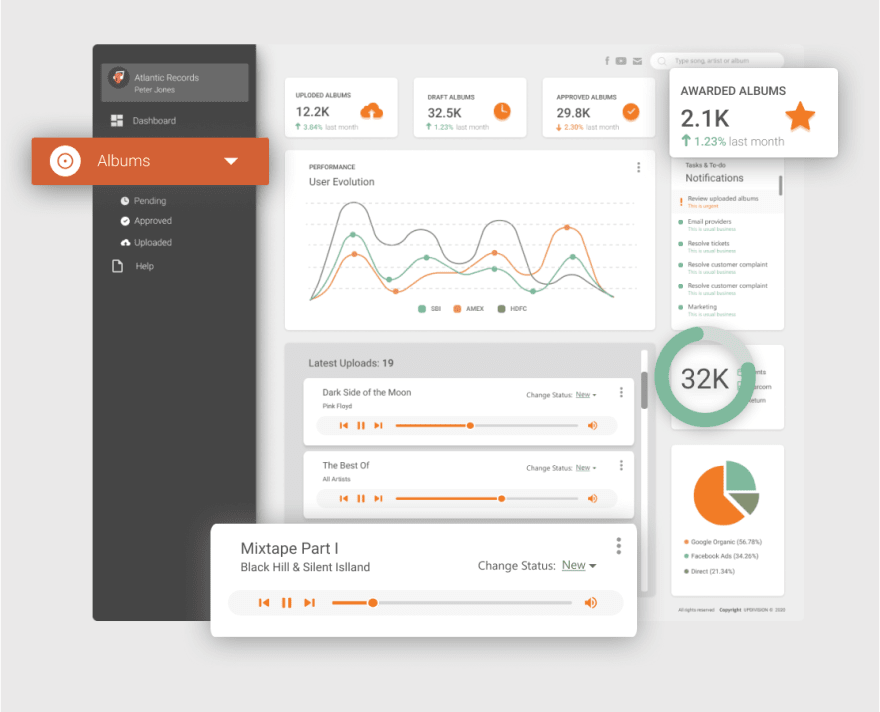
An admin dashboard we designed for a music distribution company based on Material UI Kit.
We build everything in Figma, a collaborative UI design tool, which allows product owners, UI/UX designers, graphic designers and developers to work alongside each other on the same project. This makes going from design to development a lost faster.
What` more, we use UI kits from our partners Creative Tim, based on some of the most popular design systems, like Material Design and Argon. This allows us to speed up the design process, while keeping everything consistent through reusable components, such as buttons, cards and modals. This is particularly useful for apps requiring an admin dashboard. Of course, if you need a unique look, we also do design from scratch.
We use UI components to speed up design and keep everything consistent.
The anatomy of a great user story
Although we listed user stories second, it`s more of a circular process, really. Based on how the user is going to move through the app in the design, we write the user stories. And by writing the user stories, we sometimes notice gaps in the design logic, so we go back to the wireframes and amend them.
Throughout our 10 years of building apps, we found that moving back and forth between user stories and design works best in covering even the most obscure edge cases.
We start writing user stories by breaking everything down into user roles (e.g. anonymous guest, logged in user, admin etc.). We then map out the most important goals a user might want to achieve depending on his or her role. For example, an e-commerce admin might want to visualize or edit a user`s order. To achieve this goal, the admin must follow certain steps, which we document as part of the user story: “the admin must navigate to the orders view”, “the admin must filter orders by user”, “the admin must hit the Edit button” etc.
User stories for one of our own products, a time management tool for freelancers.
Download user stories template.
User stories come in handy when designing user flows and they also work great as “mental notes” for developers. Relying on design alone when developing an app is tricky, as you run the risk of forgetting what some of the buttons, menus and views are supposed to do.
3 reasons our product discovery process works
We work collaboratively to get things done in less time and with less friction. Figma allows multiple people to work on the same project in real-time and get your app up and running faster.
Product owners, like yourself, can leave embedded comments for designers and web developers directly in the design.
UI/UX designers and graphic designers can co-design alongside each other and use version history to track changes.
Frontend developers can export assets, such as icons and cards, directly from Figma, without losing time with design files.
We make tracking progress easy. You can keep track of how your app is shaping up directly in your browser and see changes in real-time. Goodbye dozens of versions of the same file saved on Google Drive and countless email attachments you regularly lose track of.
Developer-friendly design = shorter development time. We bring development into our design process early on. Developers can not only export the exact design assets they need in the format they need it, they can also grab code snippets directly from Figma as CSS styling.
This is the first stage in our battle-tested process for building apps. Stay tuned for upcoming articles and share your experience of getting a project off the ground.


Top comments (0)