
The styled-components allows you to write actual CSS code to style your components. It also removes the mapping between components and styles – using components as a low-level styling construct could not be easier. Here the official docs of styled-components
Getting Started
For the prerequisite part, you need to have Node already installed on your machine.
Next let's create a react app and install styled-components too and then start the application.
npx create-react-app react-app
cd react-app
npm install styled-components
npm start
Let's Code
We need to import styled from "styled-components", and we need to create a Container component that will render an div tag. The Container component will act as a wrapper component
import styled from "styled-components";

const Container = styled.div`
//CSS to be added here
`
To add the button to switch between the dark mode we will using a toggle button created using a check box.
<Container>
      <div className="contain">
        <h5>Dark Mode</h5>
        <label class="switch">
        <input type="checkbox" onChange={(e) => setDark(!dark)} />
        <span class="slider round"></span>
        </label>
      </div>
    </Container>
CSS for the toggle button:
.contain {
    margin: auto;
    position: relative;
    top: 40%;
  }

  h5 {
    margin: 0;
  }
  .switch input {
    opacity: 0;
    width: 0;
    height: 0;
  }

  .slider {
    position: absolute;
    cursor: pointer;
    top: 0;
    left: 0;
    right: 0;
    bottom: 0;
    background-color: black;
    -webkit-transition: 0.4s;
    transition: 0.4s;
  }

  .slider:before {
    position: absolute;
    content: "";
    height: 14px;
    width: 14px;
    left: 2px;
    bottom: 1px;
    background-color: white;
    -webkit-transition: 0.4s;
    transition: 0.4s;
  }

  input:checked + .slider {
    background-color: white;
  }

  input:focus + .slider {
    box-shadow: 0 0 1px white;
  }

  input:checked + .slider:before {
    -webkit-transform: translateX(26px);
    -ms-transform: translateX(26px);
    transform: translateX(12px);
    background-color: black;
  }

  .slider.round {
    border-radius: 34px;
  }

  .slider.round:before {
    border-radius: 50%;
  }
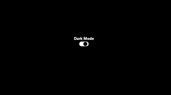
So this is how the toggle button would look like,

Now let's add the functionality, we will be using useState Hook,
const [dark, setDark] = useState(false);
By default the toggle should be off and when toggled the dark value should be true, so let's add onChange property on the input tag,
<input type="checkbox" onChange={(e) => setDark(!dark)} />
Next we need to pass the dark value to the Container component so that we can change the background color accordingly
<Container dark={dark}>
After passing dark value we can change the background conditionally
const Container = styled.div`
  background: ${({ dark }) => (dark ? "black" : "white")}; //Conditional styling the background color
  height: 100vh;
  min-height: fit-content;
  .switch {
    position: relative;
    display: inline-block;
    width: 32px;
    height: 16px;
    border-radius: 50%;
    border: 3px solid black;
  }

  h5 {
    margin: 0;
    color: ${({ dark }) => (!dark ? "black" : "white")}; // To change the color of the text opposite to the background color
  }

//Remaining CSS remains the same
The entire code:
import React, { useState } from "react";
import styled from "styled-components";

const Container = styled.div`
  background: ${({ dark }) => (dark ? "black" : "white")};
  height: 100vh;
  min-height: fit-content;
  .switch {
    position: relative;
    display: inline-block;
    width: 32px;
    height: 16px;
    border-radius: 50%;
    border: 3px solid black;
  }

  .contain {
    margin: auto;
    position: relative;
    top: 40%;
  }

  h5 {
    margin: 0;
    color: ${({ dark }) => (!dark ? "black" : "white")};
  }
  .switch input {
    opacity: 0;
    width: 0;
    height: 0;
  }

  .slider {
    position: absolute;
    cursor: pointer;
    top: 0;
    left: 0;
    right: 0;
    bottom: 0;
    background-color: black;
    -webkit-transition: 0.4s;
    transition: 0.4s;
  }

  .slider:before {
    position: absolute;
    content: "";
    height: 14px;
    width: 14px;
    left: 2px;
    bottom: 1px;
    background-color: white;
    -webkit-transition: 0.4s;
    transition: 0.4s;
  }

  input:checked + .slider {
    background-color: white;
  }

  input:focus + .slider {
    box-shadow: 0 0 1px white;
  }

  input:checked + .slider:before {
    -webkit-transform: translateX(26px);
    -ms-transform: translateX(26px);
    transform: translateX(12px);
    background-color: black;
  }

  .slider.round {
    border-radius: 34px;
  }

  .slider.round:before {
    border-radius: 50%;
  }
`;

function App() {
  const [dark, setDark] = useState(false);
  return (
    <Container dark={dark}>
      <div className="contain">
        <h5>Dark Mode</h5>
        <label class="switch">
          <input type="checkbox" onChange={(e) => setDark(!dark)} />
          <span class="slider round"></span>
        </label>
      </div>
    </Container>
  );
}

export default App;
This is my first blog on Dev.to.
Hope it was helpful and easy to implement.
Will be looking forward for feedback on this, also check out my Github thenickrj


Top comments (7)
Hey, i dont understand what's wrong with adding a class to that element rather than processing a huge string to just tweak a color...
There's nothing wrong in adding a class, the idea here is instead of having conditional statement for a class we can directly have a condition for a specific CSS property instead of having different classes
Wanted to know the same
Nice article.
There's a correction required in the paragraph.
Next we did to pass the dark value to the Container component so that we can **CHANGE** background color accordinglyYeah Changed it! Thank You
Great article
Show