In Part 1, I went through the basics of Web Components and the problem it solves. In this article, I will explore FAST to create Web Components or custom elements.
As I stated in Part 1, there is no need for abstraction layers, however, abstraction layers provide patterns and best practices for engineers to follow. Patterns and best practices take time to learn but they will speed up developments and they will help to make our code more readable by ourselves in the future or by anyone else.
What is FAST?
According to https://www.fast.design/, FAST is
The adaptive interface system for modern web experiences
Let's clarify that. FAST is a system to build web experiences which include custom elements, design systems, single page applications, or any other front end sites. With FAST, we get to follow some basic patterns to build components and sites that scale easily.
FAST as a system includes the following:
- FAST Element: an extension of HTMLElement to create custom elements. This is a thin layer of abstraction to make it easier to create custom elements.
- FAST Foundations: a set of style-less web components such as Modal, button, badge, etc.
- FAST Toolings: a set of tools/CLI help scaffold component creations and design system creations.
- FAST Integrations and Utilities: additional and optional libraries to add even more functionalities to the FAST system such as Routing, SSR, Animations, Colors, React wrapper, Blazer wrapper, and more.
How to build a component with FAST?
In Part 1, we built a custom brown <h1> tag and we named it <tebin-h1>. Let's build the same component with FAST.
To create a custom element, we will be using fast-element@v2.0.0-beta.4 package.
To go through how to build with FAST, I've setup a basic project with Webpack. In the spirit of using as much as possible from FAST, I used FAST's ToDo's example to start with. Kudos to FAST team for providing these examples.
You can find the repository here (https://github.com/tebinraouf/learning-fast/tree/building-web-components-101-part-2) to follow up with the rest of this article.
git clone https://github.com/tebinraouf/learning-fast.git
cd learning-fast
yarn or npm install
yarn build
yarn dev
or use Stackblitz for the project.
The project structure is as follows:
.
├── README.md
├── index.html
├── package.json
├── src
│   ├── components
│   │   └── h1
│   │       ├── h1.style.ts
│   │       ├── h1.template.ts
│   │       ├── h1.ts
│   │       └── index.ts
│   └── index.ts
├── tsconfig.json
└── webpack.config.cjs
Let's focus on the component directory. FAST breaks down component creation into 4 pieces:
- Component styles, which are defined in
*.style.tsfile. In this case,h1.style.tsfile. - Component template, which is defined in
*.template.tsfile. In this case,h1.template.tsfile. - Component composition, which is defined in
*.tsfile. In this case,h1.tsfile. - Component definition or registration, which is defined in index.ts file. In this case,
h1/index.tsfile.
Note: these 4 separate files are not required. You can combine all four into one single file, which could be difficult to maintain in a large project. These 4 different files provide clear separation of concern.
Let's dive deep into each part of the component:
-
h1.style.tsholds all the styles for your component. Out of the box, we can provide CSS as string or CSS through FAST'scsstag like below:
import { css } from "@microsoft/fast-element";

export const styles = css`
    :host {
        display: block;
    }
    h1 {
        color: brown;
    }
`;
Or CSS as string
export const styles = `
    :host {
        display: block;
    }
    h1 {
        color: brown;
    }
`;
or with some configurations, you could use SASS. For future articles,
I will write about how to configure SASS for FAST. However, the idea is to convert SASS to CSS string, which can then be used by the FAST component directly.
-
h1.template.tsholds the template for the custom component. Out of the box, FAST provideshtmltag build templates like below:
import { html } from "@microsoft/fast-element";

export const template = html`
    <h1>
            <slot></slot>
    </h1>
`;
slot is an HTML element. It allows us to provide dynamic content or markup to our custom element. We can think of slot as placeholder.
If there is one slot in the template, this is considered as the default slot. Text or mark up can be used in place of a slot.
If there are more than one slot, we would need to name them to identify the slot. To get more details, you can navigate to MDN.
-
h1.tsis used to compose or combine the template and the style. We also define the custom component name, which will be used when the web component is used.
*.compose({}) returns the custom element definition, which we will use to register the component.
import { FASTElement } from "@microsoft/fast-element";
import { styles } from "./h1.style.js";
import { template } from "./h1.template.js";


export class H1Component extends FASTElement {

}

export const h1component = H1Component.compose({
    name: "tebin-h1", //the component will be used like <tebin-h1></tebin-h1>
    template,
    styles,
});
-
components/index.tsis used to define/register the component based on the component definition that we get from*.compose().
import { h1component } from './h1.js';

h1component.define();
Lastly, to use the custom component, we will add the custom element to index.html
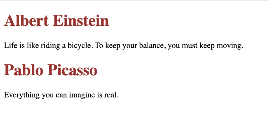
<tebin-h1>Albert Einstein</tebin-h1>
<p>Life is like riding a bicycle. To keep your balance, you must keep moving.</p>

<tebin-h1>Pablo Picasso</tebin-h1>
<p>Everything you can imagine is real.</p>
DOM Element:
Result:
To learn more, FAST provides excellent documentations on their official site at https://www.fast.design/. I will encourage you to check it out.
Lastly, by following a few simple patterns and structure, we were able to create a FAST custom element with ease. This article allows us to talk about more advance topics in the future such as directives, observables, and states. In future articles, I will talk about these and other FAST offerings.


Top comments (0)