
//Note: Watch The Video Version Here
Dear Next.Js Aficionado,
There are fabulous portfolio websites, and there are some plain ugly ones. There are "arty" ones. Minimalistic ones. And so on, and on.
Web developers are especially keen on building "out of the ordinary" projects. Sometimes they do it on purpose. More often, it just happens that way because the developer didn't prepare well.
Didn't write their homework...
As I mentioned the last time, we are about to build a SUPERB portfolio website for you that:
- Helps you get the best job offerings
- It makes you look cool in other people's eyes
- And that works for you 24/7.
But first…
What do I mean when I'm saying "SUPERB"?
That's the question I answer with this short tutorial.
I will start answering by showing you a couple of good examples. I won't show you bad ones because I want to imprint in your mind the proper "end result," and I don't wish to pick on someone and make them angry.
Example 01: The Website Of Josh Comeau
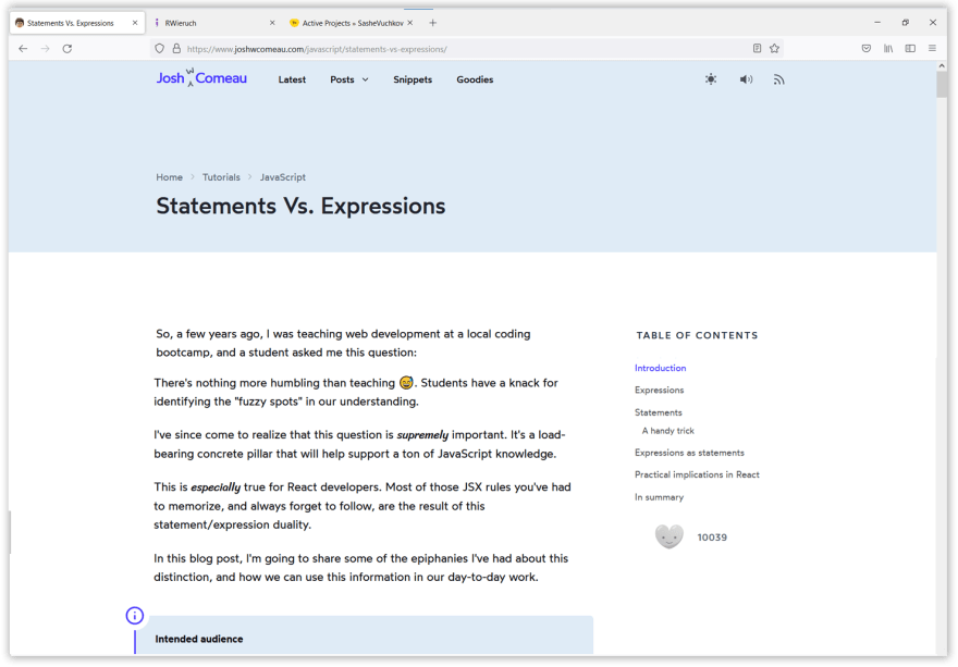
Let's talk for a minute about joshwcomeau.com.
I like this one a lot because it's arty and full of content. Right away, you can tell that its owner knows what they're doing well. Although it's not a "portfolio," it's one of the best personal websites I've ever visited.
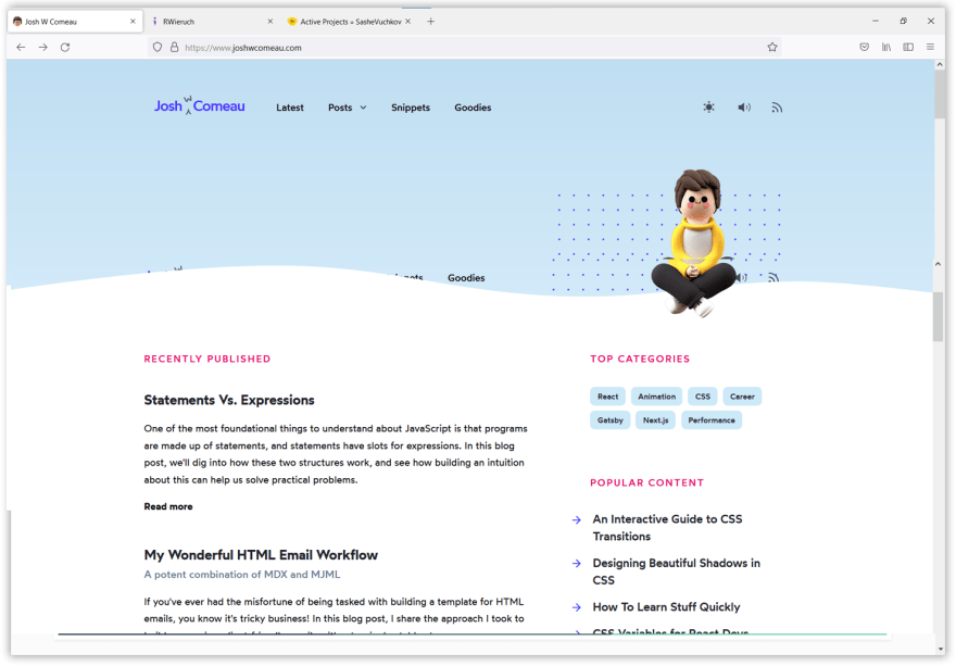
The homepage is a simple one. It shows the latest blog posts, which help the author build some authority in the eyes of the visitors.
By reading a few of the latest entries, the reader concludes that Josh Comeau is not a skillful web developer only, but they are a really knowledgeable and good communicator.
The last one is important if you want to get ahead quickly in your career.
Often the wild success isn't a matter of technical skills but a personal brand and soft skills.
Example 02: The Website of Robin Wieruch
The next one comes from Germany. It's a good primer for a "marketing machine" that helps its owner achieve career and business success.
The website has a complex homepage...
It welcomes the user with a beautiful picture of a desert, plus the web developer's name.

Right below it, we find a picture of Robin, their short bio, social media profiles, and a call to action "GET TO KNOW ME BEFORE YOU DIVE INTO MY CONTENT."

The next page section is titled "What I Offer."
Not every portfolio website needs to talk about "offers." We can replace that section with a "My Skills" or "My Philosophy" Section and put the same cool-looking snippets with icons that briefly mention more information about us.

Below "What I Offer," we find a "Portfolio " section. Robin Wieruch is really productive, so they list here not individual projects but CATEGORIES of projects.
We can start with individual projects and later transition to listing categories.

And the last important section of the homepage is titled "Vita." It's a sleek vertical timeline that lists some major life events of the site's owner. I consider it to be "the cherry on the cake."
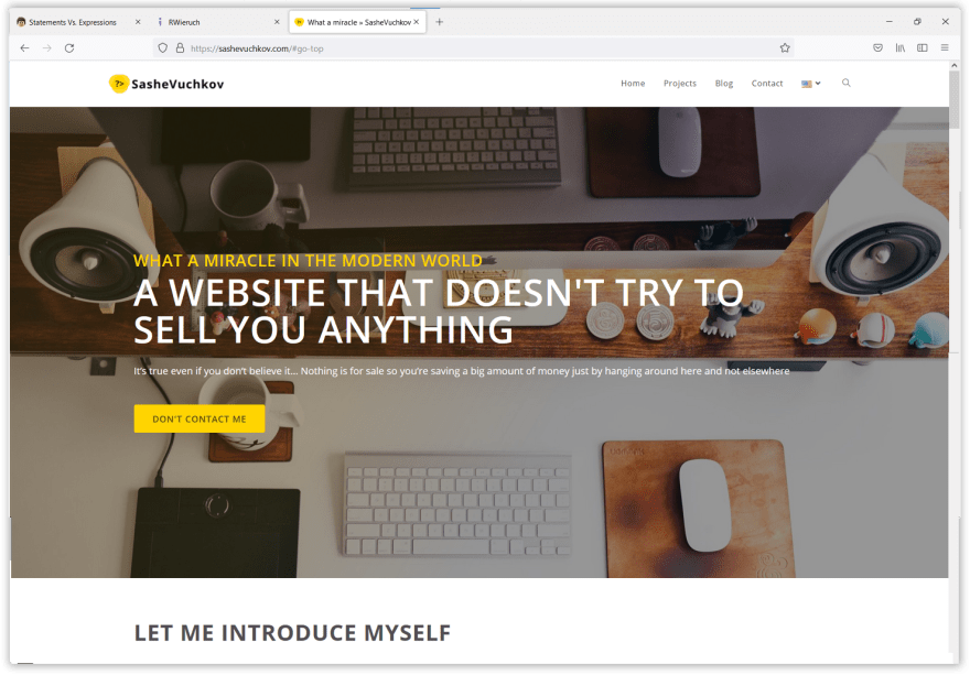
Example 03: My Portfolio Website
My portfolio website is something I created recently without much thinking about it. I used WordPress, and I didn't optimize it for better performance.
It took me 4 hours (blog posts not included). I needed something quick to "mark my place on the internet."
In the past, I had several freelance websites under different domains, which were way more sophisticated, but they aren't online anymore.
Anyway…
I'm showing you sashevuchkov.com, not because of the used technology.
WordPress, not Next.Js, powers it.
I'm showing it to you because of the website structure and the content.
It has a complex homepage that welcomes the user with a playful message:
Then it introduces me:

Then it talks a little bit about my country of origin:
"I live in Sofia, the capital of Bulgaria – a crossroad where Western Pragmatism meets Eastern Wisdom.
So we are always on the fence…
Drinking wine and listening to melancholy songs in a desperate attempt to forget about the inevitable and painful fall that constantly threatens us but actually never happens."
Just below, it mentions my core skills:

Then it talks about my working process and finally, it lists some links to my blog posts

Cool right?
How should your superb portfolio website be structured?
You will notice some commonalities if you analyze Robin Wieruch's website and mine. Both have complex homepages about the web developer - their skills, projects, blog posts, etc.
Both have dedicated blog archive pages, and both of them showcase some past or current projects.
That's how your portfolio should be structured and look.
And one more thing...
No matter your next project - never start from a "clean slate." Use the strategy I've just demonstrated to you in this article.
Find some good examples. MODEL, but not COPY, the best part of them… and you will never again struggle to produce something above average.
In the following video, I will share a shortcut to a website of equal or better quality. It will look fast and sleek. High-grade, professional asset.
So stay tuned…
What did we talk about in this tutorial?
- Three good examples to learn from
- Why do I consider them good examples
- A strategy that will help you always produce above-average stuff
Cheers,
Sashe Vuchkov

Top comments (0)