
Deprecation Notice
Yeah, yeah, I know. I hate it too when people abandon tutorial series mid-way. But, due to (exciting!) circumstances, I'm calling it quits for now.
I'm thinking of just dropping a link to the full repo here - it's a mess, but it's something you guys can chew on instead of my empty promises.
If you'd like me to drop it here - let me know at hey@redcaptom.com.
And, just sayin', I had a BLAST doing this. If you know something - anything - about technology, take the time to write it down as a tutorial series. You will get SO, SO much value out of it, you can't even believe it.
Until we meet again - RCT :)
The Video (Scroll down for the article)
Coming soon!
Building the User Interface
Alright, we're finally here - it's time to get building!
If you follow the official tutorials, the way Shopify teaches you how to build apps revolves around the backend first, and the frontend later. I take a different approach, mostly for the sake of speed of iteration (it's much faster to mock a backend in order to build a frontend, than it is to mock a frontend in order to build a backed IMHO). Another advantage is that you don't end up writing useless backend routes that never gets called - once the interface is all lined up, it's clear what needs building on the backend.
Getting ready
From now on, every line of code will go into a Git repository, with every post in the series represented as a commit. This is to allow you to follow along as I do my thing, and so you can revert back (more on this later) if you get stuck somewhere along the way.
Note that the link I post here is to the tree of the relevant commit. This might sound complicated, but I'd like to assure you that it's not - it's a feature of Git exposed by Github. All that means from your perspective is that the state of the repository in that link - i.e. the files you will see - match the state of the repository when I wrote this tutorial. Here is the state of the repository for this tutorial.
If you need further explanation - please let me know!
a Note About the Terminal
It's probably obvious by now that I'm not using Windows for these tutorials. I'd really like to be able to contribute more to the Windows-folk out there (I assume you guys are the majority here), and if you recall I tried to give Windows alternatives when unix tools were unix-only (read: nvm-windows). If at any point you're not sure which command is which in Windows, just email me at hey@redcaptom.com and I'll edit the information in.
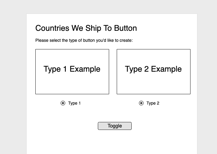
Recall our previous mockup:
We will now attempt to recreate it in React and Shopify Polaris. Let's first get the correct node version (we'll use the LTS version which is 12.18.0 at the time of writing - this version will be supported for a long while from now). For that we'll need nvm, which you can get from here.
This makes sure we will have the correct version added to source control, allowing anyone who uses the project to use the same Node.js version that we do.
nvm install 12.18.0 && \
nvm use 12.18.0
From here on we have two options: We either roll our own project scaffolding, or we use a scaffolding tool to do the work for us. Remember - this is not the final version of our app, which will use Next.js as the main backbone. This is just an experimentation playground - one step removed from all the complexity - where we can build our React & Polaris interface in an isolated way, away from the full app.
For that purpose, then, we will use create-react-app that we've seen in the React sidestep, add Polaris to it and voila - we're good to go!
cd ~ && \
npx create-react-app countries-we-ship-to-button && \
countries-we-ship-to-button
Wait for that bad boy to finish, and you will find yourself inside the project folder.
In order to begin work on the interface, we're going to need Shopify Polaris:
npm install @shopify/polaris
Ignore any warnings that come by - we're using a very mainstream package with great support. If something does not work out of the box in this stage - it's probably not the package's fault.
By the way - that @ there, in @shopify/polaris? That's called a "Scoped NPM Package", and it means that this is an official module from Shopify. Goodie! :)
Starting For Real Now
Let's dive in! The scaffolding that create-react-app does allows us to use App.js for experimentation - everything is loaded up and ready to go. Your App.js should look like this:
import React from "react";
import logo from "./logo.svg";
import "./App.css";

function App() {
  return (
    <div className="App">
      <header className="App-header">
        <img src={logo} className="App-logo" alt="logo" />
        <p>
          Edit <code>src/App.js</code> and save to reload.
        </p>
        <a
          className="App-link"
          href="https://reactjs.org"
          target="_blank"
          rel="noopener noreferrer"
        >
          Learn React
        </a>
      </header>
    </div>
  );
}

export default App;
And we can get going. Let's first turn the functional component into a class component, since this component is going to be rather large, and I prefer to have my larger components as classes and my smaller ones as functional components:
import React from "react";

class App extends React.Component {
  render() {
    return (

    );
  }
}

export default App;
We can now import Polaris (note how we're importing both the library and they style files - this is just because we're playing with the interface here manually, and will be abstracted away once we move over to Next.js), and specifically the <Page> component, which will be the first Polaris component we use:
import React from "react";
import { Page } from "@shopify/polaris";
import "@shopify/polaris/styles.css";

class App extends React.Component {
  render() {
    return (
      <Polaris.Page
        title="Welcome!"
        subtitle="Please select the type of button you'd like to generate for your site:"
      ></Polaris.Page>
    );
  }
}

export default App;
Let's run our code, to see how it looks like live! Type the following into your terminal:
npm start
And you should see the following error message:
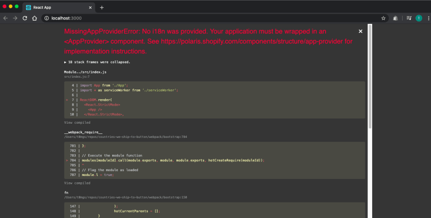
This is perfectly fine, and has to do with how Shopify apps are expected to be built. Shopify has a special component called AppProvider that wraps all Shopify apps, allowing all the components in the app to share a set of properties across the board. Don't fuss too much about it right now - we'll deal with it later. For now, just add it to your code to make sure you pass the check:
import React from "react";
import { Page, AppProvider } from "@shopify/polaris";
import "@shopify/polaris/styles.css";

class App extends React.Component {
  render() {
    return (
      <AppProvider>
        <Page
          title="Welcome!"
          subtitle="Please select the type of button you'd like to generate for your site:"
        ></Page>
      </AppProvider>
    );
  }
}

export default App;
You should now see the following:
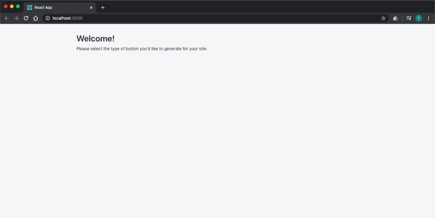
Which means that Polaris is properly installed, and we have created our first page!
We'd like to now create a proper layout for our page. Fortunately, Polaris provides the Layout component to let us scaffold the page properly. Let's add it now to create two half-sections for our page, just like in the schema we drew up before:
import React from "react";
import { Page, AppProvider, Layout } from "@shopify/polaris";
import "@shopify/polaris/styles.css";

class App extends React.Component {
  render() {
    return (
      <AppProvider>
        <Page
          title="Welcome!"
          subtitle="Please select the type of button you'd like to generate for your site:"
        >
          <Layout>
            <Layout.Section oneHalf>
              <h1>First Half</h1>
            </Layout.Section>
            <Layout.Section oneHalf>
              <h1>Second Half</h1>
            </Layout.Section>
          </Layout>
        </Page>
      </AppProvider>
    );
  }
}

export default App;
You should now see something like this:
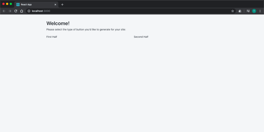
Note that the Layout component has a sub-component called Section. This is what the Layout.Section syntax means - it's a component within a component. Specifically, since a component is actually a function, Section is a property of that function, that just happens to be another function. An in React-speak, this is a component nested inside another component.
Note also the oneHalf property (i.e. 'prop') we gave the Layout.Section component - this is one variant out of a few (see here) that we can give the section to form a "grid" of sorts on the page. This is useful if you'd like to have columns in your page (created by multiple Sections in the same Layout, each with a oneHalf or oneThird property supplied to it).
But this is still not a great look, since the headers are kind of "floating" in the page. Let's wrap them in a Card component, shall we?
import React from "react";
import { Page, AppProvider, Layout, Card } from "@shopify/polaris";
import "@shopify/polaris/styles.css";

class App extends React.Component {
  render() {
    return (
      <AppProvider>
        <Page
          title="Welcome!"
          subtitle="Please select the type of button you'd like to generate for your site:"
        >
          <Layout>
            <Layout.Section oneHalf>
              <Card title="First Half"></Card>
            </Layout.Section>
            <Layout.Section oneHalf>
              <Card title="Second Half"></Card>
            </Layout.Section>
          </Layout>
        </Page>
      </AppProvider>
    );
  }
}

export default App;
It should now look like this:

Let's add some content into our cards, by sectioning it out - this will later act as a menu from which the customer can choose which type of button they'd like to have in their website. That way, the content of each selection will be a demo of one variant of the button (we will actually implement that button later, so I'll use a dummy one for now). Note that this is similar in nature to Sectioning out the Layout interface like we did before:
import React from "react";
import { Page, AppProvider, Layout, Card } from "@shopify/polaris";
import "@shopify/polaris/styles.css";

class App extends React.Component {
  render() {
    return (
      <AppProvider>
        <Page
          title="Welcome!"
          subtitle="Please select the type of button you'd like to generate for your site:"
        >
          <Layout>
            <Layout.Section oneHalf>
              <Card title="Full Button Variant">
                <Card.Section title="Demo">
                  <button>Dummy Full Button</button>
                </Card.Section>
              </Card>
            </Layout.Section>
            <Layout.Section oneHalf>
              <Card title="Empty Button Variant">
                <Card.Section title="Demo">
                  <button>Dummy Empty Button</button>
                </Card.Section>
              </Card>
            </Layout.Section>
          </Layout>
        </Page>
      </AppProvider>
    );
  }
}

export default App;
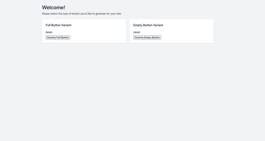
And I think this is enough for this post. We now have a working playground to play with, as well as a start to our product page! Stay tuned for the rest of the interface in the upcoming tutorials.

Top comments (2)
Thank you for this series, I have wateched all the videos you put out so far and looking forward to the upcoming ones. If I may ask, how long does the review process from Shopify take to get your app listed in the app store?
Awesome! Happy to hear you're finding it useful!
It was about 2 weeks for me from first submission, through a round of fixes and up until the app was live. Assume less if you're following all the guidelines to a T.