Before we can write a single line of code we have to have a good idea of what we're creating. We know our requirements and our stack from the previous posts, now it's time to mock up the UI.
Usually it's a good idea to start with a wireframe before getting straight into the colour mockups. Wireframes are better for iterating quickly on layout options. Since we're building a simple UI that is really only a chatbox, I figured we can move past the wireframe step and start with a full-colour mockup.
I would also recommend mapping out the user flows and how it relates back to our stories defined in the first post but since I don't expect that this app will be very groundbreaking I think it's best that we allocate our time elsewhere. There is plenty more to do.
Colours
I wanted to choose a colour palette that was welcoming, informal and warm to users. Since this will be a chatbot-like interaction, I wanted to give the app a friendly atmosphere.
I settled on a purple/pink palette:

I used the fantastic coolors.co to get this palette together
First draft
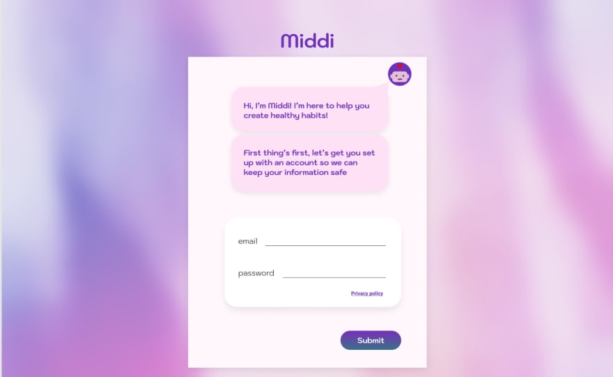
I went with a blurred background image to allow an interesting and fun background without taking focus away from the main chat window. I also used a sans-serif font that was playful to keep the "informal" aesthetic.

Here's a second design which includes a login form. This demonstrates my idea of keeping the entire app inside a chat window, which includes all forms and other components. To be honest, it's probably not amazing for user experience... but it's still an interesting proof of concept so I want to see what comes of it.

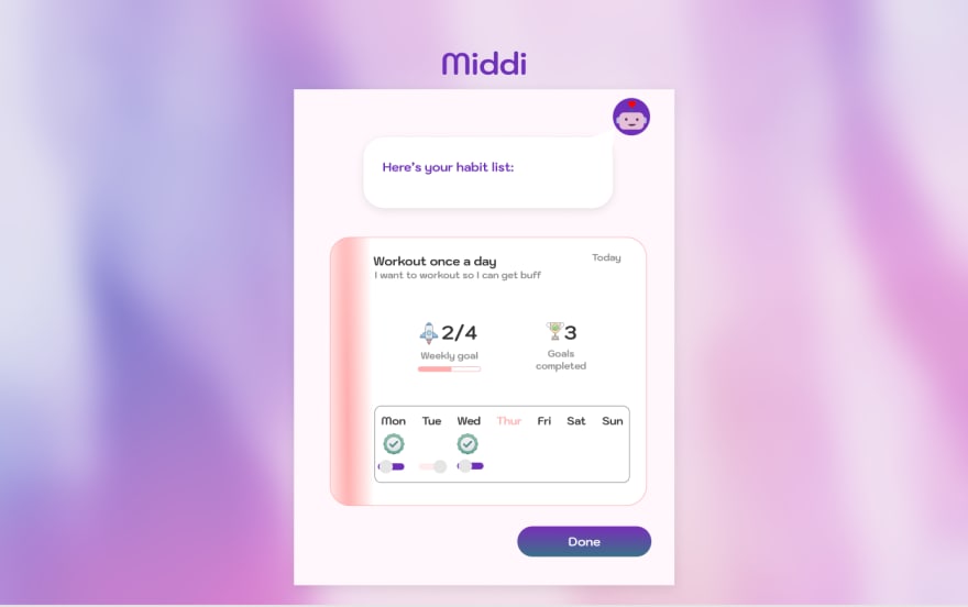
This next design includes a simple toggle for completing daily habits. It would be interesting to allow users to assign a color to a habit to personalize their experience.

Lastly, here's the overview component which shows a summary of a habit's progress. There is some flexibility here to show some interesting stats.
One thing not included in these designs that I wanted to keep in mind, is some fun animations/interactions to keep the app lighthearted and friendly. I want users to feel good when they complete a habit. So showing some sort of "celebration" animation when they complete a habit will be really important and there is a lot of opportunity to be creative.
Now that we've got a decent UI in mind, we can actually get into the code. In the next post we'll be looking at setting up the backend with authentication and database models.


Top comments (0)