Getting closer to the capabilities of regular desktop devices with each version, slowly but surely, the iPad is becoming an indispensable gadget in our backpack. It is an ultimate tool that we use for various purposes; and surfing through the web as well as checking inbox are among them.
If you have a marketing website, then chances are your targeted audience visit your site or read your email newsletters through it. Therefore, if you want to establish a closer connection with your potential customers and speak with them the same language, you should use iPad mockups in your presentations and correspondence.
Like any other highly realistic device templates, they have the ability to persuade potential clients with its authentic appearance and compelling charisma. Let’s consider some famous brands that show on practice how to use iPad mockups in marketing materials.
Outstanding Examples of iPad Mockup Usage in Marketing Materials
Be Loud
The first example in our list is Pixelmator Photo, the popular graphic editor. Its marketing team knows a thing or two about creating a presentation that instantly appeals to the audience and brings home the proper message.
Their marketing website gets the beauty from a considerable use of highly realistic iPad mockups. Take a look at the hero area. All you can see here is a small introduction and a huge tablet surrounded by nothing more than whitespace. Sounds loud, does not it?
As for the rest of the layout, tablets accompany almost every section supporting the content visually. They vividly demonstrate the application in action and bring value to the audience, thereby making the presentation quite helpful and inviting.
The Key Takeaway:
• Make tablet speak volume by opting in favor of the big version and almost empty environment.
• Hit the audience from the get-go.
• Alternate between portrait and landscape modes to add a sense of diversity to the user experience.
Hint: Consider the iPad mockups package. It includes highly realistic renderings that come in various views and modes. Use them to create something alike in your landing page
![]()
Show Application in Various Devices
The next stop is Magpie that specializes in providing a handy environment for visual note taking. Although its marketing website welcomes visitors with cellphone-centric design, nevertheless, the team did not forget about its bigger brother, aka tablet.
One of the sections features a scene with an iPad mockup and iPhone mockup made in a subtle clay style. Together they exude an image of elegance and sophistication displaying the program in the aesthetically pleasing fashion.
Note the composition takes up almost the entire scene. In this way, the readers have an opportunity to enjoy the beauty of the interface while the team has a chance to remind their visitors once again what a great product is waiting for them, thereby closing the landing page quite strongly.

The team behind Pixelmator for iOS played the same trick. Here you can see a powerful combo of iPad mockup and iPhone rendering that are tightly placed together. This time the style of the devices is more traditional: it feels skeuomorphic. Nevertheless, all the pieces perfectly work together, creating a strong aura around the product.
![]()
The Key Takeaway:
• Show interface on various devices. This will prove to the audience that your application is ready to work with any gadget. Whether it is a brand-new iPhone 11 with triple cameras or it is an old-school yet time-proven iPhone 6, whether it is a tablet or even PC, your app is great anywhere.
• Even though you feel like your application is suitable for a mobile audience, remember tablets and cellphones are quite similar in functionality. Therefore, sometimes they can be interchangeable. Use iPad mockup in tandem with iPhone mockup to cover broad audience and show that your application perfectly fits every screen size.
Hint: To find the perfect match of mobile and tablet, consider iPad mockup and iPhone X Mockups Clay. Made in the same style, they nicely play together.
Follow the General Trends
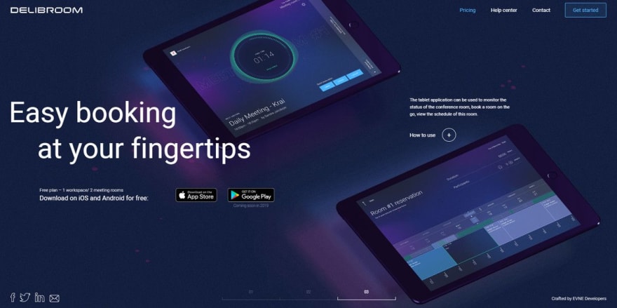
Delibroom quickly made our list. Why? Well, it has a highly trendy landing page. It lures in with its incredible techy atmosphere. The team has embraced the dark side and derived benefits from the stylistic options taken from the designs inspired by high-tech.
Set your eyes on the slider in the hero area. Each slide has its composition that presents several application screenshots under the angle. Dark canvas in tandem with neon touches skillfully play with black iPad mockup displayed in perspective.
Moreover, the team has also injected some dynamics into the scenes making the design feel alive. As a result, the homepage looks trendy, stylish, and sophisticated. It seems like you are dealing with a high-quality product.
The Key Takeaway:
Trends can be quite beneficial for your marketing website. However, use them wisely. Dark designs and high-tech aesthetics dominate the web these days; therefore, try out black iPad mockups. They perfectly blend in.
Hint: To imitate this at your marketing website, adopt iPad Pro Clay Mockups.
Last but not least
Make Various Brands Work for You
If you feel like not everything is centered around Apple since let’s be honest, there are some valid alternatives in the face of Samsung, but you still want to straddle both worlds, then you can easily mix and match device templates from various brands.
It may just seem illogical to mix various brands; however, this will create a diversity. Pair iPad mockup with tablets or cellphones from other brands to show that your application works perfectly across the platforms.

Hint: take iPad mockup from the iPad Clay Mockups pack and Samsung template from Samsung Galaxy S10 Mockup Clay pack. Thanks to similarities in design and coating (they both are made in subtle clay style), they will perfectly collaborate, creating an outstanding scene.

Top comments (0)