Mac screen mockup is not an often guest in marketing websites. The reason is simple: highly realistic renderings of iPad and iPhone are main building bricks when it comes to modern presentations these days since we are stepping into the mobile era. However, it does not mean that it is useless.
Much like MacBook, iMac mockups have their targeted audience. They are just indispensable when it comes to serious products. Unlike its much smaller brothers, iMac impresses visitors with its formidability, authority, trustworthiness, and powerful sense of sophistication. Therefore, if you are building a complex program with high-end tools and an advanced environment, then iMac mockup is a must-have for the presentation. It perfectly fits the bill by delivering the proper message to the required audience as well as strengthening the brand identity. It is here where it outdoes other Apple devices.
If you are one of those who need to play cool, we have prepared several helpful tips taken from the goliaths of the industry that show you how to use iMac mockups in marketing materials.
Usage of iMac mockups in marketing materials – Best Practices
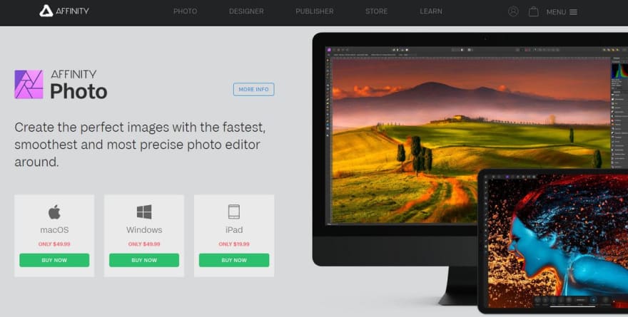
Affinity Photo
The team behind the marketing website of Affinity provides one of the best practices. You can certainly get some practical hints from its promo page.
So what can we see here? The team skillfully exploits one of its sections to the maximum. Not only does the solution reinforce the company image, but it also promotes the product quite efficiently and, most importantly, unobtrusively.
Here you can see a highly realistic iMac mockup that occupies half of the entire screen. If you think it is too much, then give the website a shot. You will see that the team was managed to balance its visual weight with the help of several important details bringing about quite a harmonious look. First, they have made the textual part eye-catching using glyphs and graphic details. Secondly, they have slightly overlapped the device with another gadget thereby setting several focal points instead of one. Brilliant.
The key takeaway
First, if in doubt, where to place your iMac mockup with the screenshots of your product, go for the time-proven hero area or sections that are located right after it. They are one of those parts of the marketing website that are destined to handle grandiose visuals gracefully.
Secondly, if you want to hit the trendy look, then do not display the entire device; show just the more significant part of it. This will be enough to grab the attention and leave something to the imagination, thereby igniting the user’s interest.
Hint: To try out Affinity solution, grab one of the iMac mockups available in free iMac Mockup package and iPad Pro from one of the packs and play with them either in Photoshop or in Sketch to come up with an idyllic composition for your hero area.
iMac Apple
The creative team behind Apple’s marketing website shows everyone that you may have a singular product, and you still can create an impression that it is much more than hits an eye at first glance. Consider the page that tout MacOS and iMac in particular.
You will not find here a spectacular hero area as well. However, it does not mean that the landing page is lacking an impression. Here the marketing team has skillfully scattered elements throughout the entire page leading engaged users from top to bottom.
There are several iMac mockups. The first one occupies almost the top position following the text-based welcome section. After that, it is used in some combos as well as alone. Finally, a trio of iMac mockups closes the presentation. As a result, the landing page feels unobtrusive, authoritative, and provides a consistent experience all the time. Clever.
The key takeaway
It is fine to have just one product and one mockup to present it to the audience. Take a screenshot of your app and create a sense of diversity using different sizes of iMac mockup. Strengthen the feeling by using black and white versions.

Hint: Peek inside iMac mockups Clay and iMac & MacBook Clay Mockups. Both these packages offer some excellent graphics that will help to create a sense of diversity.
Parallels Desktop
The marketing website of Parallels Desktop is an excellent example of iMac mockup used in a context. It is here where it is assigned to carry out a supportive role, even though it seems that it should occupy the leading position. What does make us think this way? Its gargantuan size, of course. However, the team was managed to handle the situation.
Yes, the iMac mockup is the first thing that strikes an eye, no questions asked. Nevertheless, thanks to its big size, the onlookers have an opportunity to quickly scan the image and shift their attention to a more valuable part of the section, aka content. Very smart.
First, the team has placed an unmissable focal point that grabs visitors’ attention while they are surfing through the page. Secondly, they have given some food for thoughts by taking readers closer to the details with the help of a large image. Finally, they unobtrusively move visitors’ eyes to the content as well as satisfy their craving for something spectacular with an almost full-screen iMac.
The key takeaway
Do not be afraid of using big iMac mockup. It may just seem to ruin the entire aesthetics. In fact, when used within the proper entourage and supported by valuable content, it can do nothing but good. Place it in the middle of the reading flow to naturally draw the user’s attention and make things a bit interesting and engaging. Also, use big and highly detailed screenshots so that your visitors have an opportunity to explore and enjoy the app.

Hint: If you seek an iMac mockup, whose size you can increase or decrease without losing quality, try out these desktop mockup free. Here you will find devices vigilantly reproduced in a beautiful clay style that perfectly work in any dimension and give any presentation a modern feel and sophisticated touch.

Top comments (0)