“The greatest cost of a picture is when it arms us to notice what we have never waited to see.”

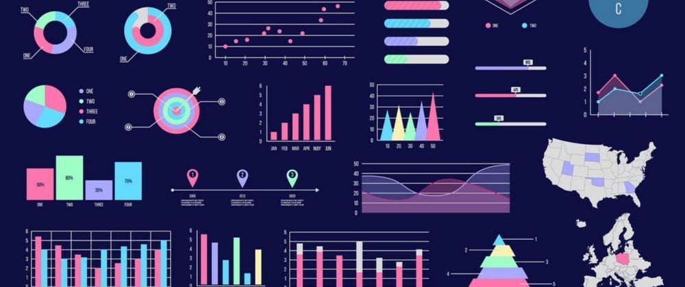
What is data visualization? Data and information visualization is an interdisciplinary field that deals with the graphic representation of data and information.
Psychology says that visual representations help us to understand data quickly. When you show an effective graph or chart, your report or presentation gains clarity and authority, whether you’re comparing sales figures or highlighting a trend.
When information is represented in a graphic form, a human can realize more frequently and quickly complicated trends. Yet it does not require any technical skills and is easy to learn with the help of various tools like Power BI, Tableau etc.
But the real question comes in now: There are so many graphs, so how do we decide when to use which graph?
Fear not for I have got you covered. A few days back, we were asked to make an AQI prediction project based on ML and we had to use Python Libraries for making the data visualizations. I was in a real fix as to when to use which graph because it was my first time doing an ML project. I have attached the Github repository link to my project:
https://github.com/prajuktadey/AQI-Prediction
Moving on to the real question, when to use which graph? Well, if you’re more inclined to working with data, there are 5 essential graphs you need to know and most of the visualizations are made using these graphs but of course you can always explore some more.
The most popular graph is, yes, you guessed it right: Bar Graphs.
With bar charts, you can easily compare data. We’ll be working with three main types of bar charts.
Vertical Bar charts: Vertical bar charts are very common but they lose their comparability if there more than 7 categories. So, if you’re using a vertical bar chart, try limiting the data categories till 7.

- Horizontal Bar charts: In case if you have more than 7 categories, horizontal bar charts if your thing. These are best when you want to show rankings like election results. The comparisons made using horizontal bar graphs are very convenient because you are able to compare items even with large figures just by looking at them.

- Stacked Bar charts: You can use stacked bar charts if you want to show part to whole, how many different elements contribute to that overall total. In simpler words, a stacked bar graph (or stacked bar chart) is a chart that uses bars to show comparisons between categories of data, but with ability to break down and compare parts of a whole. Each bar in the chart represents a whole, and segments in the bar represent different parts or categories of that whole.
Moving on to the second popular graph which is the Histogram.

Bar charts break down the data by different categories, histograms on the other hand show the distribution over a continuous variable, so things like time, age, weight.
In other words, it provides a visual interpretation of numerical data by showing the number of data points that fall within a specified range of values.
Histograms are generally less about individual data points and more about the broader pattern.
What is the difference between Bar charts and Histograms?
Bar charts allow you to compare specific variables or categories. Histograms allow you to understand the distribution of variables or the frequency of specific occurrences.

The third most popular graph is a Pie chart.

Before diving into it, I just wanted to say that this is the most hated chart by data analysts. Our brains are not really good at measuring angles and areas. Bar charts are way better than pie charts in communicating data.
Pie charts often distort the information and make it more difficult for decision-makers to understand the messages they contain.
But, in case you really want to use pie charts for your visualizations, you must follow certain rules:
a. Never use more than 5 data points because if you do the pie chart will get clustered and you won’t be able to read your data. I have attached an image of a badly constructed pie chart below:

b. Rank the values in order where the biggest segment begins in the top right hand corner because reading data from pie charts is hard enough so we want the data to be easily readable.
c. Be creative and use colors to communicate.
- In 4th place, we have Scatter plot.

If you’re looking to show correlation or how two things relate to each other then scatter plots are the best. They can be used to show whether there is a correlation or there is no correlation, to show clustering trends, or spot outliers.
When to use scatter plot?
Answer: Scatter plots are used to plot data points on a horizontal and a vertical axis in the attempt to show how much one variable is affected by another.
Try using scatter plot when your independent variable has multiple values for your dependent variable.

- Avoid scatter plot when your data is not at all related.
- Avoid scatter plot when you’ve large sets of data.

You cannot really read the data because there are a little too many data points here.
- The fifth most popular chart is the Line chart.

If you want to show how something changes over time then line chart is definitely for you. Line graphs are used to track changes over short and long periods of time.
If you have continuous data that you would like to represent through a chart then a line chart is a good option. This graph is especially effective when trying to identify a trend or pattern in your data, for example seasonal effects and large changes over time.

As you can see, we are here analyzing Parker’s body temperature. We are keeping track of his temperature over a short period of time.
It makes forecasting or pattern recognition easier.
Well, that’s it for article. I really hope I made the explanations clear because I was very confused about the graphs at one time. Hope you liked it!
Good luck with your data visualization journey!


Top comments (0)