
This is an Stepper made in React:

Steppers let you display content in sequential steps, they are good for:
- dynamically split big forms, so the user doesn’t need to fill 20000 inputs at once
- logically present data, for example, to understand the content in step 2 you need to see step 1 first
In this tutorial we are going to create a Stepper component in React, taking care of the usability, and we are going to create a cool and fancy one.
If you don’t want to go through the tutorial, the code is in Github already, here
Create the project
First things first, let’s create our project, we are going to create one with ‘create-react-app’ and Typescript
npx create-react-app fancy-stepper --template typescript
Once our project is generated:
cd fancy-stepper && yarn start
Your app should be running on localhost:3000
Preparing the component
The next step is to create our Stepper component. Let’s go to our src directory and let’s create a file called Stepper.tsx, and we are going to create our component like this:
import React from 'react';

interface StepperProps {
    // Empty right now, we will fill this in later
}

export const Stepper: React.FC<StepperProps> = () => {
    return <>Nothing yet</>
}
Now, go to your App.tsx file, and remove everything, then add your Stepper component.
import React from 'react';
import { Stepper } from './Stepper';
import './App.css';

function App() {
  return (
    <div>
      <Stepper />
    </div>
  );
}

export default App;
Creating our Stepper functionalities
If we make a breakdown of what a Stepper can do, we can summarize it like this:
- Display N steps
- Go to next step
- Go to the previous step
- Update the Stepper progress
The Steps
We are going to pass steps to the stepper component using the render props pattern, let’s start creating a steps prop in our component. That prop will accept an array of objects, and each object will configure each step, let’s write our types first:
import React from "react";

interface StepperProps {
    steps: Step[];
}

interface Step {
    // Title of the step
    title: string;
    // Element to render in the step, can contain
    // a form, an image, whatever
    element: (stepProps:StepProps) => JSX.Element;
}

export interface StepProps {
  // Here we tell the stepper to go to the next or previous step from
  // the element we are rendering
  goNextStep: () => void;
  goPreviousStep: () => void;
  // Tells you the active step right now
  currentStep: number;
  // And this is useful to know where you are
  isLast: boolean;
  isFirst: boolean;
  // Tells you the step in which you are right now, starting
  // from 1
  step: number;
}

export const Stepper: React.FC<StepperProps> = ({steps}) => {
  return <>Nothing yet</>;
};
You will notice, now in our App.tsx file, we have an error because the Stepper component is missing the steps prop, let’s add it:
import React from "react";
import { Stepper } from "./Stepper";
import "./App.css";

function App() {
  return (
    <div>
      <Stepper
        steps={[
          {
            title: "I'm the step 1",
            // Render whatever you want here, we will improve this later
            element: ({ goNextStep, goPreviousStep }) => <>Step 1</>,
          },
          {
            title: "I'm the step 2",
            element: ({ goNextStep, goPreviousStep }) => <>Step 2</>,
          },
        ]}
      />
    </div>
  );
}

export default App;
Nice!, now our steps and our Stepper are ready.
Rendering our Steps
We need to display the steps sequentially since we don’t want the steps to appear and disappear from the DOM, because that’s not good for accessibility, we are going to render them linearly with an overflow: hidden wrapper, like this:
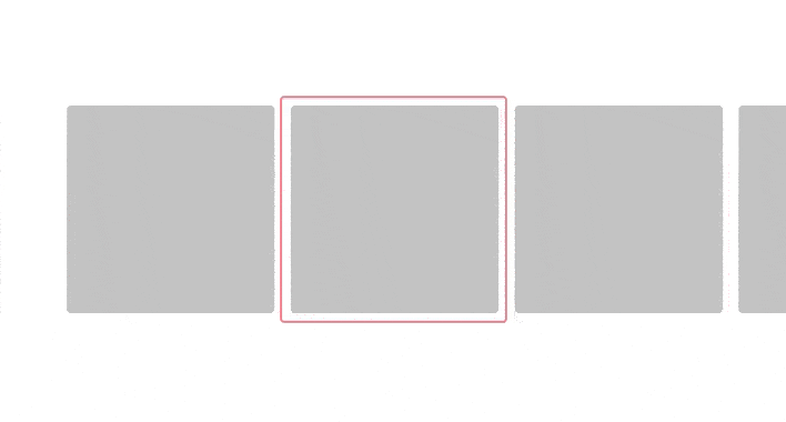
The red border represents the visible area, and each grey box represents each step, we only see the step which is currently inside the red area.
Let’s start by rendering the steps in our Stepper component:
export const Stepper: React.FC<StepperProps> = ({ steps }) => {
  const goNextStep = () => {};
  const goPreviousStep = () => {};

  return (
    <div className="stepper stepper-wrapper">
      {/* This div represents the red bordered box */ }
      <div className="stepper-selector">
        {steps.map(step => (
          <div>
            <step.element
              // NOOP right now, we will update this later
              goNextStep={goNextStep}
              goPreviousStep={goPreviousStep}
              // Fill this with fake values, we will go
              // over this later
              currentStep={0}
              isFirst={false}
              isLast={false}
            />
          </div>
        ))}
      </div>
    </div>
  );
};
Now, state
Our stepper needs to store the value of the active step, we are going to use React state for this, how we are going to update this is using the goNextStep and goPreviousStep functions, those functions are being passed to the steps we are rendering.
export const Stepper: React.FC<StepperProps> = ({ steps }) => {
  const [currentStep, setCurrentStep] = useState<number>(1);
  const goNextStep = () => {
    const nextStep = currentStep + 1;
    if (nextStep <= steps.length) {
      setCurrentStep(nextStep);
    }
  };

  const goPreviousStep = () => {
    const previousStep = currentStep - 1;
    if (previousStep >= 1) {
      setCurrentStep(previousStep);
    }
  };

  return (
    <div className="stepper stepper-wrapper">
      <div className="stepper-selector">
        {steps.map((step, i) => (
          <div className="step-wrapper">
            <step.element
              step={i + 1}
              goNextStep={goNextStep}
              goPreviousStep={goPreviousStep}
              // From our state
              currentStep={currentStep}
              // Check if this step is the first one
              isFirst={i === 0}
              // Check if its the last one
              isLast={i === steps.length - 1}
            />
          </div>
        ))}
      </div>
    </div>
  );
};
Making it fancy
Now let’s improve what we render in each step, so we can play with it a bit, we are going to add transitions too.
function App() {
  return (
    <div className="wrapper">
      <Stepper
        steps={[
          {
            title: "I'm the step 1",
            // Render whatever you want here, we will improve this later
            element: stepProps => <Step {...stepProps} />,
          },
          {
            title: "I'm the step 2",
            element: stepProps => <Step {...stepProps} />,
          },
        ]}
      />
    </div>
  );
}

export default App;

const Step: React.FC<StepProps> = ({
  goNextStep,
  goPreviousStep,
  isFirst,
  isLast,
  currentStep,
  step,
}) => {
  return (
    <div className="step">
      <div className="step-body">IM THE STEP {step}</div>
      <div className="step-actions">
        {/* If we are in the Step 1, we cannot go back, so we disable this */}
        <button
          className="step-button"
          disabled={isFirst}
          onClick={goPreviousStep}
        >
          GO PREVIOUS
        </button>
        {/* Same but with the last step */}
        <button className="step-button" disabled={isLast} onClick={goNextStep}>
          GO NEXT
        </button>
      </div>
    </div>
  );
};
If you go to your browser, you will see an ugly HTML layout, so we are going to add some styles to improve that:
/* App.css */
.step {
  height: 100%;
  width: 100%;
  display: flex;
  flex-direction: column;
  justify-content: space-between;
  background: #fff;
}

.step-body {
  flex: 1;
  justify-content: center;
  align-items: center;
  display: flex;
}

.step-actions {
  display: inline-flex;
  justify-content: space-between;
  margin: 0 2rem 1rem;
}

.step-button {
  padding: 0.5rem 1rem;
  border: none;
}
/* Stepper.css */

.stepper {
  width: 600px;
  height: 600px;
  position: relative;
  overflow: hidden;
  display: inline-block;
  box-shadow: rgba(0, 0, 0, 0.2) 0px 3px 1px -2px,
    rgba(0, 0, 0, 0.14) 0px 2px 2px 0px, rgba(0, 0, 0, 0.12) 0px 1px 5px 0px;
}

.step-wrapper {
  width: 600px;
  height: 100%;
}

.stepper-selector {
  position: absolute;
  height: 100%;
  display: inline-flex;
    top:0;
}
And now, let’s add our functionality to switch between steps, we are going to use a ref for this.
export const Stepper: React.FC<StepperProps> = ({ steps }) => {
  const [currentStep, setCurrentStep] = useState<number>(1);
  const stepperSelector = useRef<HTMLDivElement>(null);
  // Every time our currentStep is updated, we are going to trigger this
  useEffect(() => {
    moveStepper();
  }, [currentStep]);

  const goNextStep = () => {
    const nextStep = currentStep + 1;
    if (nextStep <= steps.length) {
      setCurrentStep(nextStep);
    }
  };

  const goPreviousStep = () => {
    const previousStep = currentStep - 1;
    if (previousStep >= 1) {
      setCurrentStep(previousStep);
    }
  };

  const moveStepper = () => {
    if (stepperSelector.current) {
      const stepper = stepperSelector.current;
      const stepWidth = stepper.offsetWidth / steps.length;
      stepper.style.transform = `translateX(-${
        stepWidth * (currentStep - 1)
      }px)`;
    }
  };

  return (
    <div className="stepper stepper-wrapper">
      {/* This will display our current step */}
      <div className="stepper-selector" ref={stepperSelector}>
        {steps.map((step, i) => (
          <div className="step-wrapper">
            <step.element
              step={i + 1}
              goNextStep={goNextStep}
              goPreviousStep={goPreviousStep}
              // From our state
              currentStep={currentStep}
              // Check if this step is the first one
              isFirst={i === 0}
              // Check if its the last one
              isLast={i === steps.length - 1}
            />
          </div>
        ))}
      </div>
    </div>
  );
};
Here we are getting a ref of the DOM element which contains the steps, we are going to move it every time we update the stepper.
Adding a progress bar to the stepper
Time to add a progress bar, so we know where we are in the stepper.
Let’s create a new component in a file called StepperProgress.tsx, it should look like this:
import React from "react";
import "./Stepper.css";

interface StepperProgressProps {
  stepTitles: string[];
  currentStep: number;
}
export const StepperProgress: React.FC<StepperProgressProps> = ({
  stepTitles,
  currentStep,
}) => {
    // Calculate the progress for each step we fill
  const progressPerStep = 100 / (stepTitles.length - 1);
    // Calculate the progress based on the step we are in
  const progress = (currentStep - 1) * progressPerStep;
  return (
    <div className="stepper-progress">
      <div className="stepper-progress-wrapper">
        <div
          className="stepper-progress-bar"
          style={{ width: progress + "%" }}
        />
        {stepTitles.map((title, i) => (
          <div className="step-title">
            <div className="step-title-number">{i + 1}</div>
            {title}
          </div>
        ))}
      </div>
    </div>
  );
};
This component will display a progress bar and will update the progress bar width every time we update the current step.
In our Stepper.tsx file let’s call the component:
// Rest of the Stepper.tsx file

return <div className="stepper stepper-wrapper">
      <StepperProgress
        stepTitles={steps.map(step => step.title)}
        currentStep={currentStep}
      />
      {/* This will display our current step */}
      <div className="stepper-selector" ref={stepperSelector}>
        {steps.map((step, i) => (
          <div className="step-wrapper">
            <step.element
              step={i + 1}
              goNextStep={goNextStep}
              goPreviousStep={goPreviousStep}
              // From our state
              currentStep={currentStep}
              // Check if this step is the first one
              isFirst={i === 0}
              // Check if its the last one
              isLast={i === steps.length - 1}
            />
          </div>
        ))}
      </div>
    </div>
And now let’s add some CSS for this:
// Stepper.css

// Rest of the CSS file
.stepper-progress {
  position: absolute;
  top: 15px;
  width: 100%;
  z-index: 9;
}

.stepper-progress-wrapper {
  width: 90%;
  position: relative;
  display: flex;
  margin: auto;
  justify-content: space-between;
}

.step-title {
  text-align: center;
  font-size: 0.7rem;
  align-items: center;
  background: #fff;
  padding: 0 1rem;
  height: 30px;
}

.step-title-number {
  font-size: 1rem;
  background: #ceeeff;
  height: 24px;
  width: 24px;
  margin: auto;
  line-height: 1.5;
  border: 3px solid #fff;
  border-radius: 100%;
}

.stepper-progress-bar {
  position: absolute;
  width: 100%;
  height: 3px;
  top: 13px;
  z-index: -1;
  background: #e91e63;
  transition: width 1s cubic-bezier(0.23, 1, 0.32, 1) 0s;
}
The result:


Top comments (0)