A while ago I started a completely unnecessary project. There are many problems with it. Nothing is easy. The one that really frustrates me is how the canvas is fixed-size and no matter how big the browser window is, it will always stay the same. So I went on a tangent to fix this and spent 10 hours doing this. I consider this a great loss of valuable time I could have used for gaming, so I think it’s a good topic for a post. Today I’ll tell you how to make canvas fill up the empty space of a page using CSS and the flexbox layout.
Is flexbox the right way to do it?
No idea. I don’t really do things professionally at home. This is is called work and I have a job where I have to be responsible. At home it’s complete mayhem. Let’s have some fun.
The mythical goal of filling up the screen
You know when you have a small web page with maybe an element or two and a huge amount of white space underneath?
And when you have a footer on the bottom with a different color from white? Then you have a colored line in the middle of the screen instead of the pretty design you worked on so hard. Well, if you have a canvas on the screen and you don’t know how big it needs to be something similar to this happens:
Initially the chart is not stretched to fit the empty space at all.
You see, to resize a canvas, you definitely need to set its size in pixels. And using CSS for this job also doesn’t work, since it will only stretch the image, it won’t make the canvas bigger. The canvas has its own reality in which it lives. If it says there are only 100 pixels, you can only paint 100 dots. The CSS would only make these dots bigger and uglier. But that’s a problem for later.
You could of course grab the parent of the canvas and use its width and height and set them to the canvas. And this would make your drawing space as big as the parent. But if the parent is just a div with nothing else, it will have a height of 0 – just enough to fit all the content in.
So basically you end up with a canvas which has 0 pixels. These two problems are basically the same case. This is great, because it means I can look at what others did and then apply it to my problem, right?
Height of the content
To make the canvas take all the space which is available, first we need to solve the 0 pixel height problem.
A bit of CSS would help with this. If we set the body height to 100%, it should do the trick. Except it doesn’t.
Let’s say we have the following HTML:
        <div id="canvas-wrapper">
            <canvas id='canvas-id' class="chart"></canvas>
        </div>
As you can see there are a few CSS classes there. Let’s ignore them first and put some attributes in the body:
body {
  height: 100%;
}
.chart {}
.canvas-wrapper {}
Only the body has a height attribute of 100% nothing else. And here’s the result:

When only the height on the body of a canvas is set to 100% the chart takes only a small part of the available space
Of course the canvas height is set using javascript like this:
    this.canvas.width = this.parentElement.clientWidth;
    this.canvas.height = this.parentElement.clientHeight;
Here the canvas is edited in a dedicated javascript object, which also has a link to the parent of the canvas.
As you can see from the picture above, something went wrong. A way too big part of the screen is unused, when the goal is to have ginormous chart with no blank space. I guess the percent unit of the height is not the one we need to use. Let’s use the vh unit. The difference between it and the percent is that the vh reference is the viewport height, instead of the parent height.
body {
  height: 100vh;
}
.chart {}
.canvas-wrapper {}
Additional structure
This alone, unfortunately, does not change the result. So let’s introduce a bit more markup. I’ll wrap the canvas into a div and just for fun, I’ll add a form into another div next to it:
    <div class="App">
      <div class="item">
        <form>
            <input />
        </form>
      </div>
      <div class="item-main">
          <canvas id='id' class="chart"></canvas>
      </div>
      <div class="item">
      </div>
    </div>
Now we can play around with the different sections and their CSS classes. First, Let’s add some attributes to the App class:
.App {
    min-height: 100vh;
    display: flex;
    flex-direction: column;
}
This makes the outer div work as a stack. It’s display mode is flex which means the div is a flexbox. Now each element within it will act fluidly, filling up space as described with the flex attribute of their CSS class.
Flexbox items
Now let’s have a look at the items in this container. In my case they are simple divs which have the following CSS classes:
.item {}
.item-main {
    flex: 2;
    overflow: auto;
}
You can see that one of them is empty while the other one has a few attributes. This is actually crucial in this case. The item-main class defines the type of flex and the overflow behaviors, while the normal item class has no such fields. This way we specify the proportions of the different items.
What this means is, that flex items with class .item-main would take up twice as much space as ones with a class that specifies flex: 1 and basically all the empty space in our case, since our other class doesn’t have such attribute at all.
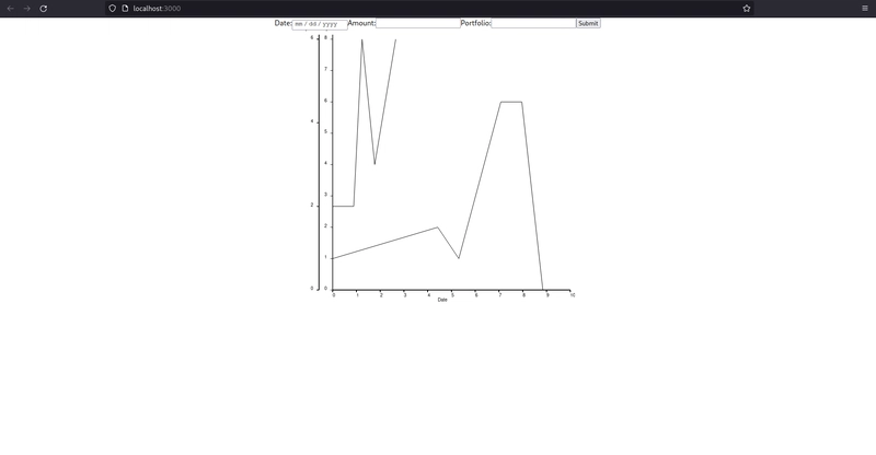
With all this in place, the page with the chart looks like this:

After all the necessary flexbox attributes are in place, the chart takes all available space on the page.
Flexbox is tricky
Like all the CSS, flexbox is tricky. You can’t simply slap in on a div and expect it to work instantly and as you want it. However, the concept isn’t that hard to grasp and after a few tries, you can easily apply it to your page.
On the other hand it makes it pretty simple to align a bunch of elements in a row or a column when compared to the old way of floating divs. So I believe it’s worth it to learn how to use it and never look back.
Cheers,

Top comments (0)