
The original article was written by SoftFormance https: https://www.softformance.com/blog/ui-ux-terms/
In our practice, we have launched more than 200+ projects which allows us to make some interesting conclusions on UI/UX design.
For example, we have seen that more than 50% of projects don’t require any custom design and can be completed only with a theme template.
However, such templates may perfectly fit the apps or software tools that are applied for internal use.
If it goes about a customer-facing app, custom design and UX planning are essential. After all, they significantly increase customer loyalty and their overall satisfaction with the product.
It’s just like with basketball jerseys. A team may use plain jerseys during practice or training sessions. However, when it comes to the official match a stylish custom jersey is a must.
Custom design is a part of a team’s brand. It makes a team much more attractive for various fans and supporters.
So, there appears an evident parallel between the value of custom app design for customer-facing software and the importance of custom jersey design for basketball teams playing official matches in front of the audience.
Also, there are cases when you cannot go without custom UI/UX design.
From our rich expertise, we know that clients and UI/UX designers often struggle to find a common language. This brings misunderstanding, which may become a truly significant challenge.
If this applies to you, we have some great news. Now you have a chance to understand UI/UX design essentials better and speak the same language with us.
Here’s a UI and UX glossary with an exclusive insight into the UI/UX design process we apply in SofFormance. All terms are grouped according to the stages of design development that we implement while working on your projects.
So, if you’re launching your first product and have no ideas on how UI/UX design is developed, this article will come in handy. It will help you understand the basic stages and notions related to this topic. Even if you have an existing app and want to make its design more user-friendly, speaking the same language with your designers will be a great benefit.
Are you ready to dive into the world of UI and UX definitions?
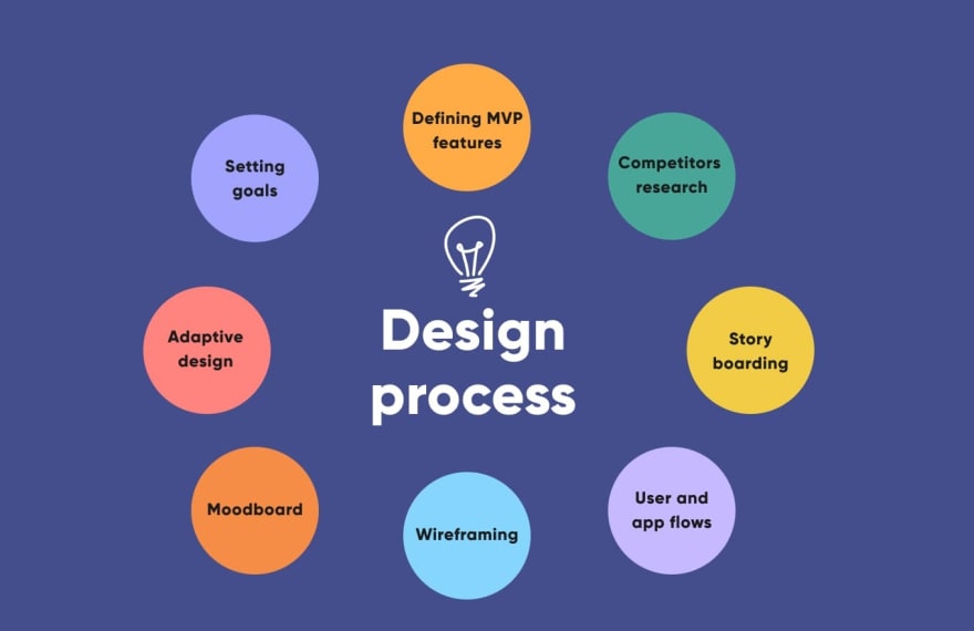
Design stages and essential terms
Our UI/UX design process may involve many steps and substeps, but let’s focus only on the most valuable ones and overview the most important terms pertaining to them.
We follow this exact process in each of our software design projects for each of our clients.
So, let’s start with…
User Experience (UX) design
At this stage, we research customer needs and their target audience. On the basis of such information and, in some cases, relevant examples, we start planning the app’s UX design.
It goes not only about the visual properties of a product but also about its basic functionalities, the manner in which they are offered to the user, the layout of elements, and many more.
This big stage consists of these steps:
Setting goals;
Defining MVP features;
Competitor research;
Storyboarding;
Creating user and app flows;
Wireframing.
These are the most important UX definitions that will help you understand your design team better:
User Experience: A general notion that refers to the experience that a user has with an app.
User Experience design: A basic notion that refers to the efforts of a design team on providing application users with a meaningful and convenient experience. Using an app with poor UX design may be like living in a flat with a toilet in front of your bed.
Agile UX: “Agile” refers to a common software development approach. It involves design development as well. According to this methodology, design work shouldn’t be an isolated stage in software development. On the contrary, this part of app development should involve collaboration and effort from many departments and stakeholders.
Lean UX: This term overlaps with another notion from the UX vocabulary, namely Agile UX. It goes about a collaborative user-centric approach where “learning loops” (such as learning, building, and measuring through iterations) prevail over design documentation.
UX Analytics: It is all about collecting and analyzing data that can help in making UX design decisions.
Meetup: It is when UX designers meet to share their experiences, brainstorm ideas, discuss the portfolios, and come up with potential UX design solutions.
Gamification: It is one of the most popular UX definitions. This is a method of improving the user experience with your app by integrating game-design elements and principles into it.
Mental model: It goes about what the user expects from a product’s functionality. A perfect alignment of a user’s mental model with a product’s actual functionality is an ideal of UX design.
Storyboard: This concept can be viewed as a separate stage in UX design. A storyboard is a visual representation of a user’s experience with a product. In most cases, it goes about creating a comic strip that describes user interaction with a product. Probably, the quality of this comic strip is not at the same level as the works of Mark Millar. However, storyboards are still very insightful for those interested in UI/UX design basics.

User flow: This definition refers to the intended series of steps that a user should take to get the desired output from the product. Typically, this user flow includes a name of a step and its detailed description.
Flowchart: It is a chart that displays a user flow. In other words, it shows the steps that an app user should take in order to complete a specific task.
User scenario: It is a mini-story that describes the needs of a user, as well as the context that makes them use your product. The key points about developing a user scenario are understanding who your users are, why they are interested in your product, and what are their goals.
User stories: These are stories about actions different kinds of users can take in a product to reach the desired outcomes. The formula for such a story is quite simple:
“As a , I want to achieve by making .”
Persona: It is a representation of a target user of an app. A persona is not necessarily a specific individual. Instead, it is a constructed user image created with real information and real user data.
End-user: A person (as a representative of a whole category of people) for whom the product is designed.

Persona spectrum: It is a representation of an app user that considers the question of inclusive design.
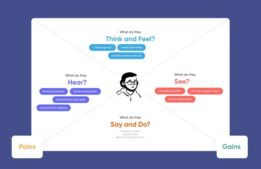
Empathy map: It is a collaborative tool with which we can visualize user behavior, attitudes, and feelings. An empathy map can be spilled into 4 equal quadrants with information on what the user says, thinks, does, or feels. All these quadrants are centered around a user persona.
Human-computer interaction: It is either a design category or a separate domain of studies that researches how humans interact with computer systems.
User-centered design: It is the desired outcome of a storyboarding stage. We can describe it as an iterative design framework that puts users and their needs at the center of any decision.
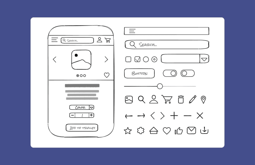
Wireframing: It goes about drawing overviews of the products and creating sketches that help understand how an app will look like. That’s when some real action begins.
Wireframing is just like going from theory to practice in your art classes. You start with learning art theory, and then you try to come up with your first artwork. Surely, you start with sketches that may be rough and even seem odd. However, they help you understand the direction for further work.
That is exactly the situation with wireframing. The creation of sketches helps is the moment when we start visualizing the application’s design.
Wireframe: It is a simplified sketch of data presented on a page. Sometimes, designers may call it a page architecture, a page schematic, or a page blueprint. Basically, a wireframe is a skeleton of your design. So, it is important to add all the essential elements of the final product to it.

Sketching: It is when a designer makes drawings aimed at proposing, exploring, refining, and communicating ideas. A UX designer may also show sketches to present his or her ideas on how to crack design problems. Sketches may often look very raw, so they are nothing without a detailed explanation from a designer.
Prototype: It is a preliminary model of a product that is used for testing. In many cases, the prototypes we create during the product development process are completely different from the ones built after wireframes.
At the earliest stages, it goes about something like building paper prototypes with only pencil and paper. This allows us to validate concepts or flows. If such concepts and flows are validated, we can use design software to build high-fidelity prototypes. High-fidelity prototypes are essential for tuning the details of the app’s UI.
Fidelity: This is a valuable concept in both wireframing and prototyping. Low-fidelity wireframes cover basic information on application layout, while high-fidelity prototypes are much closer to the final visuals and functionality of an app.
Site map: It is a list of pages that are to be added to the website. Designers create it while planning a site. A site map often consists of wireframes created during the given stage.
Minimum Viable Product (MVP): An MVP is a version of a product that includes only its basic functionalities. It is designed specifically for early release. It enables you to get customer feedback on your app and its design. Later, this feedback may be useful in planning the final UX design of the application.
Heat map: It is a graphical representation of the areas on your product that attract the most user attention. It is usually created with an eye-tracking technology or by recording the touches in sensor software systems. A heat map uses a warm-to-cool color spectrum to show how the users interact with an application. Quite logically, the warmer is the color of a component of a heat map, the more user attention this component attracts.

Eye-tracking technology: It is an advanced technology enabling you to assess the visual hierarchy of information on a screen. An eye tracker records where the user is looking on a screen and for how long. Later, the results of such a study are displayed in the format of a “heat map.”
Accessibility: It is a design process that keeps in mind the needs of people with disabilities. It goes about making a product inclusive enough for such users. If you want your app to be used by the color-blind, bling, and deaf people, as well as users with cognitive disabilities, accessibility is your top priority.
Breadcrumbs: These are UX components that enable the user to navigate your app conveniently. They allow users to understand their location in a website or app. Just like real crumbs of bread helped fairy tale heroes find their way from a dark forest or a dungeon, digital breadcrumbs enable application users to understand the sequence of steps that has brought them to a specific page.
Branding
This application design development stage is optional. If you want your app to become a brand or support a brand, you should pay attention to specific branding requirements. In this case, you use specific colors and shapes that are (or should be) associated with a specific brand.
And don’t forget about the logo! It is also playing a vital part in the branding of any product, including an application.
So, if branding is essential for your app, we will help you come up with and develop design features that support your brand.
This stage consists of a few essential steps, namely:
Logo development;
Color planning;
Attributes’ planning.
All these steps involve the following terms.
Brand identity: It is the most important concept pertaining to branding design. It involves the visible elements of a brand, such as color, design, and logo. All these things help you distinguish the brand in consumers’ minds.
Color wheel: It is, by far, one of the most iconic UI/UX design items. A color wheel shows the relationships between various colors included in the design. These are primary, secondary, and tertiary colors, etc. The color wheel goes far beyond application branding, but it is essential for this stage as long as colors are critical for brand identity.
Color contrast: It goes about the difference between colors. Colors differ in hue, value, and saturation. It may go about creating a contrast between text and its background color because it ensures the readability of the text. Color contrast also plays a significant role in application branding because you should pursue consistency in this aspect.
Brand attributes: These are functional associations that a brand raises. They may be either positive or negative and play a vital role in establishing a brand identity. It may go about some notable products, promotions, logo, colors, and many other branding features.
Do you need an example? Well, think of the trademark toys in chocolate eggs that raise instant associations with Kinder.
Typeface: It is the design of lettering that is often associated with a specific brand. It goes about letter variations in size, slope, width, weight, as well as about their consistency across various brand platforms.
Logo: A logo is a graphic mark, emblem, or symbol associated with a specific brand. The examples of such companies as Apple, McDonald’s, and Google show that the value of logos in terms of brand identification and recognition is difficult to overestimate.
Brand Awareness: It is what all these branding efforts are focused on. Brand awareness is about the ability of customers to recall or recognize a brand. If your brand awareness is high and potential customers recall your brand once they encounter the slightest associations with it, you’ve done some good job on branding.

User Interface (UI) design
At this stage of application design development, we consider UX and branding requirements to implement them in an actual user interface.
We always focus on ensuring that the interface has all the required elements and that they are easy to access, understand, and use.
You may view this stage as a logical outcome of all previous stages, as it involves the combination of wireframes, design concept, and specific brand attributes.
These are the basic UI design steps:
Moodboarding;
Design concept;
Styleguide development;
Final design.
And these are the most important UI design terms.
Design concept: It is the main idea behind a specific design. For example, you may choose straightforwardness as such a concept. In this case, your app will, not surprisingly, provide users with a rather straightforward design.
UI element: UI elements are different parts of the interface that allow the user to trigger specific actions in a website or an app. Usually, it goes about buttons, input fields, and other interactive elements.
UI pattern: These are reusable UI solutions that you may encounter on most websites. A perfect example is a user authorization screen. In most cases, it will consist of two input fields, one for a username and one for a password, and a button.
Input field: It is a UI element where the user can enter non-standardized responses. A perfect example is a field in which you should print your name or email address.
Button: A button is an interface element that a user should tap or click to trigger a specific action in an application.
Floating action button: It is a UI element that doesn’t move when the user scrolls. Usually, it is located in the bottom-right-hand corner of the screen. A perfect example of a floating action button is a services button in the Gmail interface.
Plus button: It is a common UI element, which allows a user to start a new document or file or add a new item to some list.
Picker: It goes about a UI element that enables a user to choose between various choices. For example, you may use a picker to choose a date for your booking or color for your social media website.
White space: It is a blank space you find on some pages. It doesn’t necessarily go about the background. Instead, a white space is an element that makes pages feel uncluttered and helps a designer emphasize the content located on this page.
Microcopy: Microcopies are small bits of text that help a user navigate a website or app. Labels on buttons, placeholder texts in input fields, small messages, and similar UI elements are perfect examples of microscopes.
Grid: It is a system of horizontal and vertical lines which determines the page’s layout and design. Its main purpose is organizing content on the screen.
Grid system: Such systems are tools that help us develop grids. In other words, we use them to organize pieces of content on a screen.
Flat design: It is not only an approach to design but also an entire philosophy. Flat design focuses on simplicity and functionality. No gradients, shadows, textures, or highlights are applied in this case. Instead, a flat design is built with the basics of graphics, such as bright colors, simple forms of buttons, and icons.
Graphical user interface (GUI): It is what the user of an app sees. Usually, it goes about a set of menus that allow a user to communicate with a program and get what they want from it.
Gestalt principles: This term is more about the human perception of imagery. The point is that people usually don’t perceive items in isolation. Instead, they perceive them in the context of a larger whole.
Moodboard: It is a visual representation of a concept. Usually, it goes about a ‘collage’ that consists of images, text, and various objects. Usually, designers create moodboards to convey a general idea or feeling about a topic.

Styleguide: A styleguide contains the most important details related to a product’s user interface. It is a document all designers should follow while designing an app. More specifically, a styleguide defines typography, colors, and components that should be used in an app.
Fitt’s Law: It is a mathematical model that takes into account the target’s size and proximity to determine how long it will take a user to point at it. The smaller and the further away is the target, the longer it will take a user to focus on it.
Affordance: It is a clue that helps the user understand the purpose of an element. For example, a button with a cart depicted on it instantly makes a user think of shopping. It is a perfect affordance if you want to guide your user to the screen with items to be purchased.

Mockup: It is a static representation of a developed product that involves all UI design elements. Although it is not interactive, a mockup helps you clearly understand how the product will look like.
Wrapping up
So, these were the basic stages we take while developing UI/UX design for your application, as well as some common parts of UI UX terminology. Surely, there’s much more to learn about design practices, but let’s leave it to professional designers.
At least, with this UI and UX glossary, you will have much fewer problems with finding a common language with them.
And, believe me, you will have no problems communicating your goals to our software design team. Our rich subject knowledge and 200+ successfully finished projects bring some excellent understanding of the clients and their basic needs.
So, if you have a software product or app in mind that you want to develop and are looking for some help from good design maestros, let us know.
Excellent UI/UX design makes your app attractive to the audience just like images and glossy pages make a magazine more attractive for the reader. Or, most probably, even more.
Never underestimate the value of this stage and ask us to implement your wildest design dreams. We’re in for some action and are ready to deliver apps that become real rockstars in the market of digital applications.

Top comments (0)