
Let me describe my coding journey to build a Social Proof component from Frontend Mentors. Frontend Mentors is a online platform that provide front-end challenges that include professional web designs.
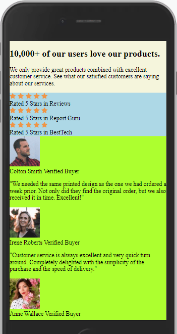
The goal is to build this:

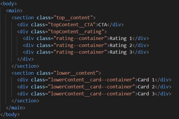
Step 1: Initial Layout Responsive Design
The first coding hurdle was setting up the HTML & CSS to create the initial layout and then testing if it flowed decently between mobile and desktop as intended.
My first decision was deciding between CSS Grid, Flexbox, or a combination of the two. Looking at the given design, the different regions of content had a natural flow from mobile to desktop. So, I only need Flexbox. If the layout had massive changes or swap places, then CSS Grid would have been a better tool
My tip to anyone is use background colors to visually show specific layout areas.
GIF of responsive layout

Screen-shot of the Layout
Step 2: Focus on Content Placement
The next step was to slowly add in all content with relevant HTML tags, no styling. The idea is to purely focus on content placement and using the right HTML tags.
Screen shot of app in development, no styling
Step 3: Add styles and background images
Now for the long grind of adding styles to each HTML tag, section by section, while checking every few changes for layout responsiveness.
The one thing I didn't know how to do was to set multiple background images at the same time.
Screenshot of CSS code for setting multiple background images

Final Outcome

You can play with the solution here
What I learned
- I learned how to add multiple background images at one time.
- I was able to complete this project in a few hours by following a tried and true process:
- Design a responsive layout
- Build a foundation with HTML
- Add content
- Style with CSS, section by section
- End with functionality (JavaScript & CSS animation/transitions)
This "Ground up" methodology kept me focused, minimized bugs, and follow the mantra "Slow is Fast".
Resources Used
- Tips on Background Images by CSS Tricks
Thank you for reading!
Obviously, this isn’t a perfect solution. This was a couple of hours of work spread out over the day while doing other things. I can spot several imperfect issues. But I’m a firm believer in learning in public, sacrificing perfection while learning, and each day improving by 1%.
Thank you for reading my learning journey and if you have tips, please DM me on Twitter or LinkedIn.
You can find the completed code here

Oldest comments (0)