Follow me as I briefly describe my coding journey to build a FAQ Accordion component from Frontend Mentors. Frontend Mentors is a online platform that provide front-end challenges that include professional web designs.
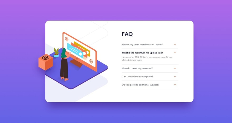
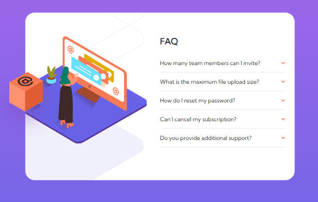
The goal is to build this:
Desktop
Step 1
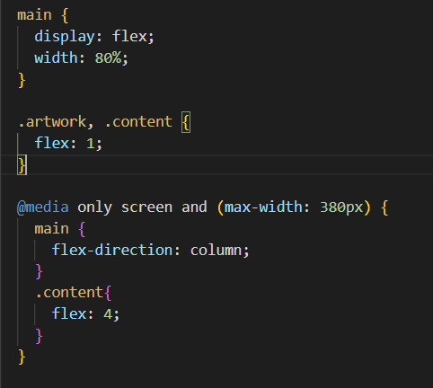
First course of action was to attempt the design responsiveness aspect from the start.
Step 2
I realized I needed to make sure the accordion title is clickable and the content of the accordion needed to be hidden. When clicked, the content of the accordion is made visible, the accordion title's style is changed, and the arrow SVG turns 180 degrees.
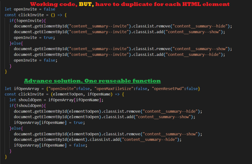
The first problem I faced was the functionality of opening and closing each accordion section. I couldn't get it to work properly after a night of troubleshooting. A few days later, I suddenly awoke during the night with a simpler solution that should have been the first option.
Step 3
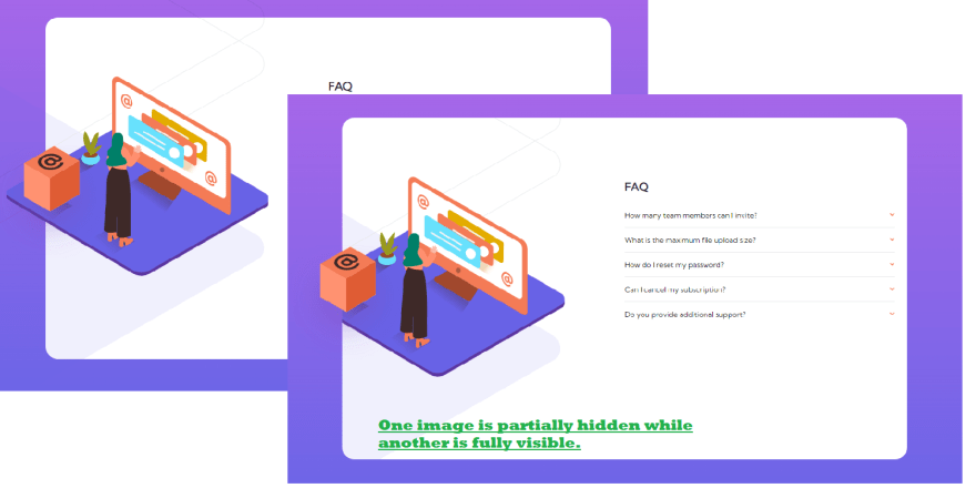
The most difficult problem of the challenge was positioning and layering three separate images while hiding some of them. Up until now I never had to hide parts of an image.
Step 4
This was a wonderful learning opportunity to use different sizes of the same image based on screen width.
Step 5
Unique accessibility concepts I've learned while building this custom accordion component
- The custom accordion component needed the ability to be navigated with tabs.
- The header of an accordion needed to be a button since it was clickable.
- Since the component would collapse, there was an aria label called "aria-expanded" to learn about.
- I didn't need a title in the alt tag for the image because it was purely decoration.
- The hidden area to be open is considered a "region" and needs a "aria-labelledby" to the clickable button.
- A label element should be attached to a input, text-area, or select element.
After making these changes, my site can now be navigated with the tab button and the accordion component opened with the enter key.
Final Outcome
You can play with the solution here. I want to add one restriction, the challenge is designed to view the responsiveness at 375px and 1440px width. Any other size and it looks dicey. This is intentional.
What I learned
- Mimic an accordion object functionality without using Detail and Summary HTML5 elements.
- Practice CSS styling like CSS background gradient
- Stacking, positioning, and layering images with CSS
- Practice CSS functionality on the webpage like animating elements while hovering
- Script tags go at the bottom of the html page. I spent 30 minutes screaming "why is this not working" for nothing.
- Including accessibility concepts & tags like aria-labelledby, role, region, and area-expanded so user can navigate via keyboard.
Resources used
- HTML5 Responsive Images BY CSS-TRICKS
- Mimic HTML5 Accordion elements
- Tips on hiding and positioning images
- Accessibility: Tab-index
- Accessibility: Accordion
- Accessibility tester
Thank you for reading!
Thank you for reading my blog. Feel free to connect with me on Twitter or LinkedIn.
You can find the completed code here





Top comments (0)