
Follow me as I describe the lessons I learned in form validation, design responsiveness, and a few small CSS tricks I pick up. This is my #11 frontend focus project in a few months from Frontend Mentors.
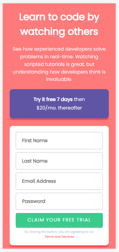
The goal is to build this:

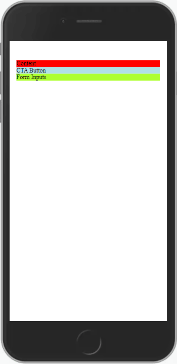
Step 1: Setup the initial mobile layout’s sections
I like to use random background colors to visual show the sections. This gives me a chance to think through the responsive design, possible content placement, setting up CSS variables, and gathering resources like fonts.
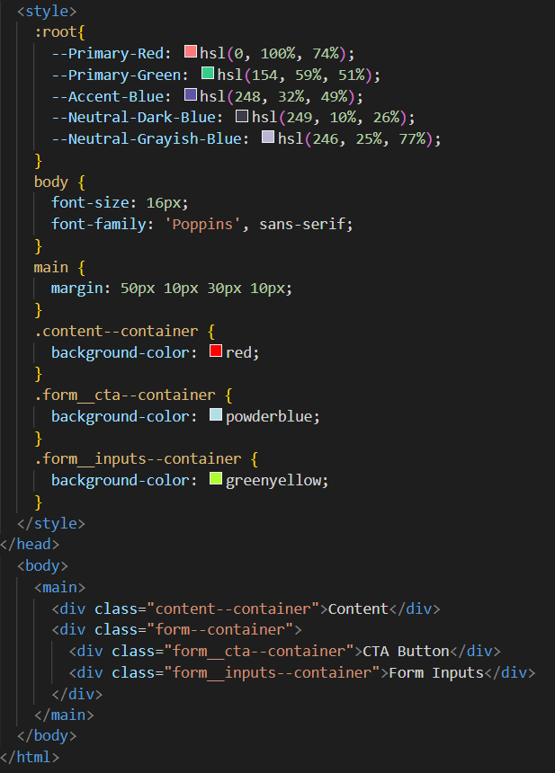
Step 2: Include all content with no styles
Similar to laying bricks for a wall, I like to add all HTML elements and content one section at a time without worrying about styling. My opinion is this gives me the opportunity to focus on content placement and finding the correct HTML elements.
As usually, I’m attempting to learn the BEM (Block Element Modifier) method of naming/structuring styles.
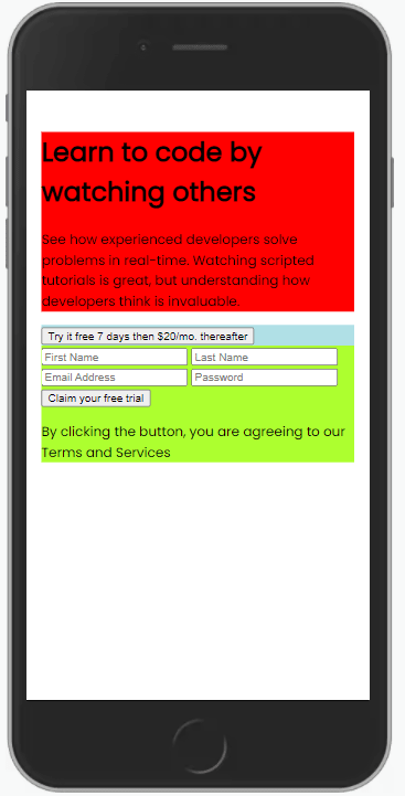
Step 3: Add styles to the mobile responsive layout
The goal is to focus just on the mobile layout for now. Can I get the components to look like the given design. In the process of doing that, I picked up a few new CSS tricks.
- I learned to use “white-space: nowrap” to ensure a group of text is always on the same line.
- I can’t believe I’m just learning about the CSS Flexbox’s "gap" style that adds whitespace between the child elements.
- The CSS style “text-indent” is awesome
I did find an issue I don’t understand. For some reason, if I set the font size and family in the body style tag there is no impact. I have to set it for each section. Not sure why, but it works.
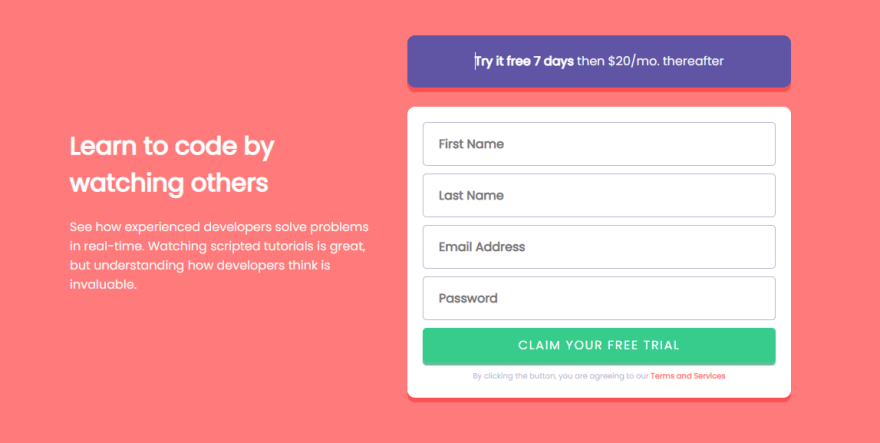
Step 4: Transition to the desktop responsive layout
In theory, optimizing for a desktop responsive layout should be easier once you have successfully styled for mobile. It’s mainly moving the sections around and tweaking minor elements.
What I quickly realized is several styles I placed within the media query for wider than 700 pixels actually belong in the general styles. Styles like max-width, justify-content, and align-items were universal to all size layouts and were necessary for smooth design responsiveness.

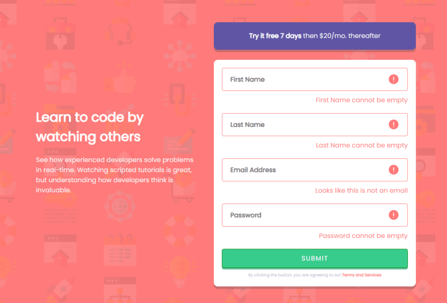
Step 5: Error Messages
What I surmised from the given design is to apply the invalid state AFTER the user clicks the submit button. Instead I did a hybrid approach. As the user input data, the input element will actively respond with validation colors. When the user presses the submit button, invalid error messages will become visible.
I use LOTS of resources to learn effective styling and JavaScript code to implement the above plan. You can find the resources within the Resource Used section. I learned how to apply styles to valid and invalid states of an element based on the focus, validity and the CSS pseudo style “not(:placeholder-shown)”.
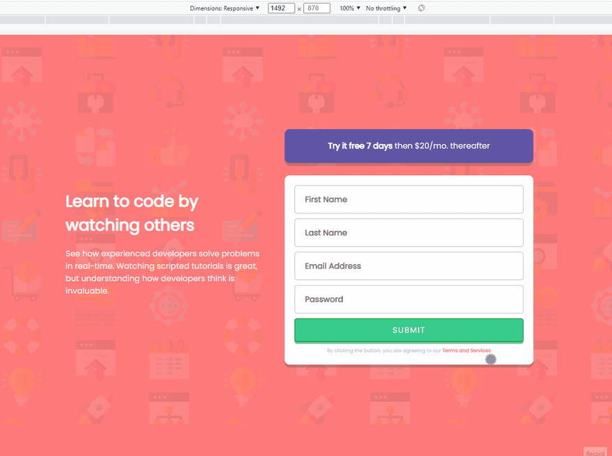
Step 6: Final Outcome
The final step in the process was adding background images and fixing the drop shadows scatter throughout the design.
GitHub repository
Hosted Demo to play with
FYI: The design didn't ask for the sign up button to do anything or have a change in state.
Resource Used
- BEM
- Box shadow generator
- Form's inputs with W3Schools
- UX for Form Validations from CSS-Tricks
- Form Validation concepts from Digital Ocean
- W3Schools JavaScript tips on getting elements by tag name
- GeeksforGeeks JavaScript tips on looping through HTML collections
- StackOverflow for checking validity
- Free Code Camp tips on HTML5 Validation
Thank you for reading, let's connect:
Obviously, this isn’t a perfect solution. If you have any advice or criticism please leave a comment or send it privately via a DM.
Thank you for reading my learning journey and if you have tips, please DM me on Twitter or LinkedIn.

Top comments (0)