Note: This article was originally published on my personal blog. For more updates, follow me on Twitter @ibelick.
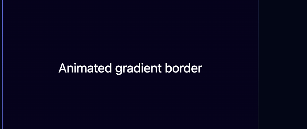
In this article, I'll share methods for creating an animated gradient border with CSS. You can easily customize the border color, animation speed, border size, and border radius with theses techniques.

Code
Property and background clip
We use the @property rule, it comes with limited supports you can check the brower support here caniuse.
For a more supported method, you can go to the end of the article.
<div class="box">{children}</div>
.box {
  display: flex;
  justify-content: center;
  align-items: center;
  padding: 12px;
  height: 400px;
  width: 400px;
  border: 3px solid #0000;
  border-radius: 12px;
  background: linear-gradient(#131219, #131219) padding-box, linear-gradient(
        var(--angle),
        #070707,
        #687aff
      ) border-box;
  animation: 8s rotate linear infinite;
}

@keyframes rotate {
  to {
    --angle: 360deg;
  }
}

@property --angle {
  syntax: "<angle>";
  initial-value: 0deg;
  inherits: false;
}
To achieve our desired effect, we'll use the following CSS properties:
- border: This property creates a 1px wide, solid, transparent border around the box.
- border-radius: This property gives the box rounded corners with a 12px radius.
- background: This property creates a two-layered background using two linear gradients. The first gradient is a solid color (#000) that fills the box's padding area. The second gradient creates the shiny effect and is animated using the custom property --angle. The gradient is applied to the box's border area. We use the backgroud-clip property to specify that the background should be clipped to the padding box.
- animation: This property applies the "rotate" animation to the box. It has an 8-second duration, uses linear easing, and repeats infinitely.
- @keyframes rotate: This keyframe animation block specifies the end state of the "rotate" animation, where the custom property --angle is set to 360deg.
- @property --angle: This part of the code defines the custom property --angle using the CSS Houdini @property rule. It specifies the expected syntax (angle), the initial value (0deg), and that the property does not inherit from parent elements.
Tailwind CSS
If you prefer using Tailwind CSS, here's the equivalent code written with React and TypeScript:
export const AnimatedGradientBorderTW: React.FC<{
  children: React.ReactNode;
}> = ({ children }) => {
  const boxRef = useRef<HTMLDivElement>(null);

  useEffect(() => {
    const boxElement = boxRef.current;

    if (!boxElement) {
      return;
    }

    const updateAnimation = () => {
      const angle =
        (parseFloat(boxElement.style.getPropertyValue("--angle")) + 0.5) % 360;
      boxElement.style.setProperty("--angle", `${angle}deg`);
      requestAnimationFrame(updateAnimation);
    };

    requestAnimationFrame(updateAnimation);
  }, []);

  return (
    <div
      ref={boxRef}
      style={
        {
          "--angle": "0deg",
          "--border-color": "linear-gradient(var(--angle), #070707, #687aff)",
          "--bg-color": "linear-gradient(#131219, #131219)",
        } as CSSProperties
      }
      className="flex h-[400px] w-[400px] items-center justify-center rounded-lg border-2 border-[#0000] p-3 [background:padding-box_var(--bg-color),border-box_var(--border-color)]"
    >
      {children}
    </div>
  );
};
In this implementation, we handle the animation using JavaScript. We utilize the requestAnimationFrame function to update the custom property --angle every 16ms (60fps).
CSS Pseudo-Elements
If you want to support more browsers, you can use the following method instead:
.box__bg {
  position: relative;
  z-index: 0;
  height: 400px;
  width: 400px;
  border-radius: 12px;
  overflow: hidden;
  padding: 12px;
}

.box__bg::before {
  content: "";
  position: absolute;
  z-index: -2;
  left: -50%;
  top: -50%;
  width: 200%;
  height: 200%;
  background-color: #000;
  background-repeat: no-repeat;
  background-size: 100%100%, 50%50%;
  background-position: 0 0, 100% 0, 100% 100%, 0 100%;
  background-image: linear-gradient(#070707, #687aff);
  animation: bgRotate 4s linear infinite;
}

.box__bg::after {
  content: "";
  position: absolute;
  z-index: -1;
  left: 1px;
  top: 1px;
  width: calc(100% - 2px);
  height: calc(100% - 2px);
  background: linear-gradient(#06021d, #06021d);
  border-radius: 12px;
}

@keyframes bgRotate {
  100% {
    transform: rotate(1turn);
  }
}
This technique uses ::before and ::after pseudo-elements to create the border and background layers, respectively. The ::before pseudo-element contains the animated gradient, rotating infinitely over 4 seconds using the bgRotate keyframes. The ::after pseudo-element is positioned above the gradient layer and sets the background color. The div itself has a fixed size, border-radius, and padding, with its overflow hidden to ensure the animated border is contained within the specified area.
More
Here we explore a few different ways to animate borders in CSS.
I recommend this article if you want to dive deeper into the topic.
Feel free to experiment and adapt the techniques discussed in this tutorial to fit your specific design needs and preferences. Let's connect on Twitter @ibelick ✌️


Top comments (0)