
So now we're good with the toolbar and actions so far, so let's create the create directory button and action.
The UI
The UI is pretty simple, we'll have a button with a plus icon, and when the user clicks on it, we'll show a modal with a form to create a new directory.
// components/Toolbar/Buttons/CreateDirectoryButton.tsx
export default function CreateDirectoryButton() {
  return <div>CreateDirectoryButton</div>;
}
Now let's import it in our toolbar.
// components/Toolbar/Toolbar.tsx
import { Grid } from "@mantine/core";
import CreateDirectoryButton from "./Buttons/CreateDirectoryButton";
import HomeDirectoryButton from "./Buttons/HomeDirectoryButton";
import { ToolbarWrapper } from "./Toolbar.styles";

const buttons = [
  HomeDirectoryButton,
  CreateDirectoryButton,
];

export default function Toolbar() {
  return (
    <>
      <ToolbarWrapper shadow="sm">
        <Grid>
          {buttons.map((Button, index) => (
            <Button key={index} />
          ))}
        </Grid>
      </ToolbarWrapper>
    </>
  );
}
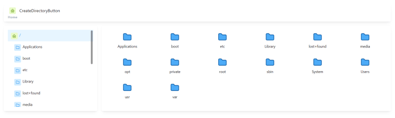
Now it look like this
Now let's enhance it, we'll actually copy/paste the HomeDirectoryButton and change it to our needs.
// components/Toolbar/Buttons/CreateDirectoryButton.tsximport { Text, ThemeIcon, Tooltip, useMantineTheme } from "@mantine/core";
import { IconCirclePlus } from "@tabler/icons";
import {
  ToolbarButtonText,
  ToolBarButtonWrapper,
  ToolbarIcon,
} from "../Toolbar.styles";

export default function CreateDirectoryButton() {
  const theme = useMantineTheme();

  return (
    <Tooltip
      label={"Create New Directory"}
      position="bottom"
      transition="slide-up">
      <ToolBarButtonWrapper>
        <ToolbarIcon variant="subtle">
          <ThemeIcon
            variant="gradient"
            gradient={{ from: "indigo", to: "cyan" }}>
            <IconCirclePlus size={18} color={theme.white} />
          </ThemeIcon>
        </ToolbarIcon>
        <ToolbarButtonText>
          <Text color="blue">Directory</Text>
        </ToolbarButtonText>
      </ToolBarButtonWrapper>
    </Tooltip>
  );
}
I know its not the best look but still not that bad 😁
The Modal Popup
So now we want to create a popup to display a form to create the directory, so let's create a new component for that.
// components/Toolbar/Modals/CreateDirectoryModal.tsx
import { Modal } from "@mantine/core";

export type CreateDirectoryModalProps = {
  open: boolean;
  onClose: () => void;
};

export default function CreateDirectoryModal({
  open,
  onClose,
}: CreateDirectoryModalProps) {
  return (
    <Modal opened={open} onClose={onClose}>
      <div>Modal content</div>
    </Modal>
  );
}
Now we create an open/close state in our button component and import our modal.
// components/Toolbar/Buttons/CreateDirectoryButton.tsx
import { Text, ThemeIcon, Tooltip, useMantineTheme } from "@mantine/core";
import { IconCirclePlus } from "@tabler/icons";
import { useState } from "react";
import {
  ToolbarButtonText,
  ToolBarButtonWrapper,
  ToolbarIcon,
} from "../Toolbar.styles";
import CreateDirectoryModal from "./CreateDirectoryModal";

export default function CreateDirectoryButton() {
  const theme = useMantineTheme();

  const [openModal, setOpenModal] = useState(false);

  return (
    <>
      <Tooltip
        label={"Create New Directory"}
        position="bottom"
        transition="slide-up">
        <ToolBarButtonWrapper onClick={() => setOpenModal(true)}>
          <ToolbarIcon variant="subtle">
            <ThemeIcon
              variant="gradient"
              gradient={{ from: "indigo", to: "cyan" }}>
              <IconCirclePlus size={18} color={theme.white} />
            </ThemeIcon>
          </ToolbarIcon>
          <ToolbarButtonText>
            <Text color="blue">Directory</Text>
          </ToolbarButtonText>
        </ToolBarButtonWrapper>
      </Tooltip>

      <CreateDirectoryModal
        open={openModal}
        onClose={() => setOpenModal(false)}
      />
    </>
  );
}
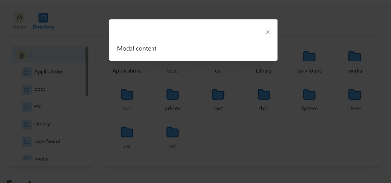
Now let's try it and click on the button, it should open the modal.
Let's update or modal to have a form.
// components/Toolbar/Modals/CreateDirectoryModal.tsx
import { Modal } from "@mantine/core";
import { Form } from "@mongez/react-form";
import SubmitButton from "design-system/components/Form/SubmitButton";
import TextInput from "design-system/components/Form/TextInput";
import { useKernel } from "../../../hooks";

export type CreateDirectoryModalProps = {
  open: boolean;
  onClose: () => void;
};

export default function CreateDirectoryModal({
  open,
  onClose,
}: CreateDirectoryModalProps) {
  const kernel = useKernel();
  return (
    <Modal
      title={<strong>{kernel.currentDirectoryNode?.path}</strong>}
      opened={open}
      trapFocus={false}
      onClose={onClose}>
      <Form>
        <h2>Create New Directory</h2>
        <TextInput
          name="name"
          required
          autoFocus
          placeholder="Please Enter Directory Name"
        />

        <div
          style={{
            textAlign: "end",
            marginTop: "1.5rem",
          }}>
          <SubmitButton>Create</SubmitButton>
        </div>
      </Form>
    </Modal>
  );
}
We imported the form component to manage the form submission and validation also we imported the SubmitButton and TextInput to create the form.
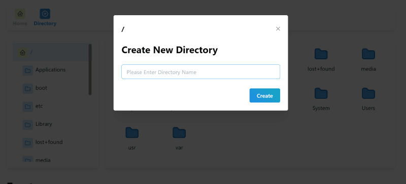
Now it look like this

Now let's update the SubmitButton UI to be using Mantine button.
// design-system/components/Form/SubmitButton.tsx
// 👇🏻 we import the button from Mantine
import { Button } from "@mantine/core";
import { useForm } from "@mongez/react-form";
import { useEffect, useState } from "react";
import Loader from "./../Indicators/Loader";

type SubmitButtonProps = {
  children: React.ReactNode;
  [key: string]: any;
};

export default function SubmitButton({
  children,
  ...props
}: SubmitButtonProps) {
  const [isSubmitting, submitting] = useState(false);
  const [isDisabled, disable] = useState(false);
  const formProvider = useForm();

  useEffect(() => {
    if (!formProvider) return;

    const onSubmit = formProvider.form.on("submit", () => {
      submitting(formProvider.form.isSubmitting());
      disable(formProvider.form.isSubmitting());
    });

    const inValidControls = formProvider.form.on("invalidControls", () => {
      disable(true);
    });

    const validControl = formProvider.form.on("validControls", () => {
      disable(false);
    });

    return () => {
      onSubmit.unsubscribe();
      validControl.unsubscribe();
      inValidControls.unsubscribe();
    };
  }, [formProvider]);

  return (
    <>
    // 👇🏻 we use the Mantine button instead of the BaseButton
      <Button
        // 👇🏻 we use the gradient variant
        variant="gradient"
        gradient={{ from: "blue", to: "cyan" }}
        type="submit"
        // 👇🏻 we use the loading prop to show the loader
        loading={isSubmitting}
        {...props}
        disabled={isDisabled || isSubmitting}>
        {children}
      </Button>
    </>
  );
}
That's for the submit button, we won't do any more.
Now let's update the text input to be using Mantine text input.
// design-system/components/Form/BaseInput.tsx
// 👇🏻 we import the Mantine text input
import { Input } from "@mantine/core";
import { FormInputProps, useFormInput } from "@mongez/react-form";
import { requiredRule } from "@mongez/validator";
import InputError from "./InputError";
import InputLabel from "./InputLabel";

export default function BaseInput(props: FormInputProps) {
  const {
    name,
    id,
    value,
    label,
    placeholder,
    required,
    onChange,
    onBlur,
    error,
    // 👇🏻 extract the autoFocus prop as well to allow focusing on the input
    autoFocus,
    otherProps,
  } = useFormInput(props);

  return (
    <>
      <div className="form-control">
        <InputLabel htmlFor={id} required={required}>
          {label}
        </InputLabel>
        // 👇🏻 we use the Mantine text input instead of the native input
        <Input
          id={id}
          name={name}
          placeholder={placeholder as string}
          onChange={onChange}
          onBlur={onBlur as any}
          value={value}
          // 👇🏻 we use the autoFocus prop to focus on the input
          autoFocus={autoFocus}
          // 👇🏻 we use the invalid prop to show the input has error
          invalid={error !== null}
          {...otherProps}
        />
        {error && <InputError error={error} />}
      </div>
    </>
  );
}

BaseInput.defaultProps = {
  type: "text",
  rules: [requiredRule],
};
Now our final modal look like this
The Action
So we're done now with the modal, now let's submit the form and create the directory.
import { Modal } from "@mantine/core";
import { Form, FormInterface } from "@mongez/react-form";
import SubmitButton from "design-system/components/Form/SubmitButton";
import TextInput from "design-system/components/Form/TextInput";
import React from "react";
import { useKernel } from "../../../hooks";

export type CreateDirectoryModalProps = {
  open: boolean;
  onClose: () => void;
};

export default function CreateDirectoryModal({
  open,
  onClose,
}: CreateDirectoryModalProps) {
  const kernel = useKernel();

// 👇🏻 we use the onSubmit prop to submit the form
  const submitForm = (e: React.FormEvent, form: FormInterface) => {

  }

  return (
    <Modal
      title={<strong>{kernel.currentDirectoryNode?.path}</strong>}
      opened={open}
      trapFocus={false}
      onClose={onClose}>
      // 👇🏻 we use the onSubmit prop to submit the form
      <Form onSubmit={submitForm}>
        <h2>Create New Directory</h2>
        <TextInput
          name="name"
          required
          autoFocus
          placeholder="Please Enter Directory Name"
        />

        <div
          style={{
            textAlign: "end",
            marginTop: "1.5rem",
          }}>
          <SubmitButton>Create</SubmitButton>
        </div>
      </Form>
    </Modal>
  );
}
The good thing here is the form submission will not occur until the input is filled, otherwise an error will be displayed.
Now we need only to get the input value so we don't need to send the entire form elements.
// 👇🏻 we use the onSubmit prop to submit the form
  const submitForm = (e: React.FormEvent, form: FormInterface) => {
    const directoryName = form.value("name");

    kernel.actions.createDirectory(directoryName);
  };
So we can get the input value using the input name, now let's pass it to our createDirectory action and log it for now.
Now once we submit the form, we'll see in the console the input value, so if we type App, we shall see create directory App in the console.
Let's make another small change, we'll also pass the directory path that we need to create this directory in.
// createDirectory.tsx
import Kernel from "../Kernel";

export default function createDirectory(kernel: Kernel) {
  return function create(directoryName: string, directoryPath: string = kernel.currentDirectoryNode?.path as string) {
    console.log("create directory", directoryName);
  };
}
So we can pass the second parameter the directory path, but we'll set the current directory path to be the default value.
Next Chapter
In the next chapter, we'll create the directory in the backend first then we implement it in the React Project.
Article Repository
You can see chapter files in Github Repository
Don't forget the
mainbranch has the latest updated code.
Tell me where you are now
If you're following up with me this series, tell me where are you now and what you're struggling with, i'll try to help you as much as i can.
Salam.

Top comments (0)