
After we created our FileManager Component, now let's create our component skelton.
FileManager Skelton
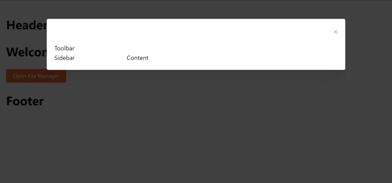
As we can see in the cover image, the file manager will contain two big sections, the toolbar section and body section.
Body section will also contain two parts, sidebar section where we display list of directories and content where we display the current directory folders and files.
// FileManager.tsx
import { Grid, Modal } from "@mantine/core";
import { FileManagerProps } from "./FileManager.types";

export default function FileManager({ open, onClose }: FileManagerProps) {
  return (
    <>
      <Modal size="xl" opened={open} onClose={onClose}>
        <Toolbar />
        <Grid>
          <Grid.Col span={3}>
            <Sidebar />
          </Grid.Col>
          <Grid.Col>
            <Content />
          </Grid.Col>
        </Grid>
      </Modal>
    </>
  );
}
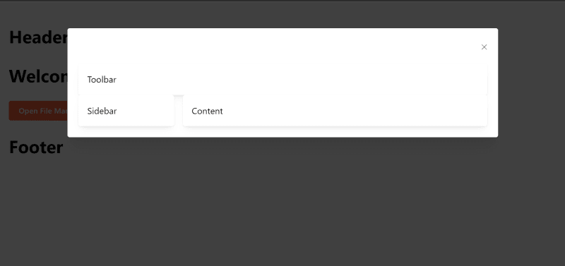
We added Toolbar component alongside with Grid to split the body into two parts, the first part will be the Sidebar which will take only 3 spans (25% of total width) and the second part will be the Content.
Now let's create the three components, each component will have its own directory so we can expand it later and split it into smaller components.
The structure of directories will be like this

Now our FileManager component will contain the following code
import { Grid, Modal } from "@mantine/core";
import Content from "./Content";
import { FileManagerProps } from "./FileManager.types";
import Sidebar from "./Sidebar";
import Toolbar from "./Toolbar";

export default function FileManager({ open, onClose }: FileManagerProps) {
  return (
    <>
      <Modal size="xl" opened={open} onClose={onClose}>
        <Toolbar />
        <Grid>
          <Grid.Col span={3}>
            <Sidebar />
          </Grid.Col>
          <Grid.Col span={9}>
            <Content />
          </Grid.Col>
        </Grid>
      </Modal>
    </>
  );
}
Now when you open the file manager, you'll see this.
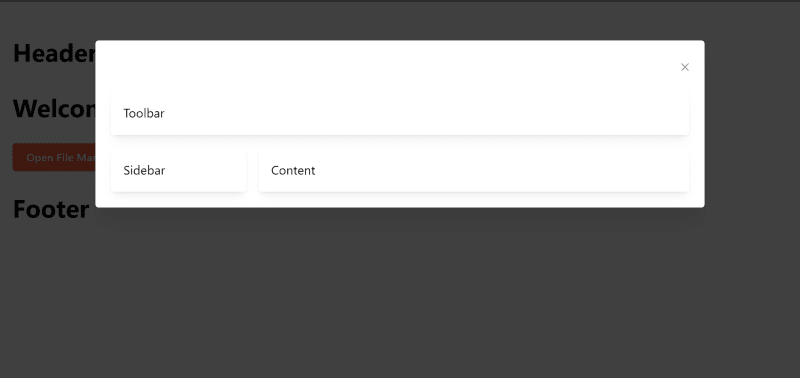
A little bit of enhancing UI, we'll wrap the three components with Card to have some nice shadows.
// Toolbar.tsx
import { Card } from "@mantine/core";

export default function Toolbar() {
  return (
    <>
      <Card shadow="sm">
        <div>Toolbar</div>
      </Card>
    </>
  );
}
The others(Content and Sidebar) follow as well.
Now it will look like:
Let's add a BodyWrapper around the grid to give a little margin, create FileManager.styles.ts file beside FileManager.tsx.
import styled from "@emotion/styled";

export const BodyWrapper = styled.div`
  label: BodyWrapper;
  margin-top: 1rem;
`;
Bonus Tip: Adding
labelto your styled component will append it in the class name, this will help us identify which element in the dom belongs to what styled components when you inspect elements.
Now let's import it in our FileManager component.
import { Grid, Modal } from "@mantine/core";
import Content from "./Content";
import { BodyWrapper } from "./FileManager.styles";
import { FileManagerProps } from "./FileManager.types";
import Sidebar from "./Sidebar";
import Toolbar from "./Toolbar";

export default function FileManager({ open, onClose }: FileManagerProps) {
  return (
    <>
      <Modal size="xl" opened={open} onClose={onClose}>
        <Toolbar />
        <BodyWrapper>
          <Grid>
            <Grid.Col span={3}>
              <Sidebar />
            </Grid.Col>
            <Grid.Col span={9}>
              <Content />
            </Grid.Col>
          </Grid>
        </BodyWrapper>
      </Modal>
    </>
  );
}
Much better!
In the next topic we'll start the real work, as we'll add logic to our component and start using our FileManager class as well.
Article Repository
You can see chapter files in Github Repository
Don't forget the
mainbranch has the latest updated code.
Salam.

Top comments (0)