
In our previous chapter was finalizing the list request, now let's work on the toolbar.
The Concept Behind File Manager Toolbars
So what is the basic concept behind file manager toolbars? Well, it's simple, you have a list of buttons, each button has an action, and each action has a handler, that's it❕
Now we have two things here, the UI AKA the buttons and the logic AKA Actions.
// src/apps/front-office/file-manager/components/Toolbar/Toolbar.tsx

import { Card } from "@mantine/core";

const buttons = [];

export default function Toolbar() {
  return (
    <>
      <Card shadow="sm">
        <div>Toolbar</div>
      </Card>
    </>
  );
}
We didn't add anything new here except that empty button, let's add a button to navigate to home directory.
// Toolbar.tsx
import { Card } from "@mantine/core";

const buttons = [
  HomeDirectoryButton,
];

export default function Toolbar() {
  return (
    <>
      <Card shadow="sm">
        <div>Toolbar</div>
      </Card>
    </>
  );
}
Home Directory Button
Now let's create that button inside the toolbar under components/Toolbar/Buttons directory.
// HomeDirectoryButton.tsx
export default function HomeDirectoryButton() {
  return <div>HomeDirectoryButton</div>;
}
Now let's import it then we need to render these button, let's render it in a grid as well.
// Toolbar.tsx
import { Card, Grid } from "@mantine/core";
import HomeDirectoryButton from "./Buttons/HomeDirectoryButton";

const buttons = [
  HomeDirectoryButton,
];

export default function Toolbar() {
  return (
    <>
      <Card shadow="sm">
        <Grid>
          {buttons.map((Button, index) => (
            <Button key={index} />
          ))}
        </Grid>
      </Card>
    </>
  );
}
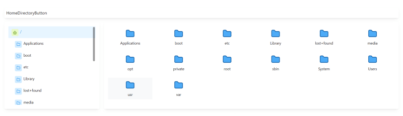
It looks like this:
Now let's render it in a button.
import { ActionIcon, ThemeIcon, useMantineTheme } from "@mantine/core";
import { IconHome2 } from "@tabler/icons";

export default function HomeDirectoryButton() {
  const theme = useMantineTheme();
  return (
    <>
      <ActionIcon variant="subtle">
        <ThemeIcon variant="light" color={theme.colors.lime[1]}>
          <IconHome2 size={16} color={theme.colors.lime[9]} />
        </ThemeIcon>
      </ActionIcon>
    </>
  );
}
We wrapped the button in Action Icon Component so it does not make any paddings around it and we added the same exact icon in the Sidebar.
Now let's wrap it in a tooltip.
// HomeDirectoryButton.tsx
import { ActionIcon, ThemeIcon, Tooltip, useMantineTheme } from "@mantine/core";
import { IconHome2 } from "@tabler/icons";

export default function HomeDirectoryButton() {
  const theme = useMantineTheme();
  return (
    <>
      <Tooltip label="Home" position="bottom" transition="slide-up">
        <ActionIcon variant="subtle">
        <ThemeIcon variant="light" color={theme.colors.lime[1]}>
            <IconHome2 size={16} color={theme.colors.lime[9]} />
        </ThemeIcon>
        </ActionIcon>
      </Tooltip>
    </>
  );
}
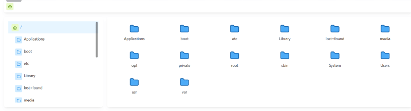
You will see something like this
This is because Mantine Cards by defaults makes any overflow inside it to be hidden, se we need to make it visible.
Let's create Toolbar.styles.tsx file and add this style to it.
// Toolbar.styles.tsx
import styled from "@emotion/styled";
import { Card, CardProps } from "@mantine/core";
import { FC } from "react";

export const ToolbarWrapper = styled<FC<CardProps>>(Card)`
  label: ToolbarWrapper;
  overflow: visible; ;
`;
Now let's import it and use it instead of the Card component.
// Toolbar.tsx
import { Grid } from "@mantine/core";
import HomeDirectoryButton from "./Buttons/HomeDirectoryButton";
import { ToolbarWrapper } from "./Toolbar.styles";

const buttons = [
  HomeDirectoryButton,
];

export default function Toolbar() {
  return (
    <>
      <ToolbarWrapper shadow="sm">
        <Grid>
          {buttons.map((Button, index) => (
            <Button key={index} />
          ))}
        </Grid>
      </ToolbarWrapper>
    </>
  );
}
Now it works fine
Now let's make styles for three elements inside the button, the icon, the text and the wrapper.
// HomeDirectoryButton.tsx
import { ThemeIcon, Tooltip, useMantineTheme } from "@mantine/core";
import { IconHome2 } from "@tabler/icons";
import {
  ToolbarButtonText,
  ToolBarButtonWrapper,
  ToolbarIcon,
} from "../Toolbar.styles";

export default function HomeDirectoryButton() {
  const theme = useMantineTheme();
  return (
    <Tooltip label={"Home"} position="bottom" transition="slide-up">
      <ToolBarButtonWrapper>
        <ToolbarIcon variant="subtle">
          <ThemeIcon variant="light" color={theme.colors.lime[1]}>
            <IconHome2 size={16} color={theme.colors.lime[9]} />
          </ThemeIcon>
        </ToolbarIcon>
        <ToolbarButtonText>Home</ToolbarButtonText>
      </ToolBarButtonWrapper>
    </Tooltip>
  );
}
Before we continue, we should create a file in the src directory called definitions.d.ts to allow overriding the styled theme parameter according to Mantine.
// definitions.d.ts
import "@emotion/react";
import type { MantineTheme } from "@mantine/core";

declare module "@emotion/react" {
  // eslint-disable-next-line @typescript-eslint/no-empty-interface
  export interface Theme extends MantineTheme {}
}
We disabled the eslint error because we don't need to add anything to the theme.
Now to the styling section.
// Toolbar.styles.tsx
import styled from "@emotion/styled";
import { ActionIcon, ActionIconProps, Card, CardProps } from "@mantine/core";
import { FC } from "react";

// 👇🏻 We need to add FC<CardProps> to make it work with styled
export const ToolbarWrapper = styled<FC<CardProps>>(Card)`
  label: ToolbarWrapper;
  overflow: visible; ;
`;

// 👇🏻 the wrapper that will be used to wrap the icon and the text
export const ToolBarButtonWrapper = styled.div`
  label: ToolBarButtonWrapper;
  text-align: center;
  margin: 0 0.5rem;
  cursor: pointer;
`;

// 👇🏻 We need to add FC<ActionIconProps> to make it work with styled
export const ToolbarIcon = styled<FC<ActionIconProps>>(ActionIcon)`
  label: ToolbarIcon;
  width: 100%;
`;

// 👇🏻 the button text that will be displayed below the icon
export const ToolbarButtonText = styled.div`
  label: ToolbarButtonText;
  color: ${({ theme }) => theme.colors.gray[5]};
  font-weight: bold;
  font-size: 13px;
`;
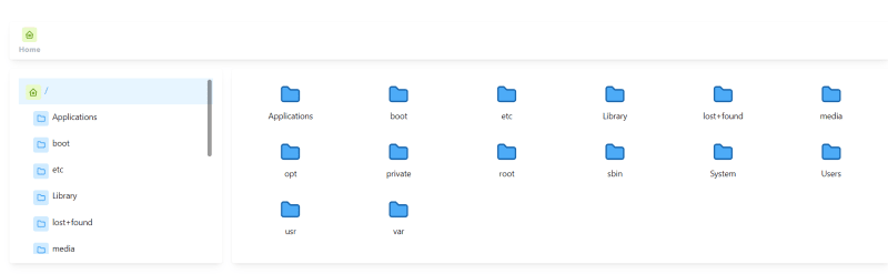
Now the final look will be like this
Actions
For now let's make a simple actions list, let's head to our Kernel and add the a getter actions property.
// Kernel.ts
...
  /**
   * Get kernel actions
   */
  public get actions() {
    return {
      navigateTo: this.load.bind(this),
    };
  }
Here our first action is already built-in the kernel, it's the navigateTo action, it's just a wrapper for the load method.
Now let's try it in the HomeDirectoryButton component.
// HomeDirectoryButton.tsx
import { ThemeIcon, Tooltip, useMantineTheme } from "@mantine/core";
import { IconHome2 } from "@tabler/icons";
import { useKernel } from "app/file-manager/hooks";
import {
  ToolbarButtonText,
  ToolBarButtonWrapper,
  ToolbarIcon,
} from "../Toolbar.styles";

export default function HomeDirectoryButton() {
  const theme = useMantineTheme();
  // we need to use the kernel to get the root path
  const kernel = useKernel();

  const actions = kernel.actions;

  return (
    <Tooltip label={"Home"} position="bottom" transition="slide-up">
      <ToolBarButtonWrapper onClick={() => actions.navigateTo(kernel.rootPath)}>
        <ToolbarIcon variant="subtle">
          <ThemeIcon variant="light" color={theme.colors.lime[1]}>
            <IconHome2 size={16} color={theme.colors.lime[9]} />
          </ThemeIcon>
        </ToolbarIcon>
        <ToolbarButtonText>Home</ToolbarButtonText>
      </ToolBarButtonWrapper>
    </Tooltip>
  );
}
So far so good, nothing hard nothing easy, now let's add the create directory button.
But first we need to create actions directory in our file manager file-manager/actions and create a file called createDirectory.ts and add the following code.
// createDirectory.ts
import Kernel from "../Kernel";

export default function createDirectory(kernel: Kernel) {
  return function create(directoryName: string) {

  }
}
Let's make an index file and export all actions from it.
// index.ts
export { default as createDirectory } from "./createDirectory";
What we did here is we create a function to receive the kernel and also return a callback function, that callback will be used directly when calling it from the kernel actions list kernel.actions.createDirectory.
// Kernel.ts
// 👇🏻 import the createDirectory action
import { createDirectory } from "../actions";
...

  /**
   * Get kernel actions
   */
  public get actions() {
    return {
      navigateTo: this.load.bind(this),
      createDirectory: createDirectory(kernel);
    };
  }
Now we updated our actions list and added create directory action.
But there is a catch here, each time we call the actions getter, it will create a new createDirectory function, thus we need to make sure we call it only once.
// Kernel.ts
...

  /**
   * Get kernel actions
   */
  public get actions() {
    // we added the following line to disable the annoying eslint message
    // as we can not use the this keyword in any getters i.e createDirectory.
    // eslint-disable-next-line @typescript-eslint/no-this-alias
    const kernel = this;

    return {
      navigateTo: this.load.bind(this),
      get createDirectory() {
        return createDirectory(kernel);
      },
    };
  }
Using the getter advantage again in createDirectory will make sure we call it only when we need to use it.
Next Chapter
In the next chapter we'll start working on the create directory action and button as well.
Article Repository
You can see chapter files in Github Repository
Don't forget the
mainbranch has the latest updated code.
Tell me where you are now
If you're following up with me this series, tell me where are you now and what you're struggling with, i'll try to help you as much as i can.
Salam.

Oldest comments (0)