Hello and welcome. This post references a previous blog I wrote, so to catch up, you can read it here:

Recap
In my previous post, I looked at the homepage at sayplants.com, and discussed the most immediately noticeable issues. To recap quickly these were:
- Too many Calls-to-action - there were many links that pointed to the same page, some that were labelled inconsistently, meaning users may be overwhelmed with choice or confused by the lack of direction
- Unclear signposting - Both in the copy and the positioning of certain elements on the page, there was assumed familiarity with the product offering. This would likely lead to issues for users who were visiting for the first time
- No discernible hierarchy - from the website alone, it was hard to clearly define what the main function of SayPlants was. There were numerous services, but none was clearly the only main focus. This left a lot of opportunity for users to misinterpret, and spread this along
Onwards
In this post, I will be detailing some of my suggested changes to address some of the issues I have raised in my previous post, and some that I have noticed since then.
I'll break this into a few sections so it's easier to read, and we'll cover the 3 screens that are visible on the homepage, and then a (simple) mockup that takes into consideration all of my suggestions.
Section 1
One of my concerns was that there was a good amount of assumed knowledge from the way that the copy was originally written. For example, referring to "rewards" without context of what a reward would be in this context.
Additionally, from the landing page, if I had to guess what service was being offered, I would say a restaurant directory, and I wouldn't have even known that I could scroll down and found out about the dining club.
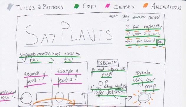
My suggestion for section 1 covers 2 main areas:
Who are you and why am I here?
Users shouldn't have to think too hard about whether your service is for them, and especially not on what the service is that you are offering. To this end, I would like to include a (very short) explanation of (at least) the main purpose of SayPlants for a user.
So what are you offering me?
Users should also not be made to do too much work to understand what it is they can do with your service (unless mystery is part of your brand). So, I want to have some simple examples of the deals that are available.
Additionally, given that the restaurant index is somewhat self-sufficient in the context of the service that SayPlants offers, then some users may only come to the site for this use (at first). Therefore, I wanted to give easy access for those who are unlikely to want to extra work once landing on the page, to then get to what they need.
Section 2
In the previous section 2 there were 6 clickable links, only one of which was actually unique to this section. The rest were also in the Nav Bar or in other areas of the page. So naturally, a big focus was making this area simple, and not presenting too many diverging routes.

Establishing a hierarchy
In the planning for this section, I wanted to keep in mind that scrolling down the homepage of a website is still a chance to see what is offered. So it was important not to just remove everything, but instead to consider what, from the founders' perspective, were the "secondary" offerings, and highlight them here.
This arrangement can indicate to users that aside from what they say in section 1, there are 2 supplementary areas to explore, although they are not part of the main offering.
Reviews
Subsequently, the review section I was mostly happy with. Put simply, I just cared more about what the reviewers said than who they were. As I mentioned in my previous post, word-of-mouth is critical to the success of any business, so it is essential we see what was said.
Section 3
In the final section of the page, there were another cluster of call-to-actions, but my issue with it was that they were very easily overlooked. I generally understand the convention of putting links and contact information as footers on a page, however, after understanding the consumer decision journey for SayPlants I'm proposing a change.

The idea being that if we were to order the levels of commitment customers can engage in from lowest to highest commitment, it would look as follows:
- Visit the website once
- Visit repeatedly
- Follow on social media
- Subscribe to newsletter
- Become a paying member
Now, with this in mind, it is critical to try and create some kind of attachement to the brand for any user, especially someone who has shown some level of intent by making it to the bottom of the page. So, this is a chance to make the most of the moment. Much like the "MaKe sUrE yOu HiT tHaT sUbScRiBe BuTtOn, LiKe AnD ComMent" that you hear at the end of every YouTube video, in the internet age of minimal attention spans, you must take advantage of a captive audience.
Final product...ish

Now this is by no means a finalized product, but here is a slightly more hi-fi version of my sketches, made in Figma.
I would still like to add some things, like making it clearer that the user can scroll, but I would love to hear your thoughts on my ideas, and my mock up so far.
I hope documenting this process is useful for someone, and points you in the right direction of what you should keep in mind when designing your own landing pages.
Thanks for reading!
Music of the Moment
Since it's Nigerian Independence Day let me bless you:
Damages comes from the latest album by Tems, For Broken Eyes. A bop
An all time classic that needs no introduction: Igwe - Midnight Crew
Bonus Track: Styl-Plus - Olufunmi, this will be play at my wedding, no arguments

Top comments (0)