Welcome, I'm not a designer (at least not yet), but surely part of my role as an engineer involves empathizing with the design team? So, I'm dedicating some time to think like a designer, and we'll see where it goes.
As part of being a full stack engineer, I think it's important for me to take the time to focus on the specific aspects that can make an application good or bad. From the database design, to the type of authorization, there are so many different things that need to come together to make everything work well.
At the moment my focus is UX design. Now, I'm not a designer per se, just someone who uses the internet and has over time, and from my time spent building apps understands that small things can make a big difference.
For this case study I took a look at sayplants.com, specifically the homepage, and took note of some things that could be improved.
Thoughts?
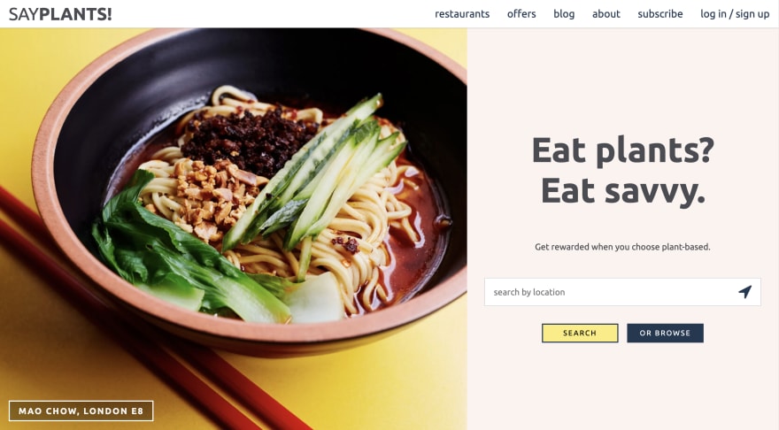
Before I talk about what I picked up on, take a few minutes, and have a look at these screenshots and see what you think might need work.

Ok let's get into it 🚀
Repetitious Links
If you look carefully you'll see quite a number of different, and also duplicated links. I'll lay them out below:
{
    restaurants : 2,
    offers : 3,
    blog : 2,
    about : 3,
    subcribe : 3,
    quiz : 1,
    sign_up : 2,
    advertise_with_us : 1,
    add_a_restaurant : 1,
    facebook : 1,
    instagram : 1
}
To me, this presented 2 main issues:
-
Users are given too much freedom*1.
It might sound extreme to want to minimize the amount of freedom, but trust me, there are several reasons why this might be a good thinga. If users follow a limited number of paths around your website, their behaviour is more predictable, which means you can better optimize for their specific user journeys. For example, someone who arrives on a site to browse through a list of options, will likely have totally different behaviour than one who wants to search for something specific. Therefore, if these 2 options are both given clearly, then users can self-select a path that works for them, rather than having to navigate a screen that tries to do both, but does neither well.
b. By limiting distractions that are shown to a user at a given time, this creates focus that can be tailored to a desired action. It is fairly common for e-commerce platforms to be designed for users who start a transaction, to finish it. That is to say, there are fewer navigation options available other than those to continue with the purchase, or to go back one step and correct information about the order. With this in mind, you may see improved conversion rates.*2
c. If users are given less freedom, there are clearer and fewer expectations placed on the site they are visiting. In other words, if you land on a page that as 4 clearly defined options in a Nav Bar, then this implicitly sets your expectations of what this website can offer you. Without this, your mind is given to wander and as you explore, you may be disappointed that you don't find what you had imagined might be available. This is not to say that users cannot think of what the site might offer without it being laid out explicitly, but research shows how setting expectations can change individuals' behaviour.*3
Potential confusion - particularly with the "our mission" link at the bottom of the page, and the "about" link in the Nav Bar both leading to the same page, users can falsely lead into thinking that there are 20 different pages they can navigate to from this homepage, when in reality only 11 of them are unique. Aside from the issues highlighted in point 1 (which also apply here), unless part of your brand is about mystery and misdirection, it will likely make the website much easier to navigate for the user, there is more consistency.
Unclear signposting
It's vital that users know what they can do on each page, can find what they need, and know where they can go to next.
Have you ever been on a confusing website, where you couldn't even find what you came for, so you just leave? Same. Let's try and avoid that here.
Example 1
If I were a user who had never heard of this website before, I would have no idea what was meant by rewards here. I'm also not given context, or direction of where I should go to find out more, so I have to start searching the website blindly, which I don't want to have to do (see Repetitious Links 1.3).
Ideally, messaging that is predicated on a previous understanding of the product should be limited to a restricted area. For example, the homepage could have this messaging for a user who is signed in (and therefore has visited before), while choosing to be more explicit and explanatory on a generic landing page.
Example 2

If I were looking at this search bar on a printed out sheet of paper, I might think that the search bar and the buttons beneath were 3, unrelated, elements. To this end, I might try to click the navigation icon on the right hand side of the search bar, only to find out it's a piece of paper, so of course nothing happened.
In all seriousness, icons are important. It's a way for us to hint non-verbally to a user, that they should expect a certain output from a specific action. In this case, using the navigation here creates confusion, as it is placed in a context where we normally might see a search icon.
Small detour: this reminded me of those mental exercises where you are a shown an word and you need to say the colour of the text, not what the word says.
Example here
Back to the matter: As I mentioned, you want to make sure that users are clear about the results of their actions before they take them.
So, it might be advisable to have a clearer grouping of responsibilities, where the search bar and button are clearly a pair, an alternative to which is the browse button.
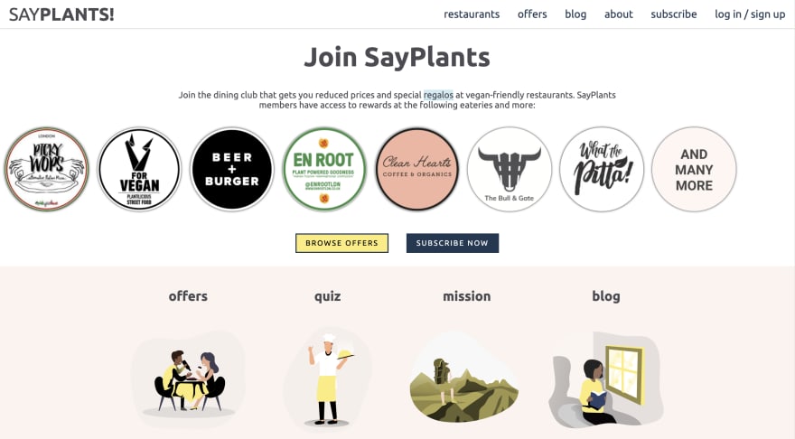
Jack of all Trades, Master of None
Finally, but by no means last in terms of importance, a user should be able to explain to someone else what the purpose of your website is, and what a user can do there. Of course, social channels and SEO are very important, but there is so much evidence out there that highlights that Word of Mouth*4 and e-WOM, are of high importance as well. Therefore, you want our users to essentially be able to tell your user stories without being explicitly told themselves
In this instance, success can be achieved more easily when you can define a clear hierarchy of services that are being offered.
At present, I can list 5 different things offered by SayPlants: a dinner club, a tool for finding new restaurants, a blog, a newsletter and a quiz. Depending on my interests, I might be more likely to tell a friend that I found a great quiz, than a highly functional directory of restaurants serving plant-based food options. Now, this is all fine and good, but is that what you want to be known for?
If there is one major Unique Selling Point about your service, everyone who visits the site should know this, even if it's not something they use themselves. Thus, this should be highlighted in your layout and ordering of options.
References
*1 in this paper, Frei highlights that in order to reach customer satisfaction, sometimes a trade off must be made between efficiency and service. The particular area that is relevant here is Request Variability, as it explains why limiting customer's freedom minimizes what they might ask for. Thus, your service can be closer aligned with what they are seeking.
*2 In this study, researchers observed that while more choice attracts customers, fewer options leads to stronger purchase rates
*3 this research shows that when given a suggested amount, the value of individual charity donations rose.
*4 This paper identifies Word of Mouth, both online and offline as the most effective marketing tool
Music of the Moment
Edit: I forgot to include any music at first, so now I give you the aptly named: Sorry Ain't Enough by Sault
Thanks for reading, I'll likely have a follow up to this soon, where I talk about the changes I implemented after making these initial observations.

Top comments (0)