In the lead up to our next Game Jam, commencing September 16, participants from our June Hackathon will be taking over the Decentraland blog and revealing their design and building secrets. This week’s guest blogger is community member, surz. You can find surz at Discord or on Slack using @surz.
I found out about Decentraland in 2018 and got interested in the clean, low poly design that the project adopted. A year later, I joined the Creator Contest and got more involved. The Builder is a great tool for starting out and developing with pre-made 3D models. Following the Creator Contest, I got an invitation to join the June Hackathon. With some basic knowledge of Javascript, Python and C++ (mainly for scripting) and my interest in 3D modelling, I decided to join the event.
I created a miniature solar system visualization, for educational and art content. The idea was to create a planetarium-type scene that provides basic information about each planet. Beyond the information, I wanted to make it immersive by creating a simple artscape of each planet's surface. In this way, the comparison between the planets and how they differ from our own becomes more authentic and engaging.
You can take a look at the scene in this link
Or check out some screenshots below:


Tutorial
I’d like to share what I used for the UI and how I built it. This tutorial will focus on three sections from my project's UI: the sun, Mercury and the Disclaimer Menu.
The design of the icons and the character that I feature in my UI are both credited to my brother, Jevicho99.
You can download the code, 2D images and 3D models that I use in this
tutorial from this link
If you have any doubts about how UIs work in Decentraland, or about any of the code examples, check out Decentraland's documentation here.
So, let's get started!
Prepare UI assets
We want to have several different UI menus on our scene that can be used at different times. Each of these menus has a static part that isn't clickable and a dynamic part that's clickable.
You can find the images for this tutorial in the github page under the folder /images.
Download these and follow along as you read this tutorial if you want.
Here are the static non-clickable parts of the disclaimer pages:


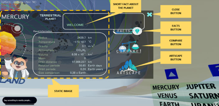
Here are the static, non-clickable parts of the Sun and Mercury UIs:


Below are the dynamic parts used in both kinds of UIs. These are added to the larger images we just saw, and serve as buttons. Each performs a specific task when clicked.

Close button: Hides all UI elements. This button will be present on all screens.

Next button: Switches between disclaimer screens.

Facts: Displays a little fact about the planet. When clicked again, it switches to another fact.

Compare: Displays information that compares the current planet to Earth.

Artscape: shows a 3D landscape of the surface of the planet.
When put together, the full UI layouts should look like this:
Now that we're happy with the design of our screens, let's implement this in our code.
Add a canvas and container
The first step of creating a UI is adding a canvas component, and a container rectangle to go in it. The rectangle will wrap every UI element that we’ll add in later and make it easier to position them.
// create canvas
const canvas = new UICanvas()
// create container inside canvas
const rect = new UIContainerRect(canvas)
rect.adaptHeight = true
rect.adaptWidth = true
rect.hAlign = 'left'
rect.vAlign = 'top'
rect.opacity = 0.8
Notice that the rectangle has an opacity of 0.8, so all of our UI will be partly transparent.
Add static content
The following code adds the static part of the sun UI.
let sunUITexture = new Texture("images/UI/UI_sun.jpg")
const sunImgScreen = new UIImage(rect, sunUITexture)
sunImgScreen.hAlign = 'left'
sunImgScreen.vAlign = 'top'
sunImgScreen.sourceLeft = 0
sunImgScreen.sourceTop = 0
sunImgScreen.sourceWidth = 1024
sunImgScreen.sourceHeight = 483
sunImgScreen.width = 1024
sunImgScreen.height = 512
Notice that when we’re creating the UIImage component, the first argument is rect. That’s the name of the rectangle we created to wrap all the UI. By passing this argument, we’re making this image a child of that rectangle and positioning it relative to it.
That there are plenty of fields, but most are quite self explanatory. You might be wondering what sourceLeft, sourceTop, sourceWidth, and sourceHeight are there for. These are sometimes used for displaying a cropped section of an image. Since here we’re using the full image, we’re setting them to cover the full dimensions.
If you’re following through, this is a good time to try your scene out with dcl start. You should now see this image appear on the UI.
Since we don’t want this UI to be always on, we’ll add one more line that sets the visible property to false. This will keep the image invisible until its visible value is changed, which we’ll go into later.
sunImgScreen.visible = false
To add the rest of the information screens in our scene, we use almost identical code, except that each has a different image as texture.
Add a close button
The way we’ll add buttons isn’t very different from how we just added our image, our buttons will be images with extra functionality. For example, this code adds a 'close` button to the screen.
typescript

let imgCloseBtn = new Texture("images/UI/close.png")

const closeBtn = new UIImage(rect, imgCloseBtn)

closeBtn.name = 'close_btn'

closeBtn.width = '50px'

closeBtn.height = '50px'

closeBtn.sourceWidth = 112

closeBtn.sourceHeight = 112

closeBtn.positionX = 953

closeBtn.positionY = -5

closeBtn.isPointerBlocker = true

closeBtn.onClick = new OnClick(() => {

   log("Close Button Clicked")

   canvas.visible = false

})
You'll notice the code isn't too different from the static images we added before. The only significant differences are:
- The
isPointerBlockerproperty is set totrue, that allows you to click on this component, and not on things that might be behind it - The
onClickproperty, that determines what to execute when clicked. In this case, it sets the visibility of the entire UI to false
For the other buttons in our UI, we use pretty much the same code as above, but with different onClick behavior and positioning.
Adding UI text
We want our UI to have text that can be changed dynamically, unlike the fixed text that we imported as part of our images. For this we will create a UIText component. The following code adds a text component that says “WELCOME”. We’ll later make our scene change this text so that it displays different facts about the current planet.
typescript

const factTxt = new UIText(rect)

factTxt.outlineColor = new Color4(0.7, 1, 0.8, 1)

factTxt.value = 'WELCOME'

factTxt.fontSize = 22

factTxt.width = 500

factTxt.height = 205

factTxt.positionX = 455

factTxt.positionY = 0

factTxt.color = new Color4(0.7, 1, 0.8, 1)

factTxt.textWrapping = true
Grouping UI objects
What we’ve seen so far is probably good enough for many different use cases where you want a simple UI that won’t be changing too much as it’s used. But what if you want to handle several UI screens, each with various components, and that can be easily switched from one to the other? What follows is a solution I came up with that helps scale things easily.
After following the examples we went over to create all the UIImage components needed for each screen, we can list them all in JSON format, grouped based on functionality. These will then be called when switching between screens.
typescript

const staticScreenGroup = {

   "sun": sunImgScreen,

   "mercury": merImgScreen,

   "disclaimer1": discImgScreen1,

   "disclaimer2": discImgScreen2

}

const closeMenuGroup = {

   "closeBtn": closeBtn

}

const disclaimerMenuGroup = {

   "nextBtn": nextBtn

}

const planetMenuGroup = {

   "factBtn": factBtn,

   "compareBtn" : compareBtn,

   "artscapeBtn" : artscapeBtn,

   "factTxt" : factTxt

}
Handling grouped UI objects
To make use of the component list we just created, we'll also write a function that parses the list and makes the required elements visible, depending on the screen.
This function takes three arguments as booleans, each switching different parts of the UI on or off: planetMenu (displays the fact, compare and artscape buttons, and the fact text), disMenu (displays the next button in Disclaimer screens) and closeMenu (displays the close button)
`typescript
function stateDynamicUI(bPlanetMenu: boolean, bDisclaimerMenu: boolean, bCloseMenu: boolean) {
for (let key in planetMenuGroup) {
planetMenuGroup[key].visible = bPlanetMenu
}
for (let key in disclaimerMenuGroup) {
disclaimerMenuGroup[key].visible = bDisclaimerMenu
}
for (let key in closeMenuGroup) {
closeMenuGroup[key].visible = bCloseMenu
}
}
`
What’s missing is selecting which base static image we want to display. We will create a singleton object that includes a function that makes all static UI elements invisible except for the one we want to currently display.
typescript

const stateInfoUI = (

   function () {

     let UI_show: UIImage

     return {

        changeCurrentUI: function(ui_screen) {

           if (UI_show) {

              UI_show.visible = false

           }

           UI_show = ui_screen

           UI_show.visible = true

           canvas.visible = true

        },

        getCurrentUI: function () {

           return UI_show

        }

     }

}())
Opening UIs from in-world objects
We’ll now add a basic 3D menu made out of three 3D boxes into our scene. When each of these boxes is clicked, it will open a different UI, including all the associated elements.
The desired results will look like the GIF below.

Paste the code below to add the 3D entities:
`typescript
// parent entity
const menu3D = new Entity()
engine.addEntity(menu3D)
const sunMenu = new Entity()
sunMenu.addComponent(new BoxShape())
sunMenu.addComponent(new Transform({
position: new Vector3(8, 1.5, 8),
scale: new Vector3(0.1, 0.25, 0.5)
}))
sunMenu.setParent(menu3D)
engine.addEntity(sunMenu)
const mercuryMenu = new Entity()
mercuryMenu.addComponent(new BoxShape())
mercuryMenu.addComponent(new Transform({
position: new Vector3(8, 1, 8),
scale: new Vector3(0.1, 0.25, 0.5)
}))
mercuryMenu.setParent(menu3D)
engine.addEntity(mercuryMenu)
const disclaimerMenu = new Entity()
disclaimerMenu.addComponent(new BoxShape())
disclaimerMenu.addComponent(new Transform({
position: new Vector3(8, 0.5, 8),
scale: new Vector3(0.1, 0.25, 0.5)
}))
disclaimerMenu.setParent(menu3D)
engine.addEntity(disclaimerMenu)
`
Now we can add an OnClick component to our 3D entities and reference the functions that display UI elements we created in the previous step.
typescript

menu_sun.addComponent(

   new OnClick(e => {

      log("sun CLICKED")

      planetMenuGroup.factTxt.value = "WELCOME"

      stateInfoUI.changeCurrentUI(staticScreenGroup.sun)

      stateDynamicUI(true, false, true)

}))
The code above works for the ‘sun’ menu, for other menus you can use almost the same code with different arguments inside the stateInfoUI.changeCurrentUI() and stateDynamicUI() functions. The disclaimer menu would call the stateDynamicUI function with (true, true, false), to display the “close” and “next” buttons, but not the others.
Now, when you click on the 3D objects, they should open the corresponding UI menu on screen.
Add functionality to the Next button
Now that we can easily switch between each screen with all of its elements, let’s add functionality to some more buttons from our UI screen. We already demonstrated how to give functionality to the Close button, by setting the visibility of the entire UI. To keep the tutorial short, we’ll only show the Next and the Facts buttons.
Below is the OnClick function for the ‘next’ button, which switches between the two disclaimer screens, using the functions we created:
`typescript
nextBtn.onClick = new OnClick(() => {
log("Next Button Clicked")
log(stateInfoUI.getCurrentUI().name)
if (stateInfoUI.getCurrentUI().name == 'disclaimer1_screen') {
stateInfoUI.changeCurrentUI(staticScreenGroup.disclaimer2)
}
else {
stateInfoUI.changeCurrentUI(staticScreenGroup.disclaimer1)
}
})
`
Add functionality to the Facts button
Now we’ll add functionality to the "Facts" button so that it shows a fact about the current planet:
First, we define an array of strings that lists the facts we want to show.
typescript

const sun_facts: string[] = [

   "Sun's gravity holds the solar system together, keeping everything from the biggest planets to the smallest particles of debris in its orbit",

   "At the equator, the Sun spins once about every 25 days, but at its poles the Sun rotates once on its axis every 35 Earth days",

   "By mass, the Sun is about 70.6 % Hydrogen and 27.4 % Helium",

   "Sun releases a constant stream of particles and magnetic fields called the solar wind that can slams worlds across the solar system with particles and radiation"

]
Then we’ll create a singleton to handle the switching of UI texts. This object contains a function that loops over the predefined strings and returns one of them.
typescript

const FactsModule = (function () {

    let facts_sun_ind = 0, facts_mer_ind = 0

    let fact_arr: string[]

    let fact_ind: number

    return {

        setFact: function (ui_screen) {

            if (ui_screen.name == "sun_screen") {

                log("fact for SUN")

                fact_arr = sun_facts

                facts_sun_ind = (facts_sun_ind + 1) % sun_facts.length

                fact_ind = facts_sun_ind

                return fact_arr[fact_ind]

            }

        }

    }

}())
The final step is to call this function from the OnClick property of the ‘Facts’ button, and change the value of the text component in the UI to what this function returns.
typescript

factBtn.onClick = new OnClick(() => {

   log("Fact Button Clicked")

   let factStr = FactsModule.setFact(stateInfoUI.getCurrentUI())

   planetMenuGroup.factTxt.value = factStr

})
For the final complete code of the scene, check my GitHub repository for this project.
Some closing words
I find it interesting and challenging that Decentraland provides a platform to create a virtual world governed by the blockchain. As it develops, I would like to explore possible mechanics and use cases inside the platform to create more quality content.
If you have any ideas about how to make the above code more efficient or want to talk about it, please join the discussion and share your thoughts in the #sdk channel of Discord. I’d love to hear your feedback!
And of course, if you are interested in building things, get involved in the GameJam which starts September 16th. Join here and I’ll see you in the Metaverse!


Top comments (0)