This article has been updated to reflect API changes in Framer Motion 2.0.x Beta
Framer Motion is my go-to animation library for React. Matt Perry, the creator of the library and its predecessor Pose, has been tweeting about version 2 (still in beta at the time of writing) so I decided to check it out. It has some great new features I can't wait to use when it's released. Until then, let's take a look at one of my favourites - AnimateSharedLayout.

What is AnimateSharedLayout?
Framer Motion is introducing a new component, <AnimateSharedLayout />. It allows for animating between components easily. Matt Perry's tweet illustrates a great usage of it here. The code is easy to understand and doesn't require a lot of setup to achieve.

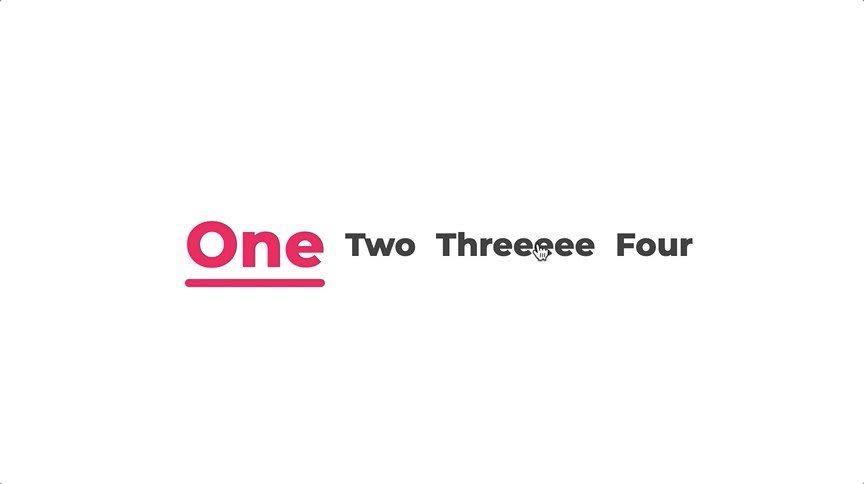
 🎩🐇In @framer Motion 2, a component can be given a magicId. When a new @reactjs component with the same magicId is added, it will appear to animate from the old one.
It makes stuff like this underline animation as simple as a boolean. Here's the code: codesandbox.io/s/framer-motio…14:08 PM - 27 Mar 2020
The magic fits all with a few lines of code!
import React, { useState } from "react";
import { motion, AnimateSharedLayout } from "framer-motion";

export default function App() {
  const [selected, setSelected] = useState(0);

  return (
    <MagicMotion>
      <ol>
        {screens.map(({ title, color }, i) => (
          <motion.li
            magic
            key={i}
            className={`title ${i === selected && "selected"}`}
            style={{ color: i === selected ? color : "#333" }}
            onClick={() => setSelected(i)}
          >
            {i === selected && (
              <motion.div
                magicId="underline"
                className="underline"
                style={{ backgroundColor: color }}
              />
            )}
            {title}
          </motion.li>
        ))}
      </ol>
    </MagicMotion>
  );
}
Wrap the animation in MagicMotion (now AnimateSharedLayout) and assign a magicId (now layoutId) prop to the components you want to animate between. So let's jump into another example and I'll break it down.
Experimenting with AnimateSharedLayout in Framer Motion
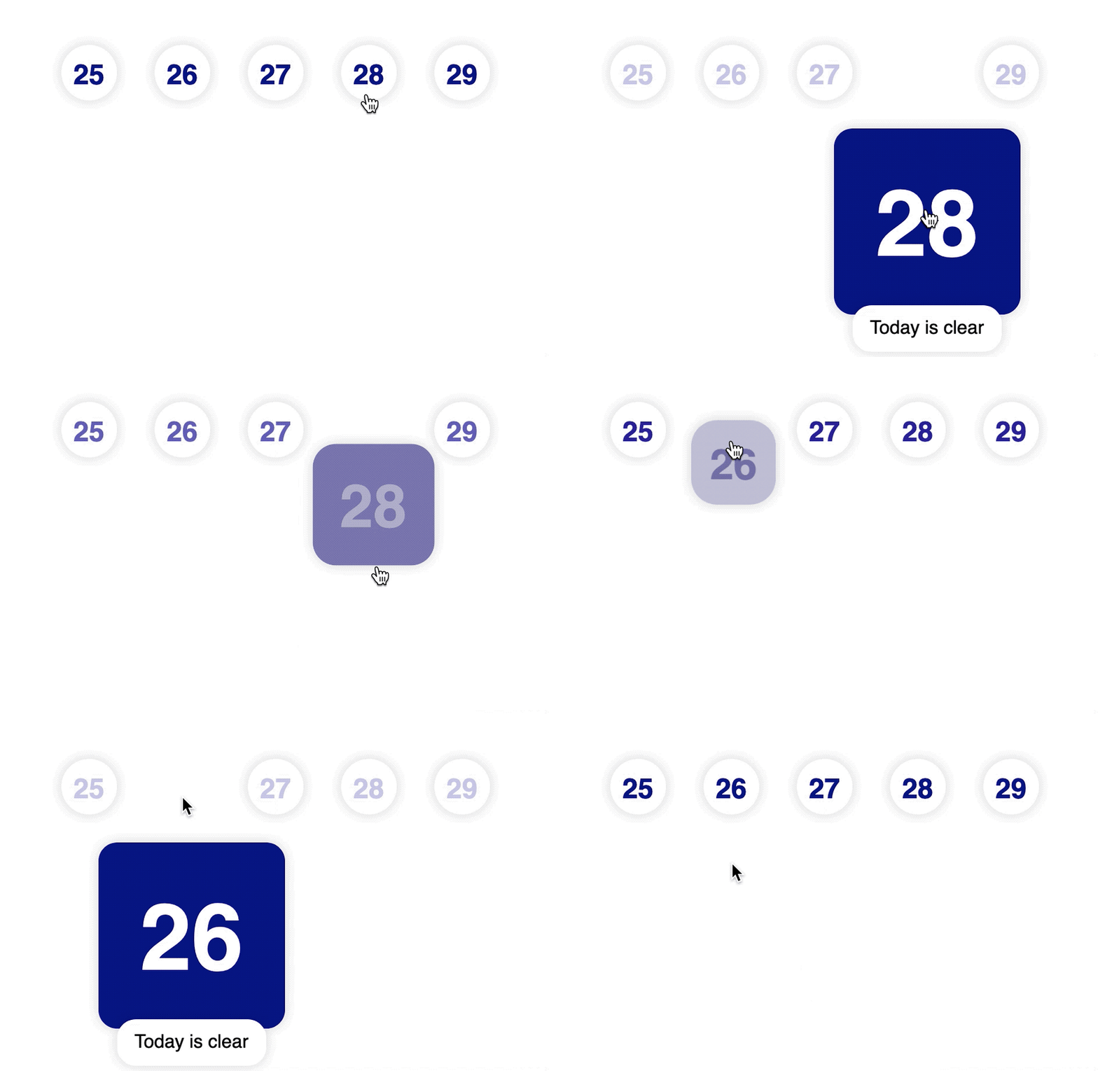
I decided to get a better idea of how this works and see what it can do by making my own experiment. The codesandbox is below to play around with. Click on the dates to show an expanded view.
In version 1, this would require a bit more setup to get right and we would be limited to a single component to perform the animation. This new approach gives developers more flexibility as it allows for different components to be used. The transition can then be linked together with a global identifier.
How does it work?
Two components make up the core of the interaction, <ExpandedCard/> and <CompactCard/> they both contain <motion.div/> components with the same layoutId prop set to expandable-card. Let's take a look at the components in their entirety.
function ExpandedCard({ children, onCollapse }) {
  return (
    <>
      <motion.div
        className="card expanded"
        layoutId="expandable-card"
        onClick={onCollapse}
      >
        {children}
      </motion.div>
      <motion.p
        className="card expanded secondary"
        onClick={onCollapse}
        transition={{ delay: 0.3 }}
        initial={{ opacity: 0, top: "6rem" }}
        animate={{ opacity: 1, top: "3rem" }}
      >
        Today is clear
      </motion.p>
    </>
  );
}

function CompactCard({ children, onExpand, disabled }) {
  return (
    <motion.div
      className="card compact"
      layoutId="expandable-card"
      onClick={disabled ? undefined : onExpand}
    >
      {children}
    </motion.div>
  );
}
The CSS for the two components defines the two states we want to animate between. The expanded card also contains some more information but we animate this separately so it doesn't just appear, instead, it slides in from the bottom.
Transitioning between the two components is as easy as wrapping them in a <AnimateSharedLayout /> component and conditionally rendering the one you want to show. The transition will be handled automgically like so.
<AnimateSharedLayout>
  {isExpanded ? (
    <ExpandedCard onCollapse={collapseDate} day={day}>
      <Content day={day} disabled={disabled} />
    </ExpandedCard>
  ) : (
    <CompactCard onExpand={expandDate} disabled={disabled} day={day}>
      <Content day={day} disabled={disabled} />
    </CompactCard>
  )}
</AnimateSharedLayout>
We store in state whether the component is expanded or collapsed and render either the <ExpandedCard/> or <CompactCard/> respectively. When the component which is currently rendering changes, the layoutId ensures a transition happens between them. The key properties which are changing in the experiment are the corner radius, position, size and background colour.
.expanded {
  width: 10rem;
  height: 10rem;
  background-color: navy;
  position: relative;
  left: -100%;
  top: 150%;
}

.compact {
  width: 3rem;
  height: 3rem;
  padding: 0.5rem;
  border-radius: 1.5rem;
}
The expanded class is re-positioned and enlarged. The shape changes from a circle to a square with moderately rounded corners and from white to navy blue. There is also another trick we use to ensure the date within the card component animates too.
The <Content /> component displays the day which changes colour depending on whether it is in a disabled, collapsed or expanded state. To ensure the transition happens, we assign a layoutId so even though we render different it in two different places, within a <ExpandedCard/> or a <CompactCard/>, framer-motion can handle the transition smoothly.
function Content({ day, disabled }) {
  return (
    <motion.h1
      className="title"
      layoutId="title"
      style={{ opacity: disabled ? 0.2 : 1 }}
    >
      {day}
    </motion.h1>
  );
}
The disabled state is shown here using an inline style but CSS classes handle the expand and collapse states.
.title {
  color: navy;
  font-weight: 800;
  margin: 0;
}

.expanded .title {
  font-size: 5em;
  color: white;
}

.compact .title {
  font-size: 1.5em;
}
Framer Motion handles the colour transition and size change without any additional changes. AnimateSharedLayout is a great addition to this already powerful animation library. It makes complex animations much simpler to implement in React and should allow more fluid transitions on the web which we are usually more accustomed to on native platforms. I hope this has whetted your appetite. If it has, take a look at how to get access to the beta version and start hacking.
How to use the beta version of framer-motion library
At the time of writing, 2.0.0-beta.31 is the latest version. (The article has been updated to work with beat 42)

You can specify the version you'd like to use in your package.json like so and start hacking.
{
  "name": "using-framer-motion-beta",
  "version": "1.0.0",
  "dependencies": {
    "react": "16.12.0",
    "react-dom": "16.12.0",
    "react-scripts": "3.0.1",
    "framer-motion": "2.0.0-beta.31"
  }
}
Should I use it?
Framer Motion version 2 is still in beta, although it seems pretty stable it should be used with caution. The API is unlikely to change but don't go building something meant for production right away. I haven't encountered anything unexpected yet but I've only played around with the beta in a limited capacity. If you're interested in playing around with it right now and don't mind the lack of documentation then go ahead. Changes are likely to be minor between now and release and it's great to see what it's capable of right now. If you're looking for stability, stick with version 1 for now and wait for the official release.
If you'd like to delve into more Framer Motion experiments, take a look at these:


Top comments (5)
Do you already use GSAP in react ? I currently use framer motion and I love it, I think it fits better than GSAP with react (Page transition really easy with Framer) but I never really give a shot to GSAP in react. Is it easy with Framer to implement a timeline ? and what about a 'children stagger' ?
Thx for your article !
I haven't used GSAP for a long time and never with React so I can't comment on that. I've had a lot of success with Pose and more recently Framer Motion. I'm not sure what you mean by a "timeline" but animating children is pretty easy, add
staggerChildrento a parent<motion/>element. Perhaps I'll write another article with some other common cases and how to animate them with Framer Motion.When I said timeline. I mean you can animate first this el, after this other el, you can start pause replay reverse that timeline.
greensock.com/docs/v3/GSAP/Timeline
To accompany this article, I've made a short run-through. This is using the updated codesandbox for Framer Motion Beta 42. Let me know if you have any questions.
If you're interested in more tutorial videos (including more long-form and step-by-step tutorials), subscribe to my channel.
Edit: This article has been updated to reflect API changes in Framer Motion 2.0.x Beta.
These changes include MagicMotion being renamed to AnimateSharedLayout and magicId becoming layoutId