So continuing off from last week, we still have three more Gestalt laws to go through to get our fundamentals. We'd covered figure-ground, similarity, and proximity. The short of them are that we will see contrast in an image or design where certain objects seemingly pop out at us. An example of this was the image of the two faces or the vase depending on how the background and foreground was colored.
Next, similarity was that we'll perceive similarity in objects that resemble each other. We looked at how to use this to our advantage by having consistent -- or inconsistent -- styling to better lead users.
Finally, the last we covered was proximity, which was similar -- heh -- to similarity but that physical closeness would lead to feeling of similarity as well. Grouping UI cards of a specific type infers that these cards have a similar significance to one another. Further, we can manipulate these almost "duh" concepts to be more clear about our designs.
So onward!
Number 4: Closure
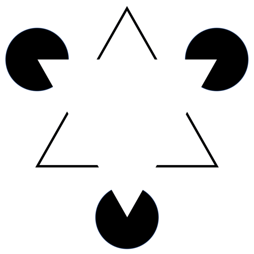
This is a really interesting concept within design but amounts to the observation that our minds will seek out order. Here's a good example of this:
So the obvious of this image is that we have a a really large triangle in the middle, with a few scattered shapes around it. However, there is no clear lines that draw the triangle. The large shape is inferred with pieces taken off from the outer lying shapes.
This concept is used in all sorts of logos or icons in UI design. Typically it lets designs and designers get away with a less is more sort of approach.
We can think of a loading screen moving in a circle and that motion infers something to us. Even though it's just an arc revolving around an axis, we draw significance out of that motion by filling in the physical gaps in the design.
Another good example I'd come across was how an image hiding on the side of the screen infers that we as users need to swipe or scroll to see it. What is in fact just an obscured picture, we'll infer that there's something more left out then what's actually present. So, interestingly, this applies to actions as well.
Number 5: Continuity
This is the principle that says our eyes will naturally be guided by continuous objects of similar kind. Think, navigation bar with similar styled links or card arrangement or even text. Left aligned text is nice because the continuous placement is easy for our eyes to read.
We seem to like it when there's a clear flow of information or objects in a design, preferring it over haphazardly placed things. This really hits home when you start to question why we'd want this over not? Couldn't the world have easily been arranged in something not sensible or if we'd even have feared continuity?
Number 6: Order
All other laws we've covered so far sort of underscore this last one. Gestalt Psychology is the study of how we, as people, make sense of the world. Which leads us to be very clear with one thing, we first and foremost see and interpret an order in the world.
We don't perceive where there is no significance, or that is just full of objects that have no relationship to one another. Instead, we see patterns and information in a way that almost reaches out at us.
Understanding the almost patently obvious but deceivingly deep ways that we see and make sense of the world can make our designs better. We can choose to represent information this way or that because we'll have an understanding that these concepts lay a ground for all the ways that we perceive order.
Getting clear on what is the intention of our site can mean that we can guide an experience and lead to a better outcome.


Top comments (0)