Over the last few weeks I've tried to learn up on being a better designer, combing through texts and other written material. Before I'd just take from different sources of inspiration for my designs that operated in the same space or had a similar sort of branding to what I was making/designing. With the help an inner eye towards what is good v. bad, I'd gotten away with not reeaally knowing why one design works or doesn't.
Obviously there's gotta be some rational reason why, some sort of harmony of elements or what have you. What I'd stumbled upon in trying to understand better was come upon the mouthful that is Gestalt Psychology. Just so I don't lose you, this is some fancy term that examines why it is some things in a design work, and why others won't. I won't get into the details, but if you've ever wondered why a movie makes sense to us -- because really a movie is just a series of still photos shown one after the other at a specific speed or frames per second -- then you've done some Gestalt Psychology.
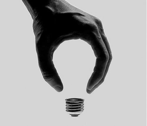
Or behold these trippy guys:
Why is it you see a lightbulb here? There isn't really a lightbulb there. Just a lightbulb stem and a hand. Yet there's something implied or more to the image than just the hand and the bulb stem.
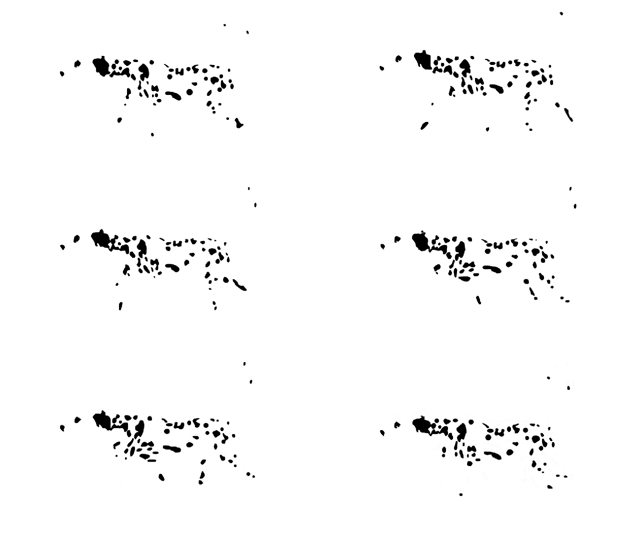
Or how about this one:
This is a gif of a dog walking. But is it really? They could just be dots moving in such a way to infer or trick us into thinking that a Dalmatian is walking smoothly.
Gestalt is important for design because it tries to understand how someone makes sense of the world and the appearance. We can use it to better unify elements that are meant to be similar or infer something larger than the sum of its parts. Lucky for us, we have some nice laws to examine design in a way to visually communicate our ideas better.
Number 1: Is It Two Faces or Just a Vase?
This is typically the first principle of Gestalt that people will go over and it goes by the name of "Figure-Ground." Essentially this the concept of separating an object in the foreground from something in the background.
An illustration of this is with the classic two faces or vase illusion:
What's going on here is that there's a strange play on your eyes. When you see a vase, it stands out as an object emerging out of the picture, or emerging out of the ground of the black backdrop. Hence figure, vase, and ground, black background. While when you see two faces, the reverse is the case. The faces form the figure sitting on top of the white background.
Think about this in terms of contrast. If we have a hero section for a landing page, and there's little contrast between text and the background, then we won't have a clear figure-ground relationship. Contrast will pop off the page so that users can more easily identify what is the necessary item on the page. It will seem like it's reaching off the page.
Number 2: Similarity
This one seems to be pretty straightforward. We'll draw meaning from objects with similar characteristics. Objects that share color, size, or shape will be grouped together more so than other objects. Kinda obvious right? Well, it is and it isn't. Using this law is important to stimulate a design to be more consistent. Why does a larger element in a nav bar look off? Well it simply just doesn't fit in with the rest. But getting very clear on what elements are similar and which aren't means you'll be able to better guide a user.
Styling all links similarly means a user can glide through a site. You could even disrupt that style with something to draw attention to that element. Harnessing an understanding of similarity can be crucial and is one of those concepts that are so deceptively deep.
Number 3: Grouping
Grouping is similar, so to speak, as similarity but focuses on the actual distance between elements. Placing elements together creates a balance between those elements. We'll draw meaning and significance from physical closeness of objects. Contrarily, bringing objects farther away from one another mirrors a feeling difference as well.
Having a grid of components that are ordered and close to one another means that they relate to each other that much more. Again, sort of obvious but illustrating a deeper truth that explains why grouped information feels right.
Knowing this means we can better make decisions about what characteristics should be grouped together for objects. We design a page with an intention and this can trickle down into how we use grouping to have the user make sense of the objects we put in front of them.
We still have three more to go, but so as to not bore you too much I'll stop off here. Be sure to check back for a continuation of Gestalt and why it makes your design make sense.


Top comments (0)