What is Grid?
The grid creates the skeleton structure of the web. It consists of horizontal and vertical grid lines called Row (Column) and Column (Column). By referring these lines, the placement of the elements to be used on the web is provided.
Grid not only allowed the designer to create more organized and planned structures during the design phase, but also facilitated the responsive coding of front end developers.
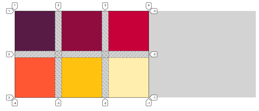
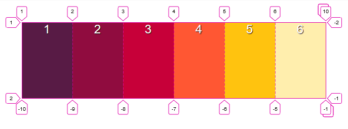
Below you can see the grid in-site placement. 👇

In the past, many methods and tricks have been used in the CSS for aligning the elements and responsive coding, of course, everything changed a lot when flex came, and it was easier 😊 but then the CSS grid entered our life 😍.
While the Flexbox allows us to encode one-dimensional, in the grid layout model, it allows children to align the elements in both dimensions as desired in a pre-defined flexible container. There is a logic that comes from flexbox, actually on the grid but you can think of it as 2 dimensional and more.
Grid Terminology
There are some concepts we need to know on the grid before we get to the coding part. After learning them, we will switch to the coding part.

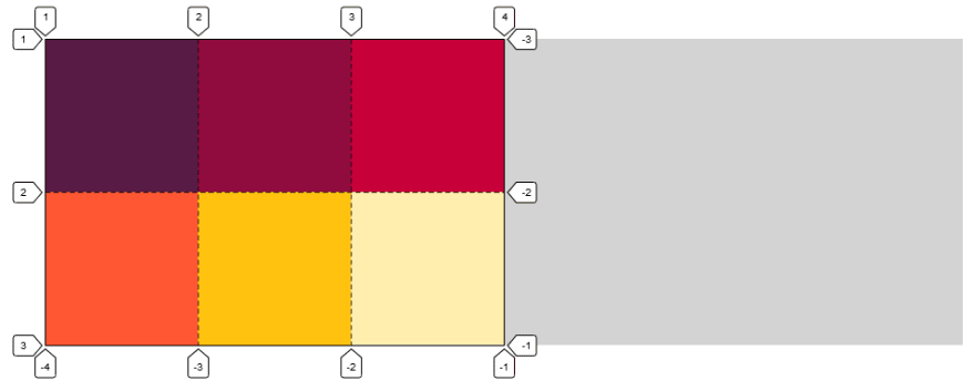
Grid Line : You can think of it as horizontal or vertical lines. They are called by number.

Grid Container : The main box provides the formation of structures such as a row, column, cell.

Grid Row :They are structures consisting of horizontal parts.

Grid Cell :It is the smallest unit of the grid. It is located between 4 grid lines.
Grid Column :They are structures consisting of vertical parts.

Grid Area :It is a structure consisting of many grid cells.

Grid Gap :They are spaces between column or row.
Grid Track : It is the general term of the grid column or grid-row.
Now that we pass the terminology part, let's come to the point now. Let's start using Css Grid. I will use more than one example while describing the subtopics. I will show the images of these examples first and then the codes.
First of all, let's create an html structure with parent and child elements.
🔻 grid-template-columns & grid-template-rows
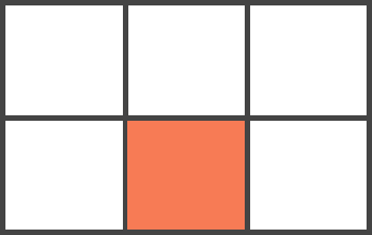
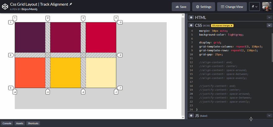
By giving display: grid to the main container, we now make the creation of a grid template. There is a structure consisting of 3 columns and 2 rows in our image. We create this with grid-template-columns and grid-template-rows properties. CSS properties are already showing what they are doing from their names. You can see the code describing the general view below. Creating the grid structure is that easy.
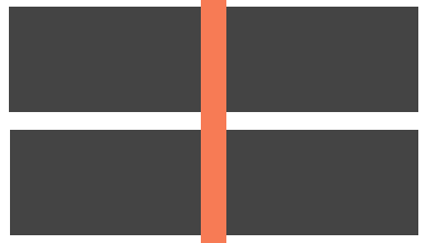
🔻 grid-gap (Gutter)
It only gives space between the grid cells.
grid-column-gap only gives space between columns, while grid-row-gap gives space between rows. You can give space to both column and row at the same time by using the grid-gap shortcut. In the meantime, we will come across these short properties more.
.container{
   grid-column-gap: 25px;
   grid-row-gap: 25px;
   //grid-gap: 25px;
}
🔻 repeat & fr Unit :
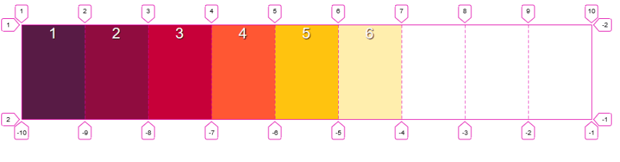
It came with many functions with Grid. One of them is repeat (). You have seen that we have written 150px several times in both column and row section above. Instead, we can write 3 in the form of 150px.
fr(fraction) : This unit came with css grid. Refers to available space. Let's understand how.

We had a 900px wide container. We will fit the items inside using fr.
grid-template-columns: 1fr 2fr 3fr: You might think like this. it fits the total width according to the fr value. In other words, you do not need to give the values to the items by considering the total width and by calculating the px.
By the way, you can use any kind of css unit. I also used % valued expression, which refers to the same code above.
🔻Grid Child Element Positions
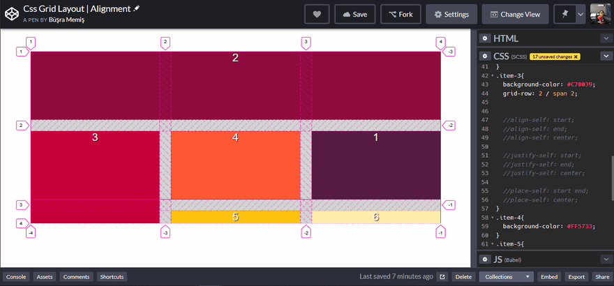
Let's come to the beautiful sides of the grid. No matter how you do your html structure. You can position the items anywhere you want.

I mentioned that the lines are numbered in the terminology section. As seen in the image, we will pull item number 1 to the bottom right corner.
I will tell from the longest to the short way. Let's enter the column values with grid-column-start and grid-column-end and draw them in a different column. It also corresponds to 3 and 4. If we want to get our work done in one line, you can also enter the start and end values by typing grid-column. The same goes for the row.
grid-column: column-start / column-end
grid-row: row-start / row-end
The good thing is that you can write both row and column code in a single existing line.
grid-area: row-start / column-start / row-end / column-end
🔻Spanning
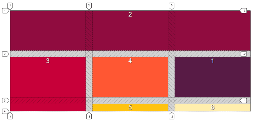
I have said that we position the items as we want. It also has several different methods. I will explain by explaining how I made the number 2 in the image.
You can do it by giving grid-column & grid-row values, which I said in the previous title. Also, if you want to extend an item from a certain place to the end, it is enough to write -1 for it. You don't need to count columns or rows.
grid-column: 1 / -1
Another method is spanning. You can think of each item as a span. And when we look at number 2, we see that it occupies a total of 3 spans. So our code is:
grid-column: span 3 or grid-column: 1 / span 3
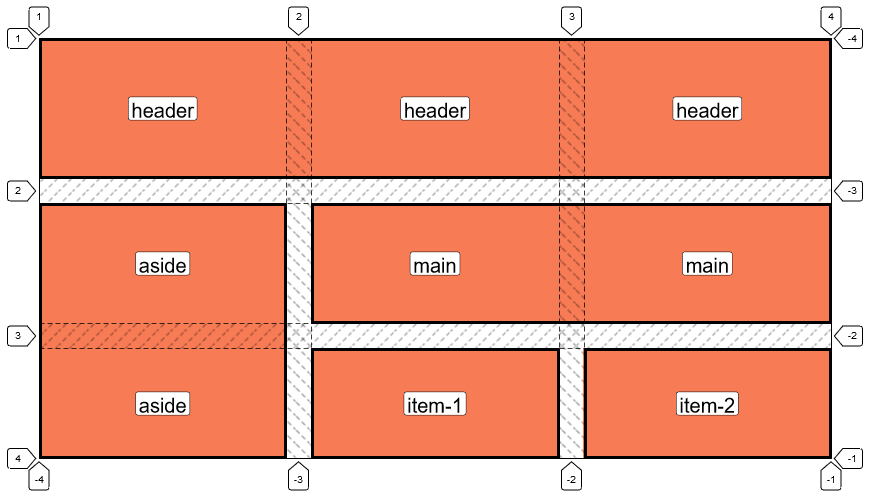
Naming Grid Areas:
In this section, I will show you how you create a template by naming it. Apart from creating the basic structure you have learned so far, we will add extra code. It is also grid-template-areas. After creating our classic display: grid and grid-template-columns & grid-template-rows structure, we create a template for our area.
grid-template-areas: "header header header"
                     " aside main main"
                     "aside item-1 item-2";
After adding the names for each column and row, we add these names one by one to the fields.
.header{
   grid-area: header;
}
You can find all the code of this layout below.
. (dot): It means an empty cell and in your template '.' the place you put remains empty.

🔻max-content, min-content, minmax()
Other values that come with the CSS grid are min-content & max-content. With these, you can adjust the col or row values according to the content.
max-content: occupies the width or height as much as the content.
min-content: takes up as much space as the widest word.
Another thing is the minmax () function.
minmax (): allows to enter both min and max values at the same time.

🔻auto-fill, auto-fit
I love the grid on its own, but I guess it's one of the things I love most about grid this feature. First I will show the difference, then I will touch on the part I love.
auto-fill: Fills the line with as many lines as it can fill. So there are absolutely gaps.
auto-fit: Acts to cover all available areas.
If we come to my favorite part. Using auto-fit, we can gain responsiveness without the need for any media query code. Do not forget to examine the code and minimize the browser from Codepen.
🔻Explicit Grid & Implicit Grid
.container{
  display: grid;
  grid-template-columns: repeat(2, 1fr);
  grid-template-rows: repeat(2, 150px);
  grid-gap: 25px;
}
Let's have a grid layout with the code above. We have a total of 6 items. The appearance of this is as follows.

We wrote only code for 2 col and 2 rows in css, but we had 6 items. their columns are pushed to the line below by pairs. Certain terms are given for the part covering the layout and for others. They are like this.
Explicit grid: The layout we wrote for the grid. Their col and rows are defined in the code.
Implicit grid: Automatically created for tracks other than the written ones.
Well, can we also write CSS for the tracks left on the implicit grid? Of course, property is also considered for this. 😄
  grid-auto-rows: 200px;
  //Rows of the Implicit grid are affected.
grid-auto-flow: Controls how auto-placed items are placed on the grid.

🔻Grid items Alignment
The align-items, justify-items and place-items properties are used to align the items in the grid container.

align-items: Allows grid items (row) to align on the horizontal axis.
align-items: start | end | center | stretch (default value)
justify-items: Allows grid items (col) to align on the vertical axis.
justify-items: start | end | center | stretch (default value)
place-items: You make alignments on both axes at once.
place-items: align-items - justify-items
If you just want to do a single item custom alignment, you can do it using align-self, justify-self, and place-self.
🔻Aligning Tracks
When the items do not cover the entire container, you can use the align-content and justify-content properties when you want to make an alignment with them.
align-content: provides alignment on the vertical axis.
justify-content: allows alignment on the horizontal axis.
Browser Support Status

You can follow the current support status at the address below. 👇
https://caniuse.com/#search=grid
👉🏼Codepen Collection: If you want to see all sample codes via codepen, you can click on the link and examine it.
👉🏼Github: You can also access all sample projects on github.
If you want to learn more about the grid, I will leave a few links and content.
🔽 Rachel Andrew's speech 👌🏻 :
🔽 W3 : https://www.w3schools.com/css/css_grid.asp
🔽 CssTricks: https://css-tricks.com/snippets/css/complete-guide-grid/
🔽 CssReferense : https://cssreference.io/css-grid/
After all this information, I put you an online exercise so that you can test yourself 👇🏻:
https://cssgridgarden.com/
PS: I don't have a very good English. So i am so sorry for wrong sentences.
Stay tuned for more.😊


Top comments (5)
Very well explained! What do you think about Bootstrap Grid vs CSS Grid? What is the future?
With bootstrap, you create a grid structure by writing more html code (adding a class), when creating a grid with pure css, you write more css code.
I think we can create more flexible and comfortable structures with Css grid. I always use css grid in my projects and I am very comfortable. I think that the css grid will be preferred more in the future.
Not the OP but Bootstrap V4 uses Flexbox, which is my preferred option VS grid. I find flexbox more flexible than grid but it's down to personal preference in which one you might use in a project.
Nice article, thanks for sharing.
Thank you Isa 😊
Some comments may only be visible to logged-in visitors. Sign in to view all comments.