
The topic of creating a more accessible internet environment has been raised a lot more in recent years, especially in web development. Making web pages available to read for disabled people is almost a required skill for front-end engineers.
How could we improve the accessibility of our website?
Use semantic HTML tags and add AIRA attributes
By using HTML tags, the type of content that is highlighted would be read out by the screen readers. These are built-in features that are interactive elements with keyboard support. For example, , ,, are the most used ones.
Disabled people could use Tab and Shift + Tabnavigate through each element.
Basically, each element tag would have one or more of the following 4 properties:
type. Describe its type such as a button, or an input area.
name. Describe its name or title. Mostly, it is the computed label. If there is no title or placeholder attribute, we could use AIRA attributes such as aria-label and aria-labelledby.
value. Usually associate with . What the user has typed in the text field.
**state. **For example, can be expanded or collapsed.
Color and contrast accessibility
Unlike sight-impaired people, some people may see things with low vision but have difficulty perceiving colors. Color and contrast accessibility are another important part we need to consider adding to our website.
The WebAIM guidelines give the following standards for developers to follow:
Level A is a basic requirement for some users with disabilities to be able to access and use web content.
Level AA indicates overall accessibility and removal of significant barriers to accessing content.
Level AAA provides improvements and enhancements to web accessibility for some users with disabilities.
Typically, Level AA is the minimum recommendation with the following criteria:
The visual presentation of text and images of text has a contrast ratio of at least 4.5:1, except for the following:
- Large Text
*Large-scale text and images of large-scale text have a contrast ratio of at least 3:1;*
- Incidental
Text or images of text that are part of an inactive user interface component, that are pure decoration, that are not visible to anyone, or that are part of a picture that contains significant other visual content, have no contrast requirement.
- Logotypes
Text that is part of a logo or brand name has no contrast requirement.
These color and contrast ratio can be confusing since these are usually taking into account by the UI and UX engineers. But as front-end developers, playing a role in the web development process, we should at least know that what they are and how they work.
After putting these standards into practice, I tested my personal portfolio website with Google Lighthouse, and here is my result.
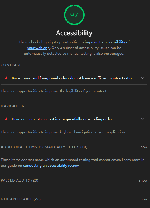
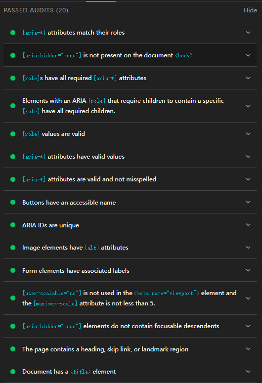

If we look through the report, I did pretty well on the naming and labeling part, but I still lack the experience in getting the correct contrast ratio correct. However, Google Lighthouse can guide me to improve the accessibility each time, and each time my accessibility score went up.
With these accessibility features, more people could access the endless web world. The developer community differs vastly from other working communities as it is friendly and inclusive, and it is one of the prior reasons why I chose front-end engineer as my career path. I hope that after reading this article, more developers will understand the importance of making our website more accessible to the disabled community.
Let’s connect:
Portfolio | Github | Medium| LinkedIn


Top comments (0)